Close

A resource for color and creativity
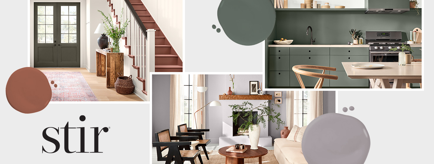
STIR® is the resource that explores the connection between color and cutting-edge design. It examines the many facets of color to help you bring a fresh perspective to your work. STIR® is an e-newsletter for design professionals.
View the Print Issue Archive.
Find additional articles and resources.
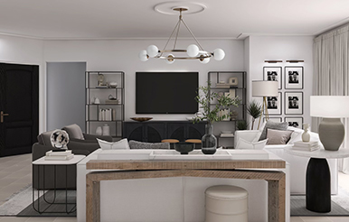
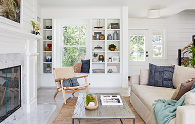
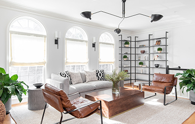
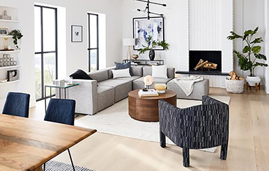
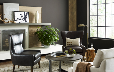
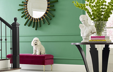
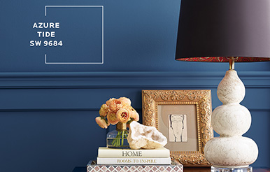
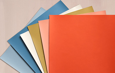
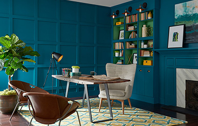
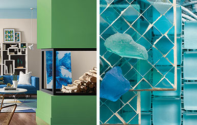
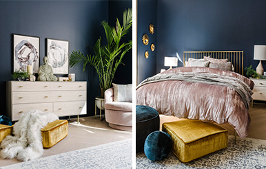
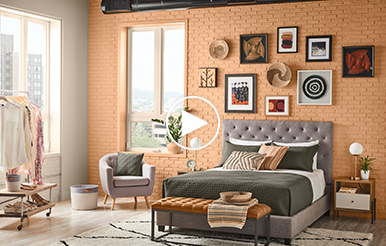
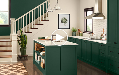
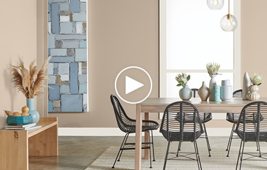
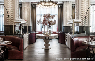
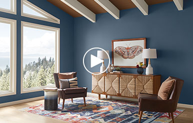
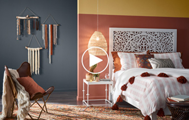
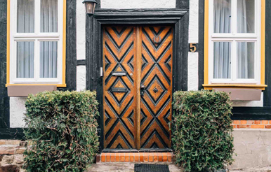
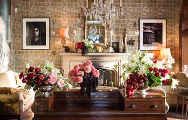
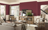
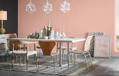
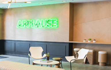
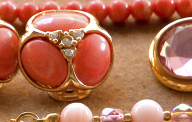
The New Age of Nostalgic Design
The world of interior design is embracing the styles and shades of the past to create spaces that are comforting, familiar, and fresh.
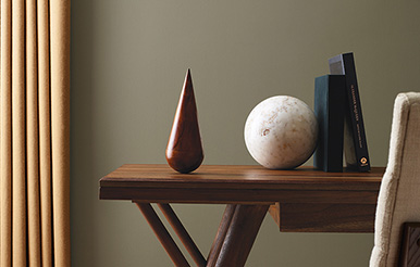
7 Designers’ Signature Sherwin-Williams Colors
While we can’t easily pick a favorite, some colors speak more loudly to us than others. See what design and color experts consider to be their “signature” shades.
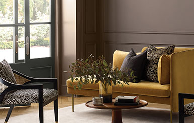
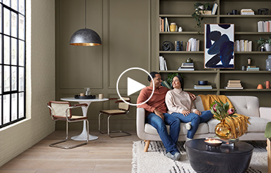
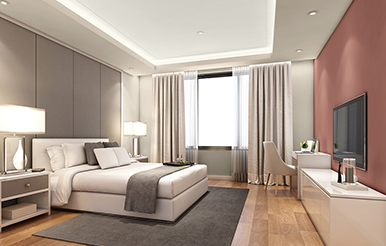
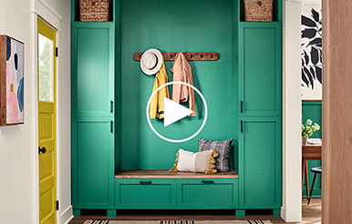
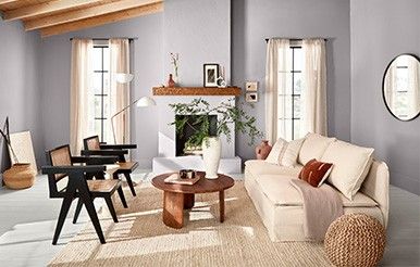
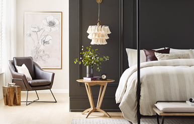
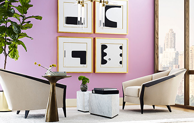
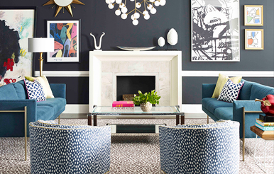
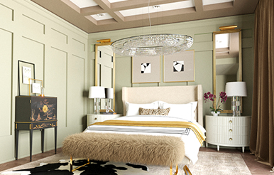
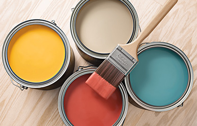
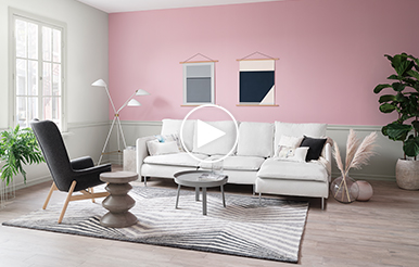
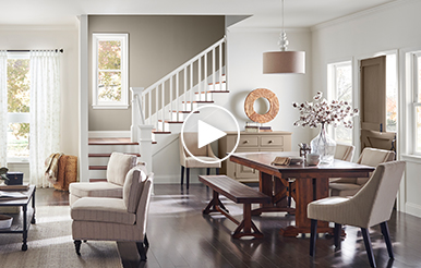
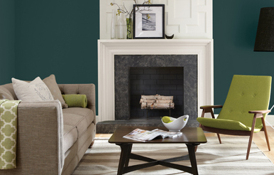
The Colors of Comfort
From blissful, barely-there tints to dramatic, dark-as-night deeps, we’re showcasing a beautiful spectrum of hues that soothe.
Redefining Real: The Future of Phygital Design
Explore the new frontiers of mixed reality, advanced tech, digital renderings, and designing remotely in a fully phygital world.
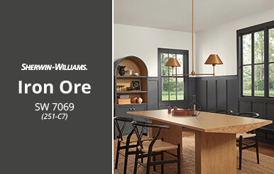
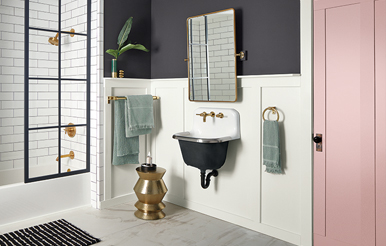
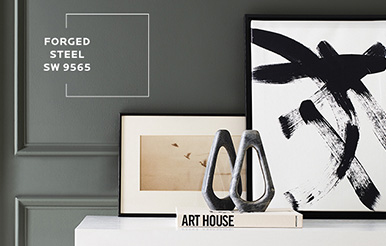
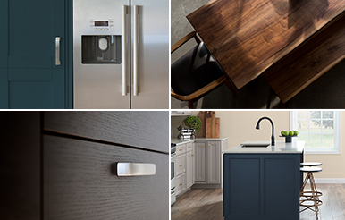
March's Color of the Month 2022: Iron Ore SW 7069
Capture the essence of well-styled simplicity with Iron Ore SW 7069 (251-C7), our inky charcoal-gray March Color of the Month.
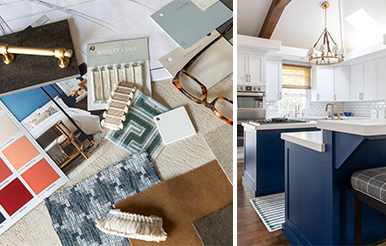
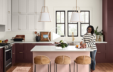
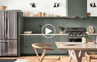
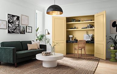
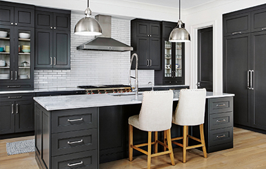
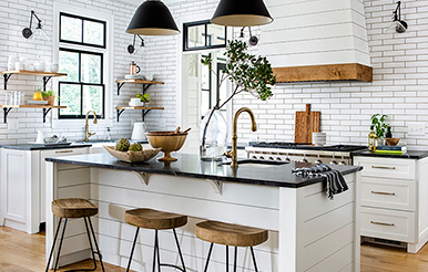
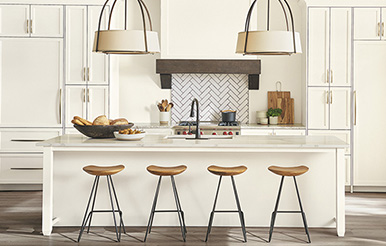
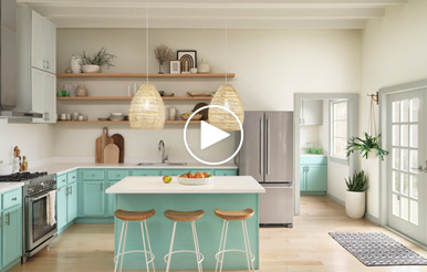
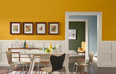
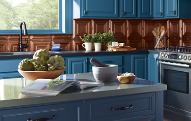
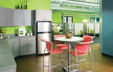
A Dash of Optimism: Colorful Trends in Kitchen Design
Modern kitchens are the ideal place to add a little design flavor and a pinch of positivity.

Designing for Wellness at Work
Explore the many ways that workspitality design invites the WFH world back into the office.
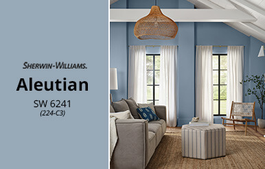
February's Color of the Month 2022: Aleutian SW 6241
Welcome soft simplicity with the watery blue of February’s Color of the Month, Aleutian SW 6241.
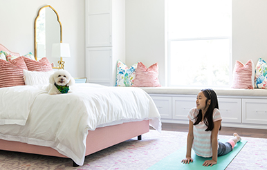
Making Room for Wellness
From home gyms to spa-inspired spaces to zen zones—take a closer look at the trends that give new meaning to the phrase “well designed.”
From Waste to Wanted
We’re spotlighting 6 companies that are transforming waste materials into beautiful and inventive products to serve modern spaces.
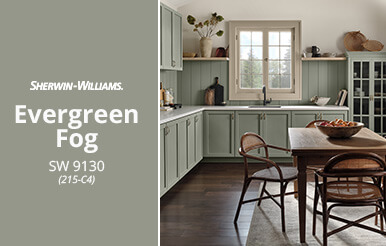
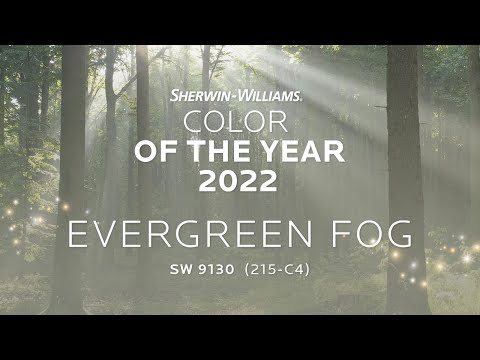
January's Color of the Month 2022: Evergreen Fog SW 9130
Weʼre embracing a time of new beginnings with the calm and cozy hue of Evergreen Fog SW 9130, Januaryʼs nature-inspired Color of the Month.
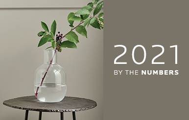
A Look Back, by the Numbers
From new (super!) formulas to favorites for indoors and out, we’re counting down some of our highlights from 2021.

Styling & Storytelling: Colors of the Month
Take a deeper dive into how this year unfolded in 12 beautiful trending hues as we get ready for a colorful 2022.
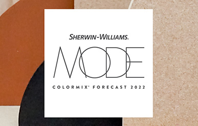
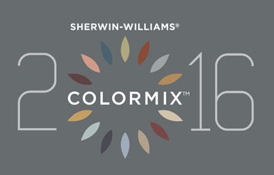
MODE: Commercial Colormix® Forecast
Introducing 6 unique color collections within the Commercial Colormix® Forecast 2022 — hand-selected for commercial settings everywhere.
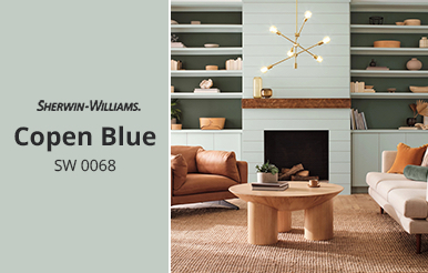
December's Color of the Month 2021: Copen Blue SW 0068
December’s Color of the Month, Copen Blue SW 0068, is a fresh-air shade of palest sapphire, at once calming and invigorating in any space.

Stir It Up: Your Top Posts from 2021
Color allows us to create connections in new ways, and we have loved sharing those connections with our STIR readers. As 2021 winds down, take a look back at your top four posts of the year.
How Color Affects Well-Being
Our 2022 Color of the Year breathes organic, restorative calm into any space. Let’s look closer at the fresh, cool shade of Evergreen Fog SW 9130 and it’s place within the growing trend of biophilic design.
Inspired by the Rich Colors of Nature
Go inside textile artist Helena Hernmarck’s Connecticut studio and see how she puts color to magnificent use.
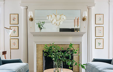
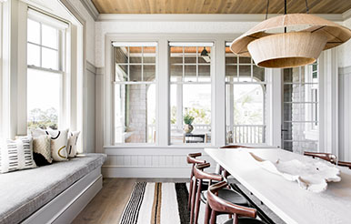
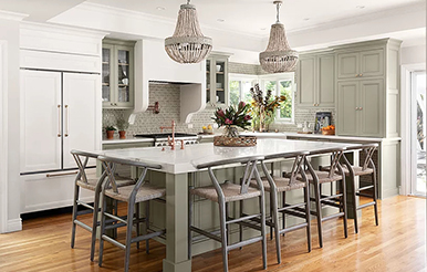
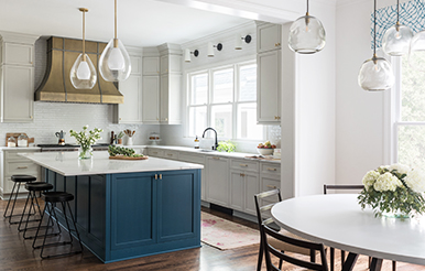
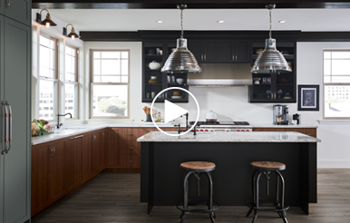
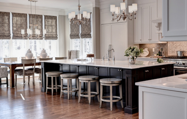
Striking the Perfect Balance
Discover designer Jean Stoffer’s secrets for creating a fresh, elegant look in this newly renovated home.
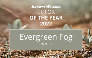
Introducing the 2022 Sherwin-Williams Color of the Year
Discover the balance between the familiar and the fantastical, between seeking sun and rooting deeply in Evergreen Fog SW 9130 (215-C4), the 2022 Sherwin-Williams Color of the Year.
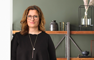
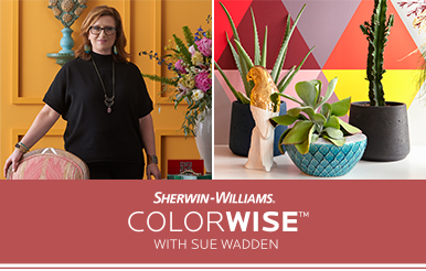
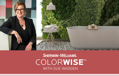
The Story Behind the Color: A Conversation With Sue Wadden
Evergreen Fog’s simple sophistication provides just the right restorative touch. Learn about the influences from Director of Color Marketing Sue Wadden.
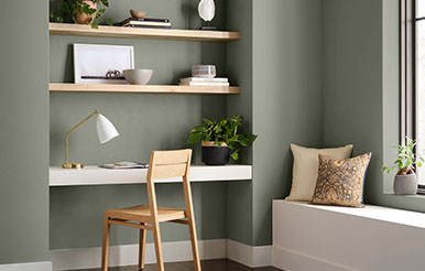
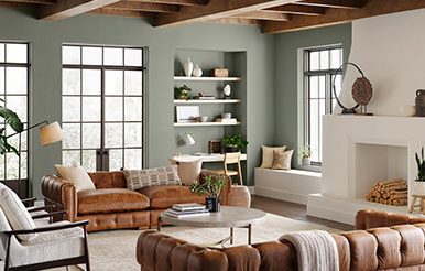
How to Use Evergreen Fog
See what paint colors, wood tones, metal finishes and other materials coordinate best with the 2022 Color of the Year.
Immerse Yourself in a Color of New Beginnings
The calm and composed quality of Evergreen Fog is rooted in the refreshing nature of the forest — a beautiful way to bring a new beginning to your designs.
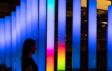
The Power of Light and Color
Get inspired by media and interactive sculptor Jen Lewin’s inventive use of light, color and sound to draw people in to her works of art.
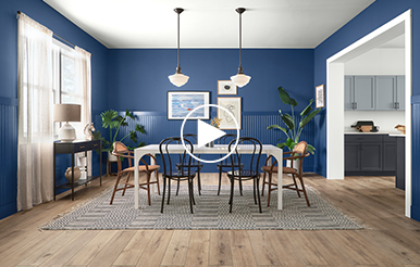
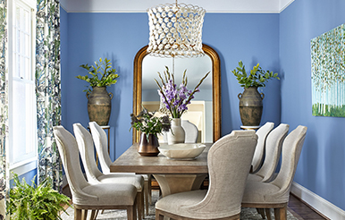
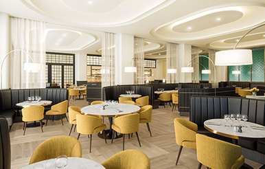
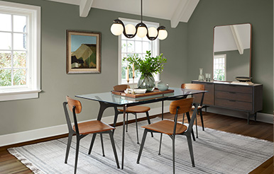
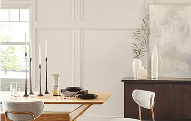
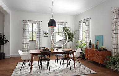
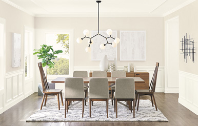
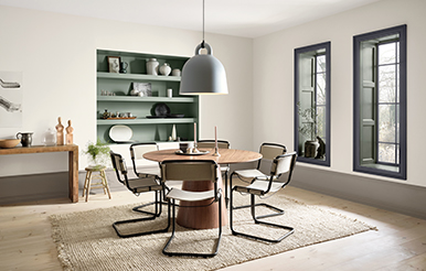
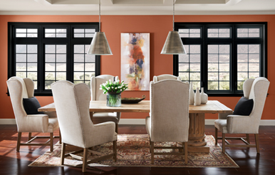
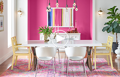
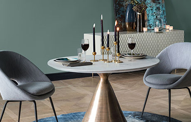
Delectable Dining Rooms
See how designers are tapping current color trends to create warm and welcoming dining spaces.
Design Pro Exclusive: Colormix® Trends and Influences With Sue Wadden
How will color preferences shift in the coming year? We tapped Sue Wadden, Sherwin-Williams director of color marketing, and her team for their top insights.

How Colormix Comes to Life Across Design
Sherwin-Williams color experts share how Colormix connects to commercial design, wood tones and a range of products.
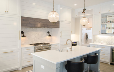
Favorite Colors for Fresh-Air Kitchens
Learn how our top bright neutrals picked by Sherwin-Williams Director of Color Marketing Sue Wadden, along with soft greens like Cornwall Slate SW 9131 (216-C4), help make kitchens feel light and breezy.
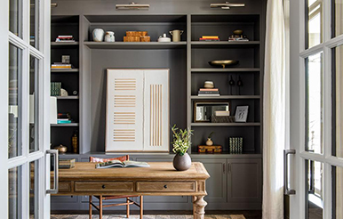
5 Work-From-Home Spaces That Wow
See how fellow designers are using trends like maximalism, grandmillennial character and joyful colors to elevate home offices.
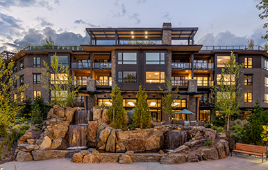
Making a New Development Feel Like Home
The design team behind a luxury multi-family retirement community in Oregon explains how they used natural materials and neutral paint colors to convey a warm, homelike feeling.
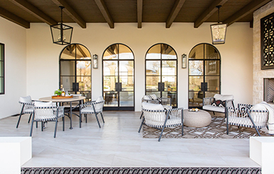
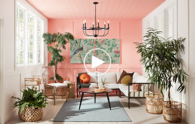
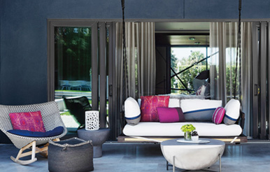
5 Outdoor Escapes Worth Exploring
Designers from California to South Carolina use color to bring character and a sense of sanctuary to screen porches, patios and more.
July's Color of the Month 2021: Jovial SW 6611
July’s Color of the Month, Jovial SW 6611 (117-C2), brings a free-spirited bohemian air into indoor/outdoor spaces, creating a pretty canvas for vintage and botanical touches.
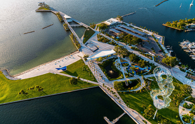
Where Sustainability Meets Seaside Fun
Architects Harold Somarriba and John Curran describe how sustainable features shine in the design for the newly reimagined St. Pete Pier in St. Petersburg, Florida.
How Color Helps Define Character in a Family Home
A palette largely inspired by the colors of the coast breathes new life into a renovated North Carolina home.
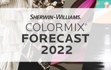
The 2022 Colormix® Forecast Is Almost Here!
Get a designer-exclusive sneak peek now of the Sherwin-Williams 2022 Colormix Forecast, coming in August.
June's Color of the Month 2021: Commodore SW 6524
June’s Color of the Month, Commodore SW 6524 (185-C7), conveys a timeless, thought-provoking sense of calm that harmonizes with wood, black and brass finishes.
A Fresh Twist on a Favorite Home Style
Architect Tyler Zagryn brings a crisp coastal look to a modern farmhouse in part by painting it Alabaster SW 7008 (255-C2) inside and out.
Ready, Set, Summer: 5 Color Palettes Inspired by the Season
See how other designers give spaces a bright look that’s beautiful all year long.

Continuing Ed: Learn More About Wellness Design in the Home
Explore how color, nature and coatings technology come together to influence wellness in our new on-demand course.
May's Color of the Month 2021: Messenger Bag SW 7740
May’s Color of the Month, Messenger Bag SW 7740 (297-C7), delivers the panache of an alluring neutral that works effortlessly with wood, stone and other natural textures.

Inspired by Nature: An Artist’s Beautiful Approach to Botanicals
Using wire, paper and paint, artist Ann Wood creates flowers and other plants that mirror colors from the garden.
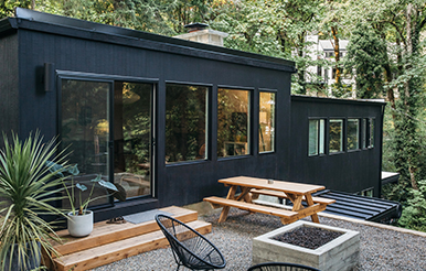
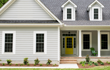
6 Exquisite Exteriors and the Design Pros Behind Them
See how Mariella Cruzado, a designer originally from Peru, takes cues from her clients’ rich Brazilian and South African roots in the dramatic transformation of a rowhouse near Washington, D.C.
Downloadable Color Palettes Exclusively for Design Pros
Join Sherwin-Williams for virtual webinars from our color and coatings experts. Explore the latest color trends, specifying the right product for your next project, and more.
April's Color of the Month 2021: Carnelian SW 7580
April’s Color of the Month, Carnelian SW 7580 (276-C6), brings sophisticated balance to the vintage modern look, working brilliantly with a wide range of complementary colors, patterns and periods.
4 Key Commercial Color Trends
Get the inside story on what’s influencing the trends for every palette of the 2021 Colormix® Forecast Commercial color collection — and what it means for multi-family, new residential, healthcare and other markets.
Global Inspiration Meets Warm, Modern Style
See how Mariella Cruzado, a designer originally from Peru, takes cues from her clients’ rich Brazilian and South African roots in the dramatic transformation of a rowhouse near Washington, D.C.

Stay in the Know With Virtual Events
Join Sherwin-Williams for virtual webinars from our color and coatings experts. Explore the latest color trends, specifying the right product for your next project, and more.
March's Color of the Month 2021: Alexandrite SW 0060
March’s Color of the Month, Alexandrite SW 0060, enlivens everyday spaces such as mudrooms and home offices with a feeling of pure joy.
Bringing Well-Being to Beautiful Life
A soothing color palette, seamless indoor/outdoor connections and host of sustainability features all contribute to the well-being benefits and beauty of a hotel in a groundbreaking new neighborhood.
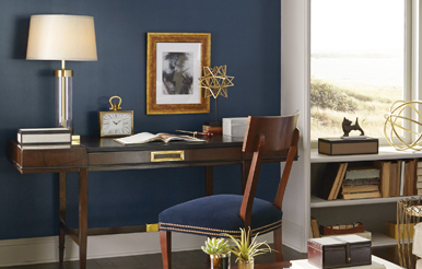
How Designers Are Using the Color of the Year
From a serene sitting area to a dramatic ceiling, see how designers are incorporating the natural beauty of Urbane Bronze SW 7048 (245-C7) into their projects.
A Calm, Collected Take on Timeless Style
Dive into our latest collaboration with Rejuvenation for a collection of calming hues curated to coordinate with the company’s light fixtures and hardware.
Announcing the Sherwin-Williams Living Well™ Collection
Innovation and inspiration come together in our paint formulas with sanitizing and air-purifying technologies — curated in 11 Living Well palettes.
Dive Into the Collection: Color and Nature’s Effect on Mood
Color has a significant impact on well-being and keeping our lives in balance. Sue Wadden, director of color marketing, discusses that impact, including how color’s influence on mood informed the Living Well collection palettes.
Expert Insights on How the Paints Work
Rick Watson, director of product information and technical services, answers questions about the key benefits and performance of SuperPaint® with Sanitizing Technology and SuperPaint® with Air Purifying Technology.
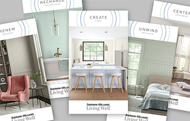
Living Well Presented in 11 Palettes
Balance, focus and other elements of well-being come to life in 11 palettes of handpicked colors, all beautifully revealed via downloadable brochures.
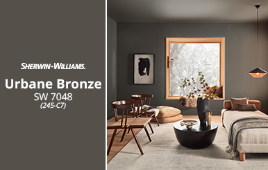
January Color of the Month 2021: Urbane Bronze SW 7048
Urbane Bronze SW 7048 (245-C7), embodies the earth’s richness to forge a grounded, serene feeling. Combine it with coordinating colors also rooted in nature for a bold take on modern and traditional style.
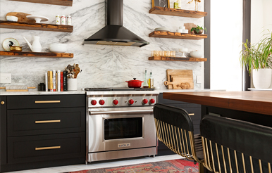
Cooking Up Character: 6 Rich Colors for Gourmet Kitchens
See how colors such as Tricorn Black SW 6258 (251-C1) convey a sense of warmth and personal style that feels particularly welcoming during the holidays.
First Look: 2021 Colormix® Forecast Commercial Color Collection
Stay on top of color trends for multifamily, new residential, healthcare and more with our latest forecast.
Introducing the Fall/Winter 2020 West Elm Collection
From the simplicity of Snowbound SW 7004 (256-C2) to the energy of Knockout Orange SW 6885 (116-C3), our latest collaboration with West Elm is designed to suit a range of comfortable, modern styles.
Discover 200 Exclusive New Hues
Explore our brightest whites and other outstanding neutrals in our new Emerald® Designer Edition™ paint.
December's Color of the Month 2020
December’s Color of the Month, Pewter Green SW 6208 (217-C6), has a calming, centering quality ideal for kitchens, baths and other rooms designed to rejuvenate.
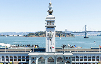
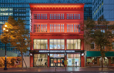
Landmark Decisions: Choosing the Best Colors for a Beloved Building
The iconic San Francisco Ferry Building gets a facelift with help from a custom paint color Sherwin-Williams named in its honor — Ferry Building Gray.
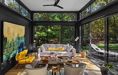
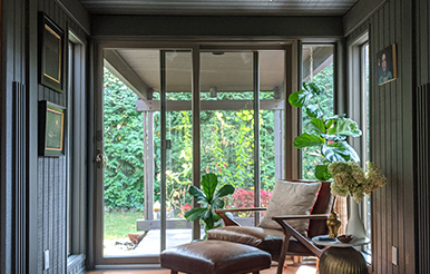
A Color Scheme With a Surprise Twist
Sunrooms tend to be painted pale colors. But in this New York home, the walls, windows and trim painted black beautifully recede, letting views to nature steal the show.
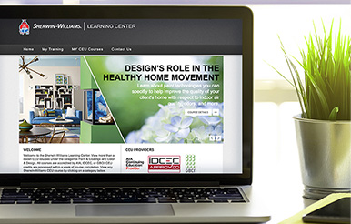
Earn Continuing Education Credits Before End of Year
Act now before the year is up: Check out more than a dozen courses in the Sherwin-Williams Learning Center and earn AIA, IDCEC and GBCI credits.
November's Color of the Month 2020
November’s Color of the Month, Canyon Clay SW 6054 (194-C6), pulls influences from nature to set a modern-rustic tone that is welcoming and relaxed.
Colorful Journey: Balancing Preservation and Personal Style
Designers with a knack for historic preservation bring new life to an 18th-century home — with brilliant results.
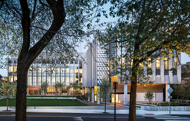
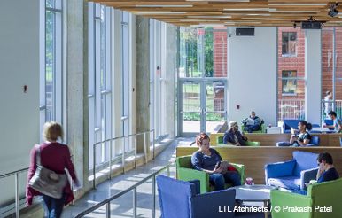
An Educational Building Engineered for Future Engineers
See how paint and other coatings help create durable conditions for Brown University's new engineering research building.

Brush Up on High-Performance Coatings
Gain a better understanding of solutions addressing specialized design needs in the CEU "Paint 201: High-Performance Coatings for Commercial Spaces."
October's Color of the Month 2020
October's Color of the Month, Mystical Shade SW 6276 (226-C3), provides an organic modern foundation for creating a mood that's light, bright and right at home with elements of nature.
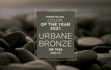
Rooted in Nature
Announcing the 2021 Color of the Year, Urbane Bronze SW 7048 (245-C7). Let a color inspired by essential elements of the earth — stone, metal and wood — provide you with a sense of calm, stability and warmth.
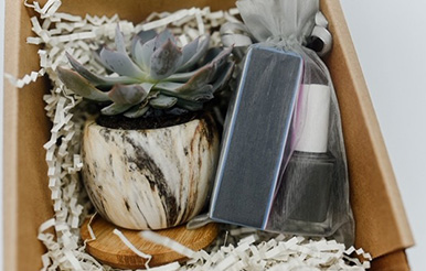
Giveaway: Share the Love
Download our shareable Color of the Year photos and post them on Instagram or Twitter with #2021COTYGiveaway for your chance to win a COTY Sanctuary Gift Box.
Your New Neutral: A Closer Look at Urbane Bronze
As a color prolific in nature, our 2021 Color of the Year lends itself to multiple styles, including the warm, comfortable minimalism of Scandinavian design.
How to Use Urbane Bronze
See what paint colors, wood tones, metal finishes and other materials Director of Color Marketing Sue Wadden suggests as the perfect complements to the 2021 Color of the Year.
September’s Color of the Month 2020
September’s Color of the Month, Rock Candy SW 6231 (257-C6), brings a breath of fresh air to any space.
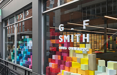
How Color Gives a 135-Year-Old Company Its Edge
Paper purveyor G. F Smith has witnessed change from a unique standpoint since its founding in 1885. See how staying on the pulse of color has helped the London company soar.
Cozy Chic: Fashion as Inspiration in a New Family Home
Just as the classic black dress is a women’s wardrobe staple, Iron Ore SW 7069 (251-C7) provides an elegant foundation for a Chicago family’s home.
Dive Into Rhythm of Color, Sherwin-Williams 2021 Color Forecast
Our color experts have chosen 40 trend hues — split between four distinctive palettes — designed to bring beautiful rhythm to your work.
August’s Color of the Month 2020
August’s Color of the Month, Perle Noir SW 9154 (226-C7), projects a Victorian sensibility of detail and drama — with a modern twist.

Our 2021 Colormix® Color Forecast: Rhythm of Color
Rhythm is the secret to how the natural world stays in step. That same sense of balance applies to how we live and design - and it takes shape in 40 exquisite trend colors.
Four Distinctive Palettes for You to Discover
Dive into the design influences that guided the four Colormix 2021 palettes through stunning room photos in our detailed, downloadable brochure.
The Trends Behind the Forecast: What to Know Now
From the benefits of biophilia to the beauty of artisan craft, Director of Color Marketing Sue Wadden examines the macro-trends that informed our forecast.
Fresh Take On a Modern Farmhouse
Colorful moments - from a dining room painted Still Water SW 6223 (219-C7) to a bedroom with an accept stripe of Arugula SW 6446 (157-C6) - give the modern farmhouse style a fun update.
Your Ticket to a Just-Painted Look That Lasts
Formulated to be self-cleaning by shedding dirt upon rain or water contact, our new Emerald® Rain Refresh™ Exterior Acrylic Latex Paint is now available.
2020 Student Design Challenge Winners
The next generation of designers wowed our judges with relevant and colorful takes on residential and commercial design. From hundreds of exceptional entries, here's what rose to the top.
Emerald® Designer Edition™: Our Finest Paint Is Here
We've taken our best-in-class Emerald® paint to the next level. Formulated to deliver a flawless finish and our best hide yet, Emerald Designer Edition is available in 200 exclusive new colors, including our brightest, cleanest whites.
Access Exclusive Designer Tools
You'll love the Emerald Designer Edition color tools ‐ including beautiful palette brochures ‐ we've created to help design pros like you gather inspiration and deliver stunning results.
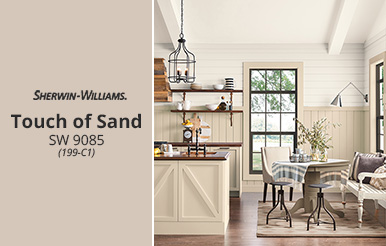
Color of the Month: Touch of Sand SW 9085
July's Color of the Month, Touch of Sand SW 9085 (199-C1), provides a refreshing neutral alternative to gray.
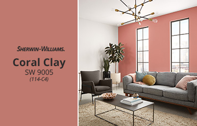
June's Color of the Month 2020
June's Color of the Month, Coral Clay SW 9005 (114-C4), embodies an individualistic spirit that can lean more energetic or more muted.

VIDEO: Go Behind the Scenes
See how Emerald Designer Edition came together ‐ from developing its ultra-white base to deciding which colors to include ‐ from Sue Wadden, Sherwin-Williams director of color marketing.
Find Your New Go-To Hues
Warm neutrals, cool neutrals, blues, greens and more: Get to know the collection's five distinctive palettes.
Why Design Is More Important Now Than Ever
From homes we cherish to healthcare facilities put to the test, our work matters. Director of Color Marketing Sue Wadden reflects on design during these times, including our commitment to provide tools, training and inspiration for your continued success.
Virtual Color and Design Events
Take part in virtual events and CEU sessions ‐ from the comfort of home ‐ and stay current on everything from our latest Colormix® Color Forecast to innovations in coatings for commercial spaces.
Introducing the Architect & Designer Support Center
This online resource center is dedicated to providing you with the most up-to-date information, including relevant industry news and valuable business insights to help you navigate these challenging circumstances.
Color Samples Just a Click Away
Order fan decks, catalogs and oversized color samples to help you stay on top of projects while working from home.
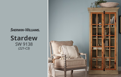
May's Color of the Month 2020
May's Color of the Month, Stardew SW 9138 (221-C3), conveys a sense of calm and effortless charm.
April's Color of the Month 2020
April's Color of the Month, Verde Marrón SW 9124 (209-C6), provides a rustic warmth perfect for creating an engaging, welcoming space.
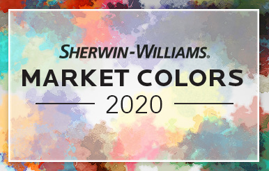
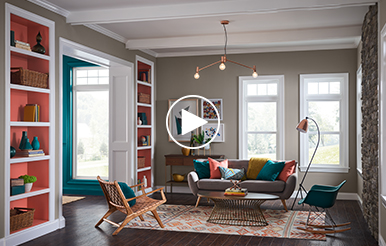
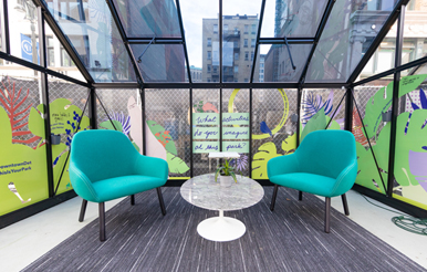
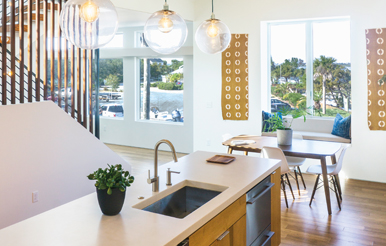
Tap Into 3 Hot Trends With Our 2020 Market Colors
The latest Sherwin-Williams Market Colors focus on different ways to nurture wellness and happiness.
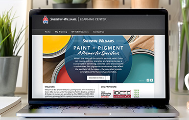
Paint Pigment: The Inside Story
Learn about the history, symbolism and pigments behind nine key colors — and how colors affect mood, perception and decision-making — in this new CEU.
March's Color of the Month 2020
Our March Color of the Month, Extra White SW 7006 (257-C1), is an eclectic, modern hue that provides the perfect foundation for a design mixing eras and styles.
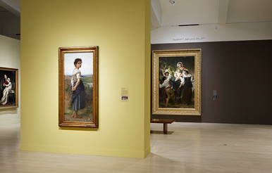
Creating the Perfect Backdrop for Art
Exhibition designers from four art museums share their secrets for choosing paint colors to make artwork shine.
Designers Work Wonders with Our 2020 Color of the Year
Naval plays a starring role in a trio of stunning projects, from a clubby restaurant to a refined farmhouse kitchen.
Continuing Ed: Designing a Healthy Home
Learn the latest on improving the quality of your clients' homes, including the use of breakthrough paint and coating technologies.
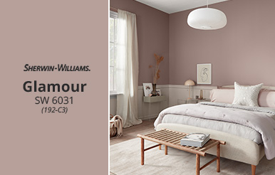
February's Color of the Month
February's Color of the Month, Glamour SW 6031 (192-C3), is a fresh neutral with a classic feel. Rooted in nature, it provides a softer, warmer alternative to gray.
Colorful Revival
Vibrant renovation enlivens historic hotel in Richmond, Virginia.
Trends in Commercial Color and Design
Tips on using the Colormix® Forecast 2020 palettes in the commercial market.
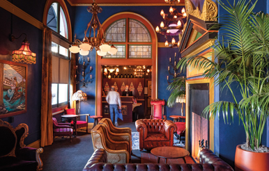
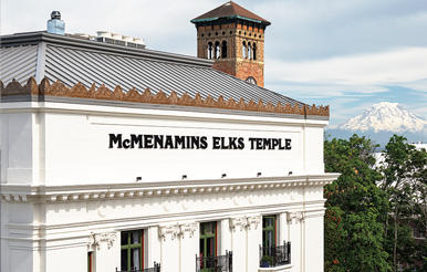
Take Two For a Century-Old Temple
Check out the dramatic reinvention of a former Elks Temple into a colorful hotel and entertainment destination.
The Student Design Challenge Is Back!
Attention, interior design students and educators: Our professional competition with top prizes of $2,500 is coming soon.
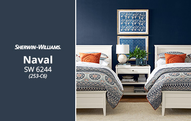
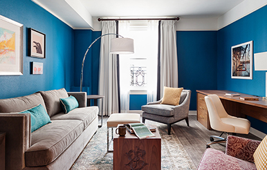
Color of the Month: Naval SW 6244
January's Color of the Month and our 2020 Color of the Year, Naval SW 6244 (253-C6), is a serene shade with a hint of opulence that works well with polished marble, gleaming metals, soft leather and sophisticated patterns.

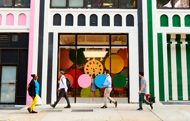
5 Colorful Destinations
Take a visual trip across the globe and get inspired by places that embrace color to the fullest.
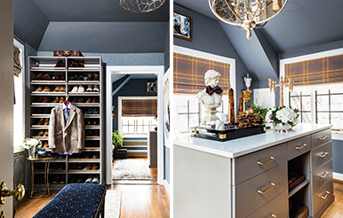
Dressed Up: Classy Closet Renovation in North Carolina
Peek inside a stylish closet and dressing space renovation in a long-neglected 1920s Tudor.
Tour the First-Ever West Elm Holiday House
See how a Sherwin-Williams palette fosters wellness and complements West Elm furnishings and holiday décor in this New York City condo.
December's Color of the Month
December's Color of the Month, Black Bean SW 6006 (252-C2), is a warm and rustic hue that offers visual depth and richness to spaces, helping it layer well with other colors.
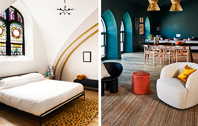
Divine Style: The Colorful Character of a Hip New Hotel
See how color helped transform a 1906 Gothic Revival church in Philadelphia into a boutique hotel.
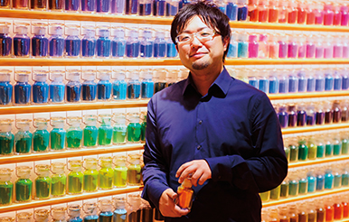
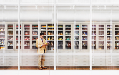
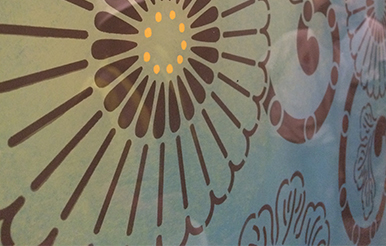
The Use of Pigments in Japan: A Culture of Brilliant Color
Get a closer look at how pigment influences Japanese culture through the eyes of this museum-style shop's knowledgeable director.
Our Latest CEU: Paint Pigment
Learn about color history, color's effect on mood and how to ensure the coatings you choose are the right ones for the job in this fun course.
November's Color of the Month
Cozy up to November's Color of the Month, Caramelized SW 9186 (291-C4). It's a warm, youthful hue that's perfect for creating a comfy nook in an urban setting.
A Mid-Century Modern Home With a Flair for Drama
See how interior designer Marc Thee took his signature luxe look to new heights in his own home and ended up using our 2020 Color of the Year inside and out.
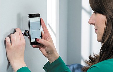
It's a Match!
ColorSnap® Match provides advanced color-scanning technology in a hand-held tool, allowing you to match paint color, furniture, textiles and more. It's a must-have for any designer's work kit.
October's Color of the Month
Dard Hunter Green SW 0041 is a lush hue with a refined quality that takes its cue from conservatories and greenhouses. Use it in kitchens and living rooms to bring the richness of nature indoors.
Say Hello to Self-Cleaning Coating
Thrill your clients by specifying Loxon® Self-Cleaning Acrylic Coating. It's formulated to be self-cleaning for exterior masonry and concrete.
NEW! Finest Whites Collection and Color Card
Evoke a quiet mood or strike a lively one with our Finest Whites collection. Choose from an array of cool and warm whites to find the perfect match for any project.
Instagram Feeds to Follow Now
We're always on the lookout for color inspiration. These color and design influencers have social feeds you just don't want to miss.
September's Color of the Month
Get inspired with Shiitake SW 9173.
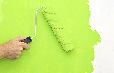
Elevated Designs Begin with the Best Paint
Lay the foundation for refined design by using the right paint for your project.
Colormix® Forecast 2020
Design pros share how they're inspired by the five new palettes.
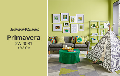
August's Color of the Month
Get Inspired with Primavera SW 9031.

Color and Design Trends From ICFF 2019
Sue Wadden shares key insights on design trends at ICFF in New York.

Get Tickled About Pink
Put on your rose-colored glasses and rethink pink.
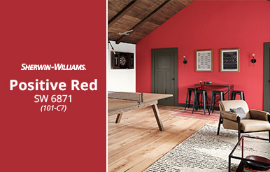
July's Color of the Month 2019
Get Inspired with Positive Red SW 6871.

How to Specify for LEED v4.1
Three ways to earn points for a LEED sustainable building.
How Play Can Inspire Paint Color Selection
Making a place for more play in your design process.
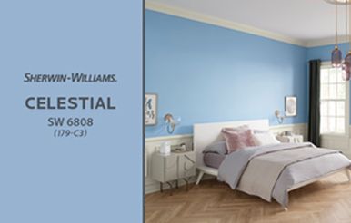
June's Color of the Month 2019
Get Inspired with Celestial SW 6808.

The State of Paint: Formulations and Performance
Improving your specifications by better understanding paint composition.
Specification Tips for Challenging Substrates
New paint formulations allow architects and commercial designers to meet green-building guidelines without sacrificing performance.
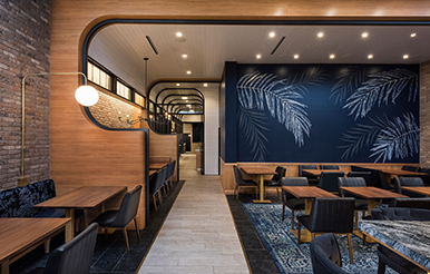
What's New in Restaurant Paint Color Palettes and Design?
Delicious insights about dining design from commercial designers across the country.
May's Color of the Month 2019
Get inspired with Delightful SW 6289.

How Do You Get Out of a Color Rut?
Get great tips for avoiding color-palette burnout.
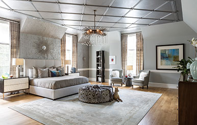
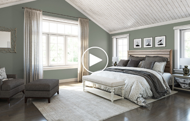
Painting a Bedroom to Look Like Polished Silver
Burnished metallics wrap a cavernous master bedroom into a warm, cozy embrace.
April's Color of the Month 2019
Get inspired with Blue Sky SW 0063.

Color Secrets Revealed
Author Kassia St. Clair dishes on the historical twists and turns that continue to shape our charged relationship to color.
March's Color of the Month 2019
Get Inspired with Distance.
Color on the Move
Discover how color rules are evolving in the industrial and home furnishing marketplaces with this lively discussion with Sue Wadden and team.

Color Fidelity
Learn about the three different types of color samples — digital, paper and "wet" — so you know which to use in different scenarios.
February's Color of the Month 2019
Fall in love with Eros Pink, February's Color of the Month. With its deep rose hues, this pink lends an air of happiness and a pop of colorful power to featured walls and furniture finishings.
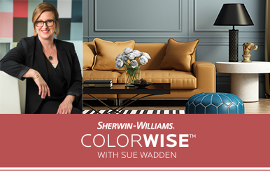
ColorWise™ With Sue Wadden: Maximalist Color
From colorful fanny packs and outrageous dad sneakers on the runway to animal prints and bold colors in interiors, the maximalist aesthetic has become big business.

Head of Its Class: An Award-Winning School Design
This colorful educational facility was designed from the ground up to provide a fresh start for an entire school district in Pennsylvania.
New! 2019 Market Segment Color Collections
From hospitality to multi-family, Sherwin-Williams 2019 market segment color collections provide plenty of project inspiration for any industry.
December's Color of the Month 2018
Whether your client is going for a mid-century or more contemporary look, Functional Gray acts as the perfect pairing for saturated pops of color in any space.
Color Strategies for a Successful Coworking Space
Increasingly popular coworking spaces foster productivity and collaboration for businesses and entrepreneurs. STIR® got the scoop from designers on what makes these spaces special and how to apply color strategies from them to any project.
Vision in White: A Residential Spotlight
Architect Rory Reynolds's LEED Platinum "The Live Oak House" in St. Augustine, Florida, stars Mother Nature.
November's Color of the Month 2018
Bring Bohemian style to life with the eclectic flair of Rojo Dust, the November Color of the Month.
Color Factory NYC: A Dream Museum for Exploring Color
From baby-blue ball pits to a rosy-hued dance floor, the Color Factory NYC offers immersive color experiences.

New! Healthcare Color Collection
Explore three new healthcare palettes designed to bring the latest color trends to your projects.
October's Color of the Month 2018
Traditional and cozy — the October Color of the Month will provide timeless style for any client space. Get design ideas and pairings now.
2019 Color of the Year: Cavern Clay SW 7701
Forged by sun. Fired by desert. Introducing Cavern Clay SW 7701, the 2019 Sherwin-Williams Color of the Year.
Colormix®: Our Favorite Ways to Use the Color Forecast Palettes
We asked savvy design pros how they plan to use the Colormix Forecast 2019 palettes. Here are some of their best ideas — plus tips from our own Sue Wadden and her color team.
Razzle Dazzle Camouflage Design
What was once the mainstay of paint design on World War I warships has transformed into an interior design trend that can add a punch of bold, modern elements to your next client project.
August's Color of the Month 2018
This soft blush color will add a cozy yet sophisticated vibe to your next client project. Get design ideas and palette pairings now.
Playing With Fire: Shou Sugi Ban
Expand your palette with this Japanese technique of charring wood surfaces.

Student Design Challenge: Meet the Winners
Meet the super talented winners of our 2018 Student Design Challenge — their renderings push the definition of excellence.
July's Color of the Month 2018
Summer vibes are in full swing with July's Color of the Month — get pairings and design ideas for this timeless, bold blue.
Watch: Designing with Saturated Trim
See how designer Tiffany Hanken gave a kitchen a distinctive pop of color with bold, saturated cabinets made possible with new Emerald.
June's Color of the Month 2018
Add organic vibes to your next design with Arugula, June’s Color of the Month. This earthy tone will bring a fresh mood to any space.
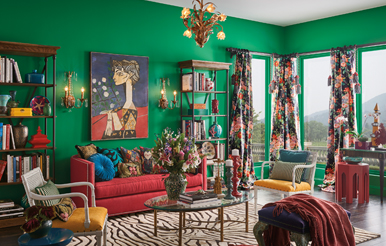
Maximalist Design and Color
"Big, bold and beautiful" could be the catchphrase of maximalist design — a movement that doesn't shy away from busy prints and contrasting patterns. Pull off this "big" design with these paint palettes and design considerations.
Get Involved and Give Back: National Painting Week
Meet the designer panel giving back by transforming rooms, homes and entire communities across the country — and learn how you can get involved by starting your own project, too!
May's Color of the Month 2018
There’s no holding back with Exuberant Pink, May’s playful Color of the Month. Add this energetic hue to your next design with these inspirations.
High-Gloss Design, High-Impact Results
We asked savvy design pros how they use high-gloss finishes, and here are some of their best ideas — plus product tips to pull off this lacquered effect.
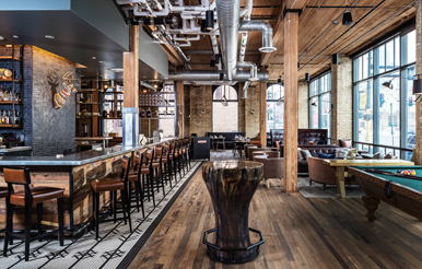
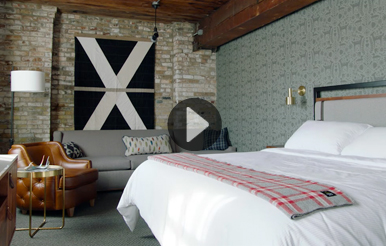
Local Color: A Boutique Hotel Design
A smart color palette was key to turning this century-old Minneapolis warehouse into a neighborhood-friendly boutique hotel.
April's Color of the Month 2018
Don't be afraid to go dark — Black Magic transforms ordinary rooms into extraordinary settings. Discover clever ways to use this bold hue now.

Color and Design Trends: 2018 Maison & Objet
Sue Wadden shares her observations from Maison & Objet — and provides insight into what's to come in color and design.
Cabinet of Curiosities
Harvard Art Museums scientist Narayan Khandekar collects pigments and protects color's role in our artistic heritage.
March's Color of the Month 2018
This rich hue has a timeless, regal feel, and it pairs perfectly with warm or cool neutrals — explore the March Color of the Month's possibilities now.
The Allure of "In-Between" Colors
How designing with colors that resist definition will add a new depth of intrigue to any project.
Meet the Judges of the 2018 SDC
Nancy Fire and Vanessa Deleon are this year's fabulous judges. They tell us what makes their design minds tick.
February's Color of the Month 2018
This grayish green will be your new go-to for any space — explore the February Color of the Month now.
Color Under Foot: New Design Possibilities with Concrete
How colorful stains, dyes, marbling and effects can help you do more with exposed concrete flooring.

Shine On, Shine Off: Gloss and Sheen
Your guide to gloss and sheen — and the outcomes different finishes deliver when all is done and dry.
January's Color of the Month 2018
Discover how designing with Oceanside can add a new depth of intrigue to any space.
Matte Moment: Designing with Dusty Finishes
How to achieve a highly crafted look with chalky, matte finishes.
Washed Ashore: Beach Cottage Gone Modern
How a designer incorporated her client's beachcombing inspirations into her seaside home.
Watch: Trend Forecast for Hospitality Design
From deep, dark jewel tones to geo-specific palettes, see what's happening in hospitality design.
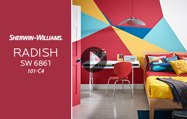
December’s Color of the Month 2017
Add a pop of bold to any room this winter with Radish SW 6861 (101-C4), the December Color of the Month.
Design with a New Neutral: Millennial Pink
Don’t be fooled by its name — millennial pink is a color that crosses age, gender and application boundaries.
New! West Elm Fall/Winter 2017 Palette
Whether a client wants a perfect neutral, refreshed trim or a bold accent wall, the new West Elm paint palette has a hue for your next project.
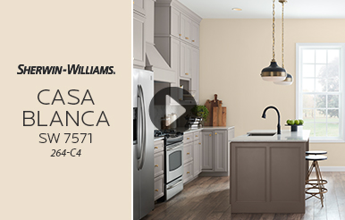
November’s Color of the Month
Envelop rooms and offer respite with muted-yet-warm Casa Blanca SW 7571 (264-C4), the November Color of the Month.
“Verde”: The Lost Color Forecast Palette
Why promising color forecast colors got left behind this year — and why it’s still worth considering them for your designs.
How Color is Redefining Boutique Hotels
The designers of the Hewing Hotel in Minneapolis transform an old warehouse into a hotel that pushes the boundaries of boutique design.
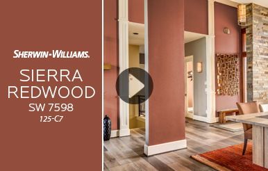
October’s Color of the Month
Get a taste of the West Coast with earthy, inviting Sierra Redwood SW 7598 (125-C7), October Color of the Month.
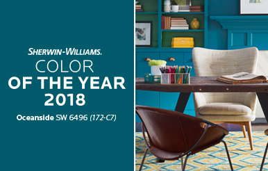
Oceanside: The 2018 Color of The Year
It’s a blue unlike any other — Oceanside SW 6496 (172-C7) offers all the intrigue of blue, but with added depth. Imagine the possibilities.
Minimalist Design Minus the White
Forget “white cube” rooms — color experts share how to use color and bold elements in minimalist designs for residential and commercial spaces.
Watch: Trend Forecast for Healthcare Design
From citrus tones to soft pastels, discover the latest trends in healthcare design.
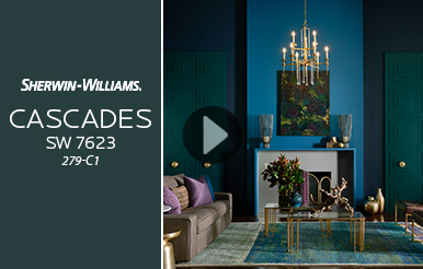
September's Color of the Month
Craving more luxury? Then explore bold, rich Cascades SW 7623 (279-C1), September Color of the Month.

How We Create the Sherwin-Williams Color Forecast
Inside the Sherwin-Williams color forecasting process, including how the forecast was narrowed down to three palettes for 2018.

Behind the Scenes of Colormix® Forecast 2018
Meet our Colormix® Forecast team and get an exclusive peek inside their annual color forecast exploration meeting.
How to Deliver True Color to Your Clients
Simple tips to help you improve your understanding of color performance in the paint — ultimately allowing you to deliver more accurate, consistent hues to your clients' projects.
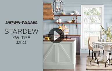
August's Color of the Month
Go coastal with cool, fresh and calming, Stardew SW 9138 (221-C3), the August Color of the Month.

The Surprising Relationship Between Spices and Paint Color
Spices and paint color - pigment - have an ancient, shared history. Understanding this relationship can help you make more inspired design decisions.

Trending Colors In the New Residential Market
Karrie Hodge, Sherwin-Williams Senior Designer, reveals some color trends in the new residential market.
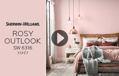
July's Color of the Month
Rosy Outlook SW 6316 and other subdued shades of red continue to be favored as both a main and accent color for this upcoming season.
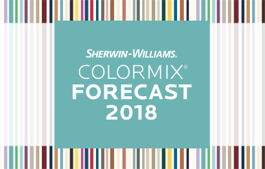
The 2018 Colormix® Color Forecast
Explore our three new palettes: Sincerity, Unity, Connectivity. And discover the drivers influencing future color and design trends, while finding new inspiration for your designs.

Microbicidal Paint: Coatings Technology at Work
How Boston University used Sherwin-Williams Paint Shield® Microbicidal Paint to bring modern technology into the renovation of a historic institution.
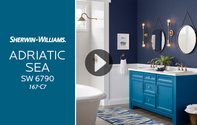
June's Color of the Month 2017
This jewel-inspired blue with artisanal, rustic tones translates into finishes with a tactile, crafted feel. Explore Adriatic Sea, the June Color of the Month.
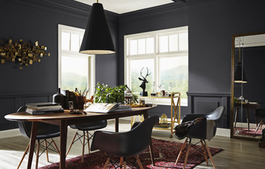
Matte Black Is the New Black
New paint technology is allowing designers to use matte black in ways they never have before.
Sue Wadden: 4 Ways to Work Color Into Kitchen Design
Your clients are afraid of kitchen color, you say? Have no fear – these ideas will help you get cooking together.
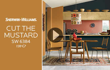
May's Color of the Month 2017
With a little bit of gold and a little bit of bronze, our May Color of the Month, Cut the Mustard, can add just the right spice to your design.
Creative Ways to Use Our Color Samples
We asked savvy design pros for the most inventive ways they use Sherwin-Williams color samples in their design process — here are some of the best ideas.
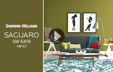
April's Color of the Month 2017
Experience desert vibes with Saguaro, the subdued yet livable color of the month.
Paint Color Selection Tips for Neon Tube Lighting
Sue Wadden and other design experts offer illuminating advice for pairing paint colors with this retro light form.
Designing for the White House Historical Association
Meet a former Student Design Challenge winner who is now a curator for the White House Historical Association.
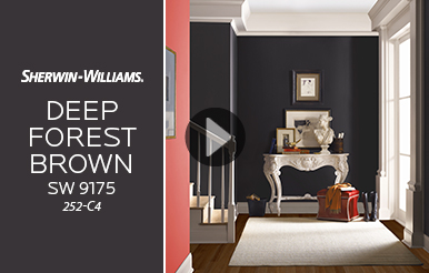
March's Color of the Month 2017
A color rooted in nature's palette — see how Deep Forest Brown takes shape on walls.
Understanding Undertones to Choose the Right Color
Sue Wadden shares her expert advice on managing undertones to create perfect color palettes.
New Design Tools to Meet Green Guidelines
These new and enhanced tools help you meet green guidelines in sustainability and healthy-home-focused projects.
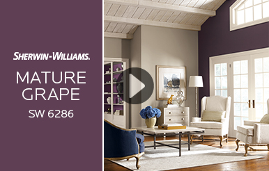
February’s Color of the Month
Whether spring, summer, fall or winter, there is no denying the luscious temptation of deep, berry hues — explore Mature Grape, February's Color of the Month.
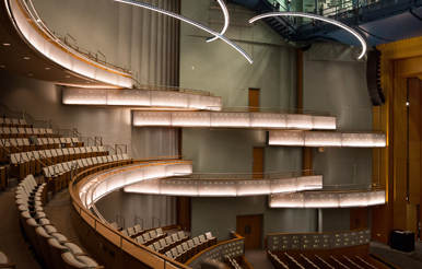
Rebuilt and Reborn: Iowa's Hancher Auditorium Rises Again
After a devastating flood, Sherwin-Williams paint helps re-create a renowned cultural hub.

Prima Pâtissière
Maggie Austin creates colorful cakes for royalty and Hollywood stars. Learn how she constructs her delicate artworks before they fall to the fork.
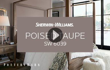
January’s Color of the Month
Watch how Poised Taupe, Sherwin Williams 2017 Color of the Year, turns cold spaces into cozy sanctuaries.

Color and Textiles: Exploring the Link Between Fabric and Hue
Internationally renowned textile designer Lori Weitzner offers an immersive, engaging journey in the world of color as it applies to design, mood and culture in her new book.
Liveable Luxe: A Kitchen Designed for Living
Don’t let its elegant palette fool you — the kitchen in this newly constructed Williamsburg, Virginia, Colonial is designed to be lived in.

December’s Color of the Month
Get inspired with December's Color of the Month, Silverplate (SW 7649).
San Francisco Red
What is it about red and San Francisco? Its iconic status for the city starts with the International Orange of the Golden Gate Bridge — which was the inspiration for the remarkable revival of this seedy San Francisco movie palace.
New and Improved Design Tools Integration
We’re making it even easier to integrate coatings and colors into your design tools, including a new Sherwin-Williams and BIMSmith® partnership.

November’s Color of the Month
Get inspired with November's Color of the Month, Double Latte (SW 9108).
Color for the Deaf: Design With Wayfinding in Mind
DeafSpace design leverages the power of color to make interiors easier to navigate, safer and more welcoming to their inhabitants.

Don't Make Color Decisions at Sunset
Color perception changes throughout the day. Here's what you need to know about the sun's changing influence.
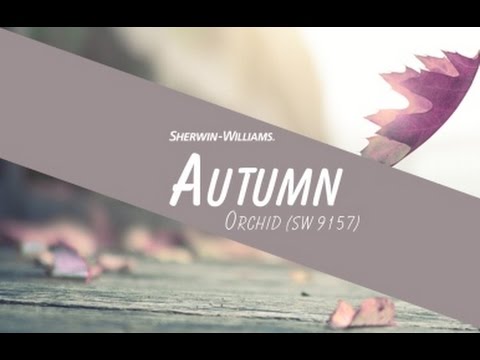
October's Color of the Month
Get inspired with October's Color of the Month, Autumn Orchid (SW 9157).

September's Color of the Month
Get inspired with September's Color of the Month, Ravishing Coral (SW 6612).
Sherwin-Williams 2017 Color of the Year: Poised Taupe
A beautiful balance of warm and cool, Poised Taupe (SW 6039), the Sherwin-Williams 2017 Color of the Year, is set to be your new go-to neutral. Explore complementary palettes and get inspired now.
Designing With Flat Paint Finishes
New technology allows for flat-finish paints that offer washable performance plus the sophisticated elegance of a shine-free finish.

Lights, Camera, Color with Wes Anderson's Colorist
The Grand Budapest Hotel won three Oscars for visual excellence. Jill Bogdanowicz made sure color expressed itself fully in every frame.
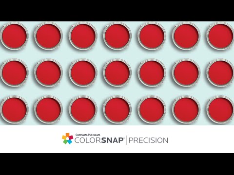
Get Gallon-to-Gallon Color Consistency
Learn more about our advanced ColorSnap® Precision technology.

Iridescence: Design With Shimmering Science
Iridescence exists everywhere in nature. Learn the science behind this structural color and ideas on how to incorporate it into design.

August’s Color of the Month
Get inspired with August’s Color of the Month, Surfin’ SW 9048

Designer John Gidding on Finding Color Inspiration
STIR® sits down with Curb Appeal’s John Gidding for a look into what drives his designs and color choices.

The History of Colors in Sports
Gain inspiration from the use of color throughout history in sports.
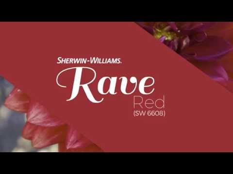
July’s Color of the Month
Get inspired with July’s Color of the Month, Rave Red SW 6608

Do You See What I See?
We may not agree on color, but it turns out our brains are seeing the same thing. Scientists are trying to unravel why.
2017 Color Forecast
The state of color has never been more restless. Our 2017 colormix™ forecast reveals new spirituality, cultural flux, feisty self-expression and soulful nostalgia combining to paint an emerging portrait of our shared future.

June’s Color of the Month
Get inspired with June’s Color of the Month, Limón Fresco SW 9030
Indigo, the World’s First Favorite Color
Equal parts exotic and familiar, indigo is a rich, worldly blue with an appeal that stretches back through centuries. Here’s a (re)introduction, plus tips from Sue Wadden on how to use indigo in any room.

May’s Color of the Month
Get inspired with May’s Color of the Month, Caviar SW 6990

Meet Sue Wadden: New Director of Color Marketing
STIR® sits down with Sue Wadden, the new director of color marketing at Sherwin-Williams, to find out what excites her most about her new job, design and, of course, her favorite Sherwin-Williams color.

March's Color of the Month
Get inspired with March's Color of the Month, Parisian Patina SW 9041.
Jackie's Notebook: 2016 Color of the Year – Alabaster (SW 7008).
Jackie's Notebook: 2016 Color of the Year – Alabaster (SW 7008).

Translating Color Ideas From Paper to Wall
Anna and Nathan Bond talk color, design, and how they’ve built a booming stationery and lifestyle brand with Rifle Paper Co.

When Color Meets Flea Market Finds
A designer’s most personal project yet comes to life when she combines the thrill of the flea market hunt with bold paint color.

Behind the Scenes of 2016 Colormix™ Color Forecast
Go behind the scenes with Sherwin-Williams Director of Color Marketing, Jackie Jordan, for an all-access look at the inspiration and influences behind our 2016 Colormix™ Color Forecast.
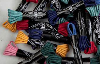
Colored Shoelaces: Dressing Up Modern Menswear
From real estate to fashion: How a broken shoelace launched a young entrepreneur into a boldly colorful new business.

How to Differentiate Between Gloss and Sheen
Get all the angles on gloss and sheen in paint – and how both can affect everything from color to finish selection.

Jackie Jordan on the Latest in Rose Gold Finishes
Move over, yellow gold and brass – the latest look in metallic finishes is pretty in pink.

Transforming Chalk Art Into a Commercial Design Business
Partners and parents Max and Johnna Holmgren are taking chalk beyond the playground, creating stylish artwork for corporations, events and well-dressed walls everywhere.
Achieving Sustainability and Luxury in a Multi-Family Project
How one designer used Emerald® Interior Acrylic Latex and color to help create a LEED-certified and gorgeous apartment complex.
2016 Color Forecast
Come explore the Sherwin-Williams 2016 colormix™ color forecast! This year's hues celebrate indulging in the moment with the best of everything life has to offer.

Southern Exposure
Textile and fashion designer Natalie Chanin's color palette comes from the ground up in her sustainable clothing line

Unearthing a Mystery
Archaeologists explore China's Terra-Cotta Warriors — and their surprising color story.

Why Are Only Certain Animals Blue?
Most animals can't produce blue pigment, yet it's common among butterflies and birds. We uncover the science behind this phenomenon.
Survey Results: How Designers Collaborate With Painting Contractors
To help celebrate Sherwin-Williams National Painting Week, we surveyed design pros to learn the most effective ways to work with painting contractors.
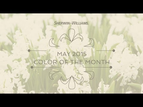
May's Color of the Month
May 2015 Color of the Month - SW 0046 White Hyacinth
Color by the Pixel
How a Chicago digital textile design studio is creating new ways for designers to work with color.
Old World, New Twist
Designers share their favorite ways to put a fresh, modern spin on traditional-style interiors.
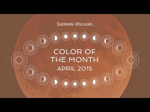
April's Color of the Month
April 2015 Color of the Month - SW 0007 Decorous Amber
Paint It Black
Dramatic and glamorous, noir-inspired hues find a home in residential projects.

From Cave Wall to Canvas
Author reveals the history and mystery behind paint colors in art.

Steampunk Power
Designer Bruce Rosenbaum puts a modern spin on Victoriana, reinventing gadgets and antiques into unique statements.
2015 Color of the Year
Jackie's Notebook: 2015 Color of the Year — Coral Reef (SW 6606)

Turning Back Time
Renovation devotee Nicole Curtis restores timeworn homes to their former glory.
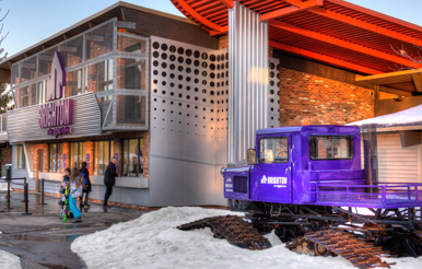
Rebooting a Ski Resort
Michigan's Mt. Brighton gets a lift, with vibrant color.

Print Issue Archive
Explore STIR® Back Issues

Inspiration
Unique styles and techniques, project profiles, color forecast, videos and more.
Education
The latest information on paint and color technology. Plus links to design blogs and industry resources.


