Close

Internationally renowned textile designer Lori Weitzner offers an immersive, engaging journey in the world of color as it applies to design, mood and culture in her new book.
by Amanda Lecky

In her gorgeously illustrated new book, Ode to Color, renowned textile designer Lori Weitzner, whose work is in the permanent collections of museums worldwide, takes a look at what she calls “the guiding force” behind her career: color. STIR® sat down with Weitzner to find out how and where the design pro finds her inspiration and what’s coming in color trends.
STIR: How did you decide to write about color instead of textile design?LW: To me, color is the most important aspect in design. It can be the most powerful element, having the ability to evoke all the senses. Color — and how we use it — can completely transform a space, thus affecting everything we do and feel.
STIR: Why did you organize Ode to Color by color “worlds”?LW: This is how I see color. I never just see one color; it is always in a family of colors that in some way relate to each other. It is similar to composing a song ... to make it really come to life and sound beautiful, you need to introduce chords to the piece — just one note at a time being played will not resonate quite the same. I often use at least three different shades of a color when painting one room!
STIR: You’ve lived and worked in New York, Zurich and Milan, and traveled extensively. Have other cultures informed your color outlook?LW: Absolutely. Every country I have visited has, in one way or another, inspired my worlds of color —from the nature to the people to the art to the food. Even non-visuals like music have served as inspiration for my color palates. Japan, India, The Philippines, Thailand, France, Italy and Australia are just a few of the places that have made deep imprints for me.
STIR: Have you noticed any particularly strong or new color trends emerging?LW: I feel that the newest trend is for people to find their own personal color worlds. That is part of the reason for writing my book. Empowering and also providing people with the tools to figure out for themselves what they are most attracted to — what they would like to use in their home or work space.
Having said the above, there are always new “movements” in color, the main one now being the move to warmer neutrals (like Sherwin-Williams 2017 Color of the Year Poised Taupe). People are a bit tired of gray and want more warmth in their interiors. And black is too harsh at the moment: coals and truffles are a much better choice now for drama. In my book I call these “Night Shadow” colors.
STIR: Do you have any practical tips for choosing colors to go with textiles?LW: I would say that one should never try and “match” exactly. That never quite works. And when selecting colors for the walls to coordinate with fabrics, I would lay the textile on the table, but always hang the color samples vertically. They need to be viewed on different planes.
STIR: What colors do you gravitate to in your own home? And which colors do you tend to wear the most?LW: I gravitate toward light neutrals in the large areas in my home (walls, sofas, beds) with strong accents in accessories and art. My neutrals tend toward green but with warmth. My floors are smoky gray and the walls are various shades of white and linen-like colors. I will never get tired of these lovely nuanced neutral backdrops, but can always add a throw or decorative pillows for drama in stronger color. As for what I wear, I prefer black (boring but I live an urban existence). However, I also enjoy deep autumn tones because they work best with my skin and hair. What colors we wear and what colors we live in actually should have nothing to do with each other. They are for very different purposes.
STIR: What’s your least favorite color?LW: Hot pink. It hurts my teeth!
STIR: What are your favorite Sherwin-Williams colors?LW: I selected one color to go with eight of the color worlds I talk about in Ode to Color:
Waterside
Whisper
Garden Party
Out Loud
Fragrant Woods
At Ease
Earthly
Night Shadows
The blues of water and sky have long been favorite colors in art and design, notes Weitzner in Ode to Color, but were rarely used until the trade routes allowed the transport of Lapis Lazuli in the Middle Ages. When synthetic blue pigments became available in the eighteenth century, the color’s popularity soared.

Whisper
Subtle variations of white, such as those Weitzner has found everywhere from the modern sculpture of Louise Nevelson to the inside of a seashell make up the Whisper family. When choosing textiles for a room with a layered white palette, remember that adding texture is essential to creating richness and interest. “Combine textiles such as chenille, velvet, dupioni silk, and taffeta silk with marble, wood, and ceramic finishes in the same room, as the juxtapositions between these materials will make the look come alive,” Weitzner writes.

Garden Party
A spirited mix of Easter egg pastels make up this color family. Weitzner took inspiration from a wide range of sources: the colors of macarons at a French salon and fresh spring greens, among them. If using these colors to decorate, take care, Weitzner advises. “When working with large surfaces, like rugs, walls, or sofas, pick two colors, either warm or cool, but not one of each, from the Garden Party palette. In other words, from the same side of the color wheel. Celery green and powder blue work together, for example, as do coral and apricot. Multicolored prints and patterns featuring the spectrum of Garden Party colors can be added against this backdrop in smaller applications, such as pillows and bedding.”

Out Loud
Think of the bold color palette of the artist Sonia Delaunay or a box of Crayola crayons and you have the Out Loud family, populated by colors like magenta, cyan, violet and orange. These energizing colors can work best as accents or in small spaces like hallways and powder rooms, Weitzner notes. “Walls, large pieces of furniture, area rugs, and tables are ideal vehicles for maximizing the impact of these colors. Furnishings with clean simple lines are better suited to these intense hues than more decorative or fussy silhouettes. And if you choose to include some white as a palette cleanser, select crisp whites, not creamy ones, to avoid muddying the palette.”

Fragrant Woods
The mossy greens and bark browns of the English countryside come alive in the Fragrant Woods family, and Weitzner finds these hues in unexpected places, from Japanese Katagami stencils to antique maps to reclaimed wood. “One of the most dramatic and sustainable ways to add character and depth to a home is through the use of salvaged wood,” she writes. “The colors of these woods range from lighter ash to the deepest umber and can work in any home. The more interesting the grain and knot, the larger plank size should be used.”

At Ease
“In my textile and wallcovering business, the best-selling colors, regardless of pattern, texture, or application, are always neutrals,” Weitzner writes. So it’s no surprise that tones like ecru, café au lait, taupe and straw make up the At Ease family. “All-neutral rooms are elegant in their understatement and an excellent way to accentuate the texture of fabric. The quieter the neutral, the more pronounced the texture will be, so choose light neutral fabrics with weaves that add interest.”

Earthly
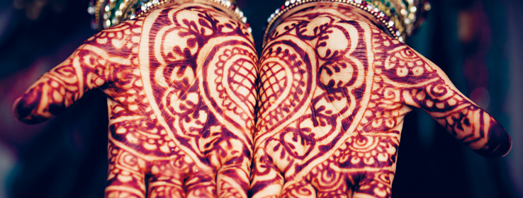
The “rapturously beautiful” colors of India — sienna, madder, terra-cotta, purple, burnt umber — come together for Weitzner to create this warm and spicy color world. At home, she suggests incorporating these through the natural materials in which these colors are already present, like brick or stone. And, she writes, “Earthly colors are adept at creating a cozy, intimate, and contained atmosphere. Sienna velvet upholstery, cochineal-colored fabric, burnt-orange chenille throws, and sorrel accessories are just some of the ways this palette can create that sense of intimacy.”

Night Shadows
Deep, dusky and sensuous and populated by shades like slate, mahogany, ebony and espresso, this palette grew out of Weitzner’s fascination with the deep tones of the urban world: concrete and stone cityscapes and the grays of men’s flannel suiting, a fabric that can move into interiors. “Use it as a wallcovering for a library or den to add intimacy. Mix it with finishes that are shiny and modern to keep it fresh. Bringing in materials like tortoiseshell, bone, or horn in accessories and sculpture complements the menswear sensibility,” she advises.

Ode to Color by Lori Weitzner (Harper Design; December 6, 2016; $50.00 hardcover)


