Close

We may not agree on color, but it turns out our brains are seeing the same thing. Scientists are trying to unravel why.
By Alyssa Ford
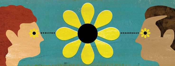
I say it’s “coral,” you say it’s “clay.” You say “mahogany,” I say “maroon.” And we’ll never agree on the Internet’s blue/black (or is it white/gold?) dress that went viral earlier this year. Even philosopher John Locke wrote, “Two people, looking upon a rainbow at the same time, do not see exactly the same rainbow.”
A growing crop of color perception experts are trying to understand where these individual differences come from. “It’s still one of the big mysteries in our field,” says Mike Webster, Ph.D., director of the visual perception lab at the University of Nevada, Reno. “People can report the same color even when their eyes filter the light in very different ways.”
A watershed study was conducted by researchers at the University of California, Berkeley, who tested subjects belonging to more than 100 different ethnic and tribal groups from the likes of Ghana, Australia and Peru. They asked subjects to label 330 colors using their own words. While subjects did label some colors differently, researchers were stunned that most subjects described colors in similar ways. This argued against the prevailing theories at the time, which claimed that language shapes how we see.
More recent studies have shown that observers who differ physiologically might still see color in similar ways. For example, researchers at the University of Rochester in New York showed that subjects chose a very similar wavelength for pure yellow even though their eyes’ color receptors differed physiologically.
Results like these suggest that human color perception is adapted to our environment. Exposed to the same colors, we tend to see colors in similar ways. Webster himself has studied whether people who grow up in tan-and-beige desert climates perceive color differently than those raised in vibrantly hued tropical climates. The working theory, he says, is that the brain has mechanisms for white-balancing, much like a camera, so that what looks white is just the average color to which we are exposed. This can allow people with very different eyes to see colors in similar ways, but can also lead people in very different environments to perceive colors differently.
“For example, we think of Mars as the ‘red planet,’” Webster says, “but if you were to grow up on Mars it would probably look gray.”
Mind’s Eye
Many factors can affect how we see color. Here are three special cases of which color professionals should be aware.
Older Clients: The lens of the human eye becomes progressively more yellow as we age. By the time many people reach age 70, they see the world through a lens roughly the color of ginger ale.
Tip: The yellow filter affects older peoples’ ability to distinguish between blues and purples the most. Use rich, saturated colors and lots of lighting.
Northern Climate Clients: In some northern climates in North America, full-spectrum daylight is filtered in such a way that the red and orange end of the spectrum is somewhat blocked while the blue end passes unhindered. Without careful consideration, this blue-heavy light can make some paint colors appear greenish.
Tip: When British designer Kevin McCloud is working in the UK, Netherlands and northern parts of North America, he opts for complex tinted palettes and paints tinted with yellow and red ochres, raw umber and iron oxide. “ The clay pigments bring out more of the red-orange spectrum and counter the overabundance of blue,” McCloud writes in his book Choosing Colors (Watson-Guptill, 2007).
Clients with Color Vision Disorders: Eight percent of Caucasian men have some degree of red-green colorblindness, where orange, red and green typically appear gold, and colors such as violet, lavender, purple and blue are virtually indistinguishable from each other.
Tip: Ask Caucasian male clients to take a quick color perception test such as the online Ishihara test. If your client does have a mild deficiency, avoid reds and greens. Online tools can filter images to show which colors would be difficult to distinguish by someone with a color deficiency.
This article originally ran in the 2015 STIR Print Annual issue.


