Close

Making a place for more play in your design process.
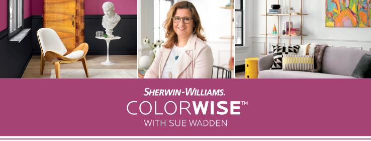
By Sue Wadden
Who likes to get a little playful with color? I sure do.
As the Sherwin-Williams Color Team dug into research for our 2020 Colormix® palettes, we were struck by the ways playfulness has been pushing color forward. You can see it in the way color is fueling everything from sneaker culture to co-working space design. Childlike wonder, openness, humor, escapism: These are just some of the ways in which playful color can inspire and affect us.
The buoyant colors our Color Team chose for our “Play” palette really pack a lot of joy. We started with a base of pure white then added surprising pops of bright hues. The resulting palette is an invitation to create spaces that capture the healthy, youthful energy of play.
Working with a residential client who’s hungry to express their unique personality? What better place to start than by exploring playful color with them? Playful color can also help that commercial client clamoring to get their brand noticed in a crowded marketplace.
Curious about how to encourage your clients to play with color more? Here are a few ideas from our team.
Adding Playful Color
Incorporating bright hues into a space can be done with playful pops of color, or it can be all-encompassing. Either method works well when the colors are anchored by neutrals. For example, you could specify Caviar SW 6990 (251-C2) for the trim, Pure White SW 7005 (255-C1) for the walls, and then Rock Candy SW 6231 (257-C6) for a ceiling or accent wall. Now you’re ready to incorporate additional bold colors with furnishings and accents.
Neutrals Aren’t Always Gray
You can introduce playful color into a space by using an unexpected color for your neutral. Instead of specifying white for trim or moldings, try Auric SW 6692 (136-C7) and use Pure White on the walls instead. This can create a playful frame for artwork and other accents.
It’s Not Just About Walls
Adding paint color to a room isn’t always about covering large, flat surfaces. With the many coatings available from Sherwin-Williams for furniture, you could cover a side table with Aquarium SW 6767 (164-C5) or an etagere in Juneberry SW 6573 (103-C6) to add some playful three-dimensionality to your spaces.
Think About Finishes
Another way to amp up playful color: high-gloss finishes. By challenging what’s traditionally done, you add a bit of cleverness and a whole lot of personality to your client’s space.
Want to explore more about playful colors? Check out these articles that give great insight into how to incorporate them into your designs:


