Close

See how other designers give spaces a bright look that’s beautiful all year long.
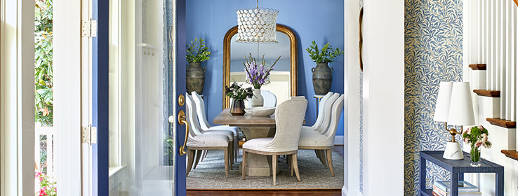
Some colors just feel like summertime. Take the palette of blues and whites in the dining room of a home in McLean, Virginia (above). It embodies the breezy quality of summer but easily transitions between seasons.
The look was a natural fit for designer Pamela Harvey’s clients. “I wanted to keep the space classic but with a modern twist to match the style and energy of the young family that lives here,” she says. Cosmos SW 6528 (178-C3) on the walls breathes fresh life into the traditional space. And rather than going with a white ceiling, Harvey chose a soft light blue — Starry Night SW 6540 (187-C1) — for a subtle layer of charm. Want more summer-inspired ideas? Here are five other spaces that take design cues from the airy colors of the season.
Something Blue
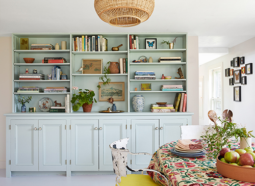
Color and quaint country charm fill the dining area of this cottage in Hudson Valley, New York, which serves as a getaway for the homeowner and her young daughter. “My goal was to make a very simple home as inviting, comfortable and versatile as possible,” designer Chiara de Rege says. “This room in particular is used for crafting, music, dining and as a library. A lot happens here!” Bookshelves painted Piedmont SW 9657 highlight vintage treasures, artwork and books, while walls painted Pale Pink SW 9696 and a rattan light fixture add to the overall playfulness of the space.
Photo by Christian Torres Photo
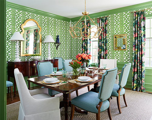
So Fresh and Green
For a fresh twist on a classically formal dining space in Warrenton, Virginia, the design team at Erika Bonnell Interiors was drawn to the color green. “We went for big, bold impact by painting all the trim and wainscoting a custom Sherwin-Williams green to match the wallpaper and contrast against the floral drapery fabric,” Erika Bonnell says. The combination of patterns and colors, paired with gold accents, results in a room that seamlessly blends with the home’s vibrant, preppy style.
Photo by Stacy Zarin Goldberg
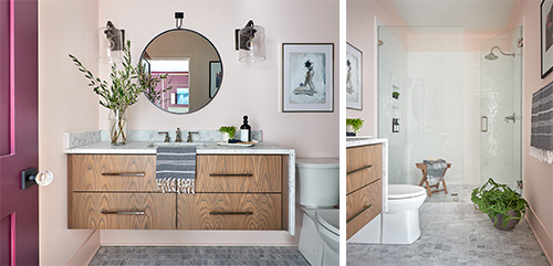
Modern Blush
As part of a 2020 showhouse at the Preserve at Narrow Passage in Davidson, North Carolina, designer Susan Hill used balanced proportions and repetition to keep the en-suite bathroom gender-neutral, despite the blush pink walls. “My goal was to create an elevated farmhouse aesthetic that felt relaxed and comfortable,” she says. “Painting the walls Faint Coral SW 6329 (268-C5) allowed me to juxtapose the rift-sawn white oak vanity, stained in ash gray, with the softer color.” A Carrara marble mosaic floor acted as a foundation for layering details such as sconces, a mirror and a door painted Blackberry SW 7577 (109-C7).
Photo by Dustin Peck
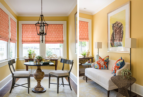
Let the Sunshine In
Natural light and the color palette of a beloved cat painting drove the design choices of this casual breakfast room in New Orleans’ Uptown neighborhood. Also on designer Susan Currie’s mind: embracing the light and coordinating with the existing colors in the home. “It all started with the paint color,” Currie says. “I wanted the breakfast room to blend with the warm orangey browns in the adjoining kitchen. Harvester SW 6373 (129-C2) was the perfect upbeat, cheerful color to tie the spaces together while also complementing the tones in the client’s favorite cat painting.” Trim painted Dover White SW 6385 (261-C2) grounds the yellow walls in a classic way. And although the space was originally designed as a breakfast nook, it easily transitions to a sitting area that overlooks the home’s backyard gardens.
Photo by Sara Essex Bradley


