Close

A palette largely inspired by the colors of the coast breathes new life into a renovated North Carolina home.
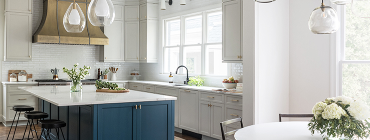
Interior designer Jennifer Felts doesn’t shy away from color. But she uses it strategically, something that comes to beautiful light in this recently renovated family home in Charlotte, North Carolina. Take the home’s kitchen, which Felts and the design team expanded into the former attached garage — freed up thanks to a new detached structure — and opened wide to the entry hall. Here, Felts used Agreeable Gray SW 7029 (243-C1) on perimeter cabinets. “It’s a nice, neutral base,” she says. Then, for the island, she chose Connor’s Lakefront SW 9060 (173-C7), a hue that pays homage to one of the homeowners’ coastal North Carolina roots. “It’s a large island, and although it brings a nice pop of color, it’s saturated enough so that it doesn’t feel bright or glaring,” she says. “It doesn’t overwhelm the space.”
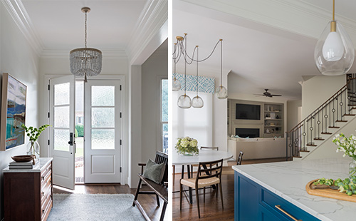
Greek Villa SW 7551 (254-C1) covers most of the home’s walls, including those in the entry hall (left), where a double door with Flemish glass replaced a single door with sidelights. That space now opens wide to the kitchen and living room (right).
But for cabinets in the adjacent mudroom, the striking blue of Connor’s Lakefront plays the starring role. “This space is inherently more casual, so the homeowners really liked the idea of having fun here,” Felts says.
That idea of balancing between moderation and making a bigger statement extends throughout the home. Built in the 1990s on an undeveloped lot within the historic district of Myers Park, the home blends in with a mix of mostly early-20th-century neighbors, including Tudor revivals and bungalows. “The house is in a classic, well-established neighborhood, so we were conscious of what we were doing — of really honoring the neighborhood,” Felts says. “So we tried to create a classic feel, but one that was clean and minimal for a big family with a lot going on.”
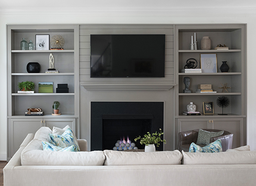
The living room’s previous built-ins — arched with faux columns — gave way to a more minimalistic design painted Mega Greige SW 7031 (243-C3). Interior designer Jennifer Felts specified shiplap above the fireplace. A nod to North Carolina beach homes, the material is also used above the home’s outdoor fireplace.
To that end, she chose Cashmere® Interior Acrylic Latex Paint in a classic Greek Villa SW 7551 (254-C1) for most of the home’s walls, with contrasting colors on the cabinets for character. In the laundry room, for example, the cabinets feature Agreeable Gray, the same hue used in the kitchen’s perimeter cabinets. For the living room’s fireplace surround and built-in shelves, it’s Mega Greige SW 7031 (243-C3). And in the butler’s pantry, it’s Iron Ore SW 7069 (251-C7). “For the butler’s pantry in particular, we went dark and dramatic,” Felts says. “The homeowners wanted it to be a little bit more of a sophisticated moment because it’s what they use when they’re entertaining.”
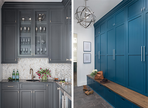
The butler’s pantry (left) makes an elegant statement for entertaining, with cabinets painted Iron Ore SW 7069 (251-C7), black quartzite countertops and a backsplash of marble tile with brass inlay. But the mudroom (right), painted Connor’s Lakefront SW 9060 (173-C7), feels ready for play. “There’s definitely a beachy water influence, but it’s done in a modern way,” Felts says.
But it’s back to fun for the kids’ new bathrooms. The vanity in the space shared by the family’s two elementary-school-age boys is painted Sea Serpent SW 7615 (234-C7). “The boys wanted something more casual-feeling — a kind of grounding color that would give them some interest but not feel too done-up or too decorated,” Felts says. For the girls’ bath, though, she selected Silken Peacock SW 9059 (173-C6), which is closer in color to Connor’s Lakefront and connects to the family’s love of the coast. “The girls are in high school and have a little stronger opinions about what they like,” Felts says. “And they really wanted a blue that was pretty similar to what was downstairs, just a little bit brighter.”
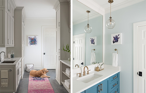
Cabinets in the laundry room (left), painted Agreeable Gray SW 7029 (243-C1), provide plenty of space for laundry baskets, cleaning supplies and “all the extras of life,” Felts says. Silken Peacock SW 9059 (173-C6) on the girls’ bath vanity (right) carries through on the use of blue throughout the house.
Photos by Erin Comerford Miller


