Close

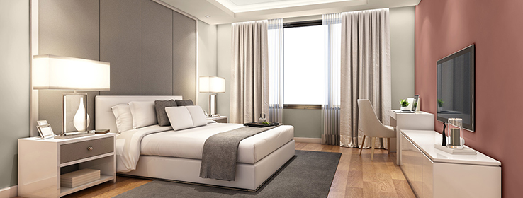
Get the inside story on what’s influencing the trends for every palette of the new 2021 Colormix® Forecast Commercial color collection — and what it means for multi-family, new residential, healthcare and other markets.
Inspiration knows no bounds. In the same way that influences from the world around us find their way into home design, the comfort and character of home are shaping commercial spaces, too. That’s why this year’s Colormix Forecast Commercial color collection is based, for the first time, on the 2021 Colormix Forecast. The four Colormix Forecast Commercial palettes — based on the Colormix palettes of Sanctuary, Encounter, Continuum and Tapestry — are designed to bring timely colors to interior and exterior residential and commercial spaces. We tapped Emily Kantz, color marketing manager at Sherwin-Williams, to learn more about key influences behind each palette and how they pertain to commercial markets.
Trend 1: Finding Comfort and Calm in Home and the Outdoors
“Healing properties tied to our sense of comfort at home have been on the healthcare side of things for years, and it’s great to see them reaching mainstream markets, too,” Kantz says. “Those comforts, combined with biophilic elements — so, bringing the outdoors in — are important to all of our markets, and they’re reflected in the colors of the Sanctuary palette. We’re seeing these influences in schools, in new residential construction and in workspaces. And you don’t need to have access to the outdoors to take these colors and apply them to commercial interiors for a feeling of lush greenery with Oakmoss SW 6180 (213-C6) or a warm desert landscape with Canyon Clay SW 6054 (194-C6) and Bona Fide Beige SW 6065 (196-C2).”
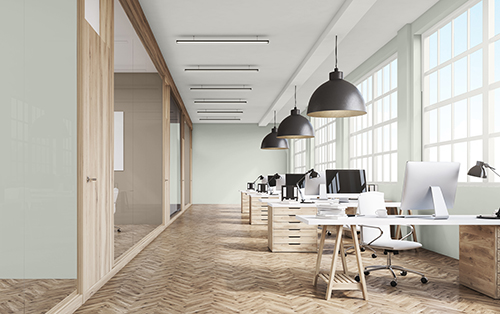
Wood finishes combine with the Sanctuary palette’s Pearl Gray SW 0052 (on the foreground and back walls) and Morris Room Grey SW 0037 (on the inner conference room walls) to create a feeling of calm and comfort in this workspace.
Trend 2: Treasuring Heirlooms and Local Character
“Given where we are right now and everything that’s happened with the pandemic in the past year, all of us want to support our local community — and we’re really valuing that sense of community like never before. We’re also finding value in hand-me-downs, in heirlooms, in the make-and-mend movement. We’re treasuring things from the past. From the hotel perspective, if you’re designing a hotel in Nashville, you want it to feel like it’s in Nashville. That means artwork from local artisans, and it means paint colors, as well. The Encounter palette has organic earth tones — yellows, blues and greens — that work well for these kinds of applications as well as across regions. Tarnished Trumpet SW 9026 (142-C3) is one of my favorites. It’s an incredibly usable golden tone. It’s happy and sunny.”
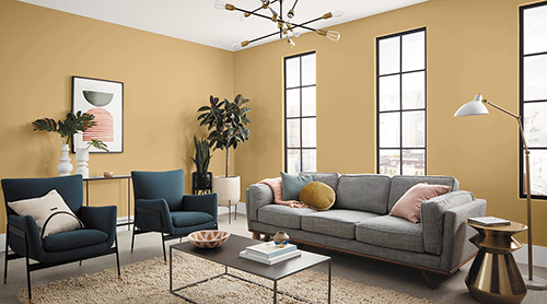
Tarnished Trumpet SW 9026 (142-C3) provides a warm, sunny foundation in this new residential space from the Encounter palette.
Trend 3: Balancing Natural and Synthetic Qualities
“Inspirations from outer space and the deep sea aren’t limited to designers. I have a 6-year-old son, and he is obsessed with space — with NASA, SpaceX, everything. He’s one out of probably six kids in his kindergarten class with the same obsession, and for them, there are no limits. They’re going to live on Mars someday. The way technology comes together with the natural world, both for these kids and designers alike, is what we’re talking about with the colors in the Continuum palette. These are beautiful, deep, rich colors. I have Cyberspace SW 7076 (235-C7) in my bedroom. It’s a very dark blue-gray, and it’s absolutely stunning. I could definitely see it on cabinets in a new residential space or in a hotel room. And blues and yellows such as Swimming SW 6764 (164-C1) and Moonraker SW 6701 (147-C1) lend themselves very well to office spaces and multi-family interiors.”
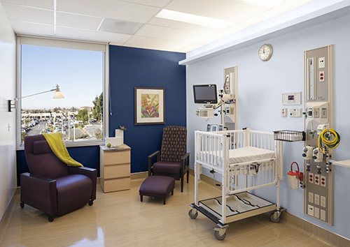
Natural and synthetic influences meet in this healthcare space showcasing the Continuum palette’s darker Commodore SW 6524 (185-C7) and lighter Wishful Blue SW 6814 (180-C1).
Trend 4: Having Some Well-Deserved Fun
“I’ve heard from architects and designers throughout this COVID-19 period, and they say that when people return to work, workplaces will need to be worth the commute. Sure, people will want to know that safety measures are in place, but they’ll also want something that’s kind of fun and not just like home. Colors in the Tapestry palette serve this purpose. They can energize a space and, although there’s enough saturation and chroma in them to make them fun, they’re not in your face. Here again, they can just be pops of color — something like a wall of Jovial SW 6611 (117-C2) or Alexandrite SW 0060. Or, for a coastal-inspired new residential or multi-family exterior, I could see Greek Villa SW 7551 (254-C1) paired with Embellished Blue SW 6749 (271-C6).”
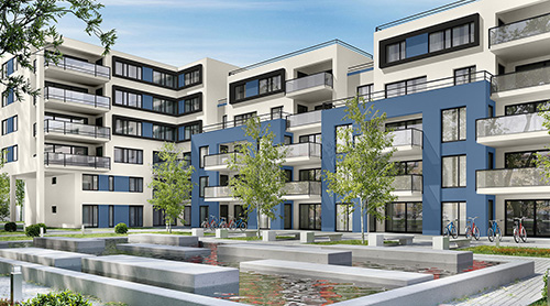
Perfect Periwinkle SW 9065 (179-C5) from the Tapestry palette provides just the right pop of color on a multi-family exterior. Greek Villa SW 7551 (254-C1) and Tricorn Black SW 6258 (251-C1) round out the look.
Want more examples of colors in these palettes applied across markets? Check out the entire Colormix Forecast Commercial color collection.


