Close

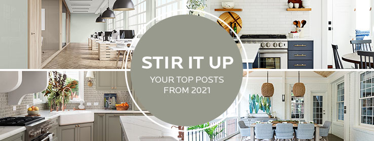
Get ready to be inspired all over again with our readers’ favorite STIR posts of the year.
Color allows us to uncover inspiration in new ways, and we have loved sharing what we’ve found with our STIR readers. As 2021 winds down, we took a look back at our readers’ favorite blog posts of the year. Some key takeaways from these inspiring pieces are:
- The impact of the COVID-19 pandemic on how we use and design living and working spaces
- The emergence of a new design trend: Coastal Farmhouse
- Endless ideas on how to make the kitchen, the heart of the home, feel fresh and inviting
- Redefining outdoor spaces—both for relaxing and entertaining
So in case you missed them or just want to revisit the inspiration, here’s a recap of your top four STIR blog posts from 2021.
1. Mix and Mingle: 4 Key Commercial Color Trends
We developed a commercial color collection based on the 2021 Colormix® Forecast that took a deeper dive into each of the four trends for commercial spaces in 2021: bringing the comfort and calm of the outdoors in, treasuring the past, the intersection of science and nature, and using fun color to energize and inspire.

In the article, Sherwin-Williams color marketing manager Emily Kantz talks about key influences behind each palette and how they pertain to commercial markets like multi-family, healthcare and more.

2. Crisp Coastal Style Meets Modern Farmhouse
See how architect Tyler Zagryn balanced coastal and farmhouse design in this 2,000-square-foot Jamestown, Rhode Island, home. Timeless and sophisticated, Zagryn’s design included a heap of Alabaster SW 7008 (255-C2) and a dash of coastal-inspired blues.
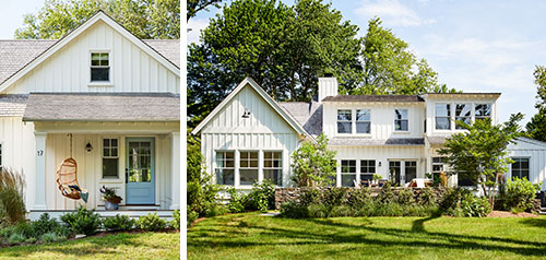
Photos by Read McKendree
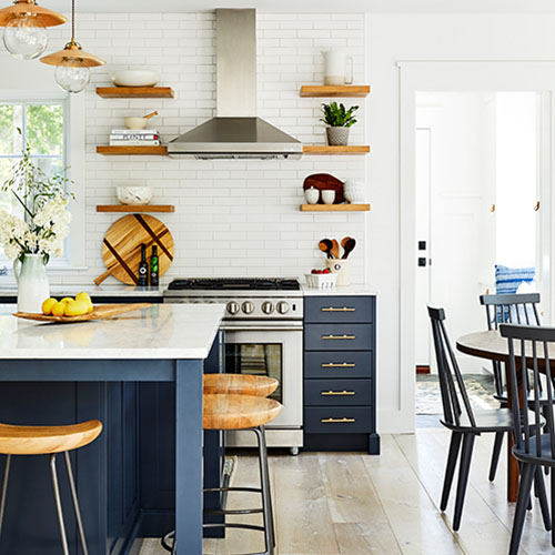
3. Favorite Colors for Fresh-Air Kitchens
Learn how to use color to create “livable luxury” in the heart of the home. Director of Color Marketing Sue Wadden shows you how to make kitchens feel light and breezy with bright neutrals and soft greens —such as the 2022 Color of the Year, Evergreen Fog SW 9130.
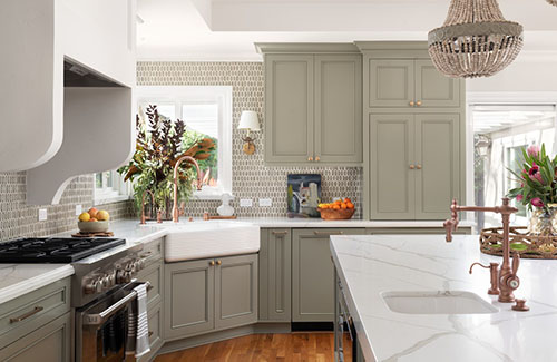
Don’t miss Sherwin-Williams Director of Color Marketing Sue Wadden’s top five neutral picks to create a refreshing feel in the kitchen at the end of the article.
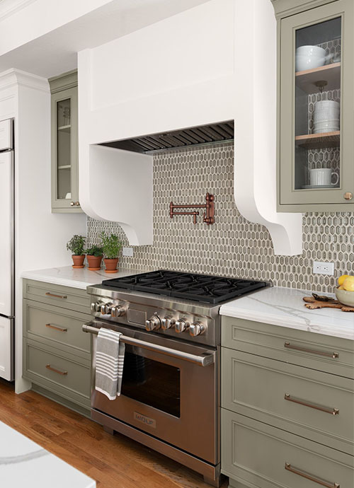
Photos by Jean Bai, Konstrukt Photo
4. Take It Outside: 5 Outdoor Escapes Worth Exploring
Whether a screened porch, patio, or add-on cottage, a home’s outdoor space provides room to breathe deep and relax with nature. We take you from California to South Carolina to see how designers are using color to create one-of-a-kind outdoor experiences for entertaining friends and family and escaping the busyness of life.
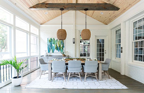
Photo by Emilie Smith
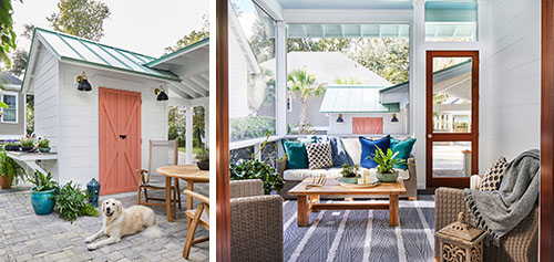
Photo by Laurey Glenn
Want to be inspired by other beautiful projects? Follow us on Instagram.


