Close

STIR® sits down with Curb Appeal’s John Gidding for a look into what drives his designs and color choices.
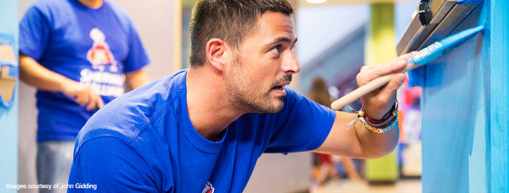
You may know him as the brain behind stunning front-home makeovers on HGTV’s Curb Appeal or as one of the expert judges on Fox’s Home Free. However you recognize John Gidding, it’s clear he’s a design talent with a keen eye for color — and a very busy man. Between his many projects, STIR was able to sit down with John and get a look into his color theory and design inspirations, plus what’s coming up next.
STIR: Hi, John! You’ve been a designer in the public eye for a long time now. Before HGTV and your other prominent design ventures, when did you first realize you were destined to be an architect and a designer?
John Gidding (JG): It happened when I was very young. I was good at art and math and someone told me I should be an architect. It became a self-fulfilling prophecy — whenever anyone asked me what I wanted to be afterward I always said “architect.” I got into college and I took an architecture course and sure enough, I enjoyed it.
STIR: Many may view design and architecture as strictly creative fields. Where do you see your strengths in math come into play?
JG:The world of architecture is built on constraints. Understanding those constraints means being able to have a conversation with the professional in the field — that’s where math comes in. The capacity to be able to speak to structural engineers about a thoughtful project is important, so over the years [math] has really helped.

STIR: Where do you go to find color inspiration for your designs?
JG: Fashion is always a first resource — [fashion designers] are always at the cutting, bleeding edge of trends and where color trends are going to go.
STIR: You’ve lived in many different cities — from Istanbul, Turkey, where you were born, to New York City and San Francisco. How have each of these places influenced your personal design aesthetic?
JG: One of the more influential cities for me was Atlanta — I moved there to shoot Curb Appeal. The residents certainly know and love that city and their architecture. Especially when it comes to residential architecture, which is what I was working on at the time. Atlanta is highly livable, there’s a lot of money being spent into the infrastructure — suddenly it’s becoming more of a pedestrian city.
STIR: Where are you seeing color palettes headed in both the residential and commercial design marketplaces today?
JG: [Design] is an on-off-on-off cycle. So because we’ve been seeing very saturated colors lately, I’m predicting we’ll move to warmer, softer tones in the blues, purples and pinks.
STIR: Which color trend are you loving at the moment?
JG: I often love the milkier grayish and grayed-out shades. I always use them. We have a joke in my firm, we call it “Gidding gray.” Any grayed-out version of a color I’ll probably be excited about.
STIR: How do you use color differently in your landscape design compared to interior design? Does your use of color in one inform your use of color in the other?
JG: For exterior projects, there are no trends that are of importance. I instead look at the fabric of the community, flora and fauna of the microclimate, and that’s what decides colors for me. Certain architecture doesn’t go well with certain colors, so I like basing my colors on architectural precedent as well.
Interior design is much more about the homeowners and the lifestyle they want to create. Also, room by room, I tend to choose colors based on the interior room function.
STIR: What’s your favorite color rule to break?
JG: Values, when they are close together (same tints and hues), tend to give a calmer appearance. Values that are pure hues and bright saturations with lots of contrast tend to create energy — and this is what I like to break — I try to create a calm environment while still using pops of constrasting color.
STIR: Any tips for designers and architects looking to push their color boundaries in their projects?
JG: The biggest challenge is to saturate without making [the room] look too graphic or too trendy — and bringing in color when possible and appropriate without making the project dated or rubbing people the wrong way. The solution to this problem is contrasting colors with natural materials — that pairing neutralizes the space so people feel at home.
STIR: What is your favorite Sherwin-Williams color?
JG: Porpoise! Can you tell how quickly I answered the question? It’s always been my favorite Sherwin-Williams color. I use it in facades, kitchens, interiors and exteriors. It’s the perfect taupey gray.
You can follow John’s latest design adventures on Instagram, Twitter and Facebook and at JanusArch.com. Plus, catch him this summer on his show, The Secret Guide to Fabulous on LogoTV.
John’s favorite Sherwin-Williams colors


