Close

Sherwin-Williams color experts share how Colormix connects to commercial design, wood tones and a range of products.
Connecting the color forecast dots across design categories is a big part of MODE, Sherwin-Williams Colormix Forecast 2022. What’s trending in healthcare, education and other commercial categories? How is color influencing the stain and grain of wood finishes? What’s on the horizon for the coatings of products such as appliances, plumbing fixtures and roofing? STIR sat down with Sherwin-Williams color experts from each of these fields to see how their pieces relate to the big picture.
Commercial Trends: Getting Back to Normal With Warm Neutrals and Pops of Color
In 2022, commercial design will be all about what Emily Kantz calls “the return.” As a color marketing manager overseeing healthcare, hospitality and commercial market segments, she’s seen how profoundly facilities in these industries have been impacted by the pandemic. “But now we’re going to try to return to normalcy, return to school, return to work, return to travel,” she says. “It’s been a really tough year for everyone, so how are we going to help ease the transition back into the classroom or the workplace?”
It starts with a strong foundation of neutrals from every palette of Colormix 2022. “We’re seeing those neutrals getting warmer and softer,” Kantz says. At the same time, she’s forecasting an appetite for color, including deep, rich hues.
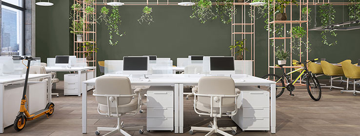
The Method palette provides the perfect example, she says, with its soft, organic neutrals such as Beige SW 2859 and almost unexpected pops of color like Chartreuse SW 0073. “This is a great palette for retail and hospitality because it beautifully pairs with the lighter wood tones we’re seeing,” she says. The Santa Monica Proper Hotel in California, designed by Kelly Wearstler, captures the idea. “It has a very soft, textural, organic feel, and the guest rooms have art deco influences with rounded edges in the furniture,” Kantz says.
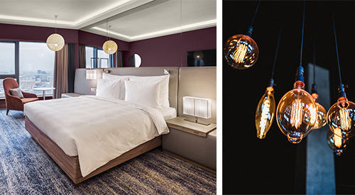
Blackberry SW 7577 (109-C7) in a hotel room joins a palette of mostly deeper and darker colors in the Opus palette. The palette’s dramatic style makes it a good fit for the hospitality segment, Color Marketing Manager Emily Kantz says.
Most tones veer deeper and darker in the Opus palette. Naval SW 6244 (253-C6), the Sherwin-Williams Color of the Year for 2020, remains “super usable and highly requested,” Kantz says. She sees bolder tones like Blackberry SW 7577 (109-C7) and Red Bay SW 6321 (113-C7) about to take off, too. But people are also gravitating toward corals such as Coral Clay SW 9005 (114-C4) and paler blues such as Aleutian SW 6241 (224-C3). As with Method — although in an entirely different way — the fit works incredibly well for the hospitality segment. “You can do something really bold and beautiful with this palette,” she says.
The wellness movement inspired many of the hues in the Dreamland palette. “I just feel like I’m in the tropics every time I look at this palette,” Kantz says. Pale colors with a floral presence, such as Rose Tan SW 0069 and Lite Lavender SW 6554 (189-C1), balance with rich greens, including Rosemary SW 6187 (215-C6). “These colors are fresh and uplifting, and they look great in a work environment,” she says. “But they’re ideal for healthcare and retail spaces, too.”
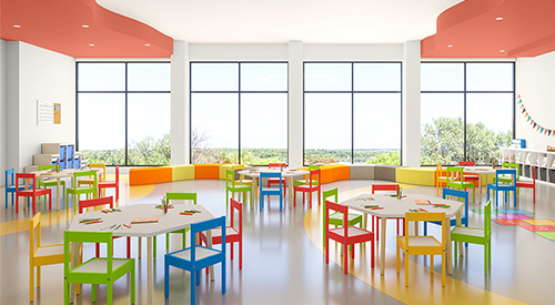
Rejuvenate SW 6620 (118-C4) from the Ephemera palette brings an energetic burst of orange to this education space.
But to Kantz, the Ephemera palette perhaps best represents the feeling of optimism and positivity. “If you know that your workforce is coming back in the fall, why not refresh your workspace with some pops of color?” she says. “Sierra Redwood SW 7598 (125-C7) strikes that balance between deep terra cotta and red, and we continue to see yellows such as Peace Yellow SW 2857 as happy. And then Rejuvenate SW 6620 (118-C4) gives you that bright pop of orange without being in your face. Paired with Cascades SW 7623 (279-C1), it looks really pretty.” Although the colors work well for commercial spaces such as offices, they’re ideal for education, healthcare and hospitality, too, Kantz says.
Wood Trends: Celebrating Each Species’ Appeal
Colormix also considers trends in kitchen cabinets, furniture, building products, flooring, architectural millwork and specialty wood products. These segments are a constant study for Lauren West, director of global color and design for industrial wood coatings in the Sherwin-Williams Performance Coatings Group. Trends rising to the top “celebrate the whole idea of wood being wood and how each species has its unique thumbprint,” she says. This includes bleached and fumed finishes that look “barely there.” Browns are evolving, as well, moving away from reds, oranges and yellows. “They’re following what’s going on with the dark chocolate values,” West says. As for species, hickory is up and coming, and walnut is experiencing a resurgence in popularity.
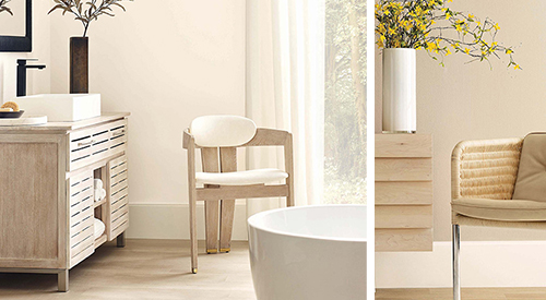
Wood flooring, cabinets and furnishings with a pale, “barely there” finish are among the trends Lauren West, director of global design for industrial wood coatings, is seeing. The look dovetails beautifully with colors such as Shoji White SW 7042 (254-C4) (left) and Accessible Beige SW 7036 (249-C1) (right) from the Method palette.
Translating Colormix 2022 colors into wood finishes is especially exciting, West says. For Evergreen Fog SW 9130 (215-C4), that included three new finishes. “One is a really light, milky finish, and another highlights the stunning texture of the wood,” West says, “but my favorite is organic and looks like the forest floor.”
Industrial Design: In a Nutshell, Warmer and Darker
Every day means work on a different product category for Kiki Redhead, global color, materials, finish (CMF) and trend manager for industrial design segments in the Sherwin-Williams Performance Coatings Group. “One day, I might be working on a new faucet for a plumbing fixtures company,” she says. “The next, it’s office furniture, then metal roofing, then medical devices like X-ray machines.” Not surprisingly, she partners with companies on color forecasts several years out.
Although trends vary between segments, warmer and darker are rising as common themes. “We’ve been watching how warm neutrals are coming back into design at all levels,” Redhead says. “And those warmer neutrals like Beige SW 2859 pair well with really dark colors like Naval SW 6244 (253-C6).”


