Close

Iridescence exists everywhere in nature. Learn the science behind this structural color and ideas on how to incorporate it into design.
by Molly Burke
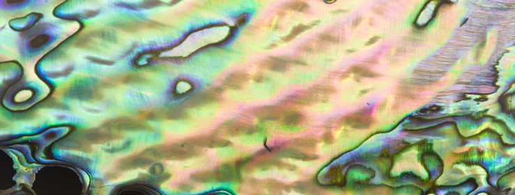
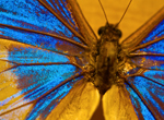
From hummingbird wings to jewel beetle carapaces and mother-of-pearl to fish scales, iridescence — a form of structural color — is one of the most visually compelling displays in the natural world. Its shimmering, metallic qualities draw in the eye and capture attention. So what makes iridescence such a unique form of color? And how do you hone its brilliance in design? Structural color science provides some insight.
Structural color, unlike colors produced by pigments or dyes, is a result of the interaction between light and biological nanostructures. This means iridescence relies on shape and materials, rather than chemical properties. When light hits these nanostructures — proteins in a feather, collagens, cellulose, or keratin — the refraction acts like a prism, splitting the light into the iridescent colors.1 The most brilliant part about this display is its ability to transform and shimmer as the eye’s observation angle changes, creating an ever-changing experience for the viewer.
In the animal kingdom, iridescence has a variety of functions: in certain breeds of birds and butterflies, iridescence is used for males to display their brilliance and find a mate, while other animals such as fish and green leaf beetles utilize iridescence to camouflage themselves and avoid predators.2 While iridescence is naturally occurring across animals, plants and certain minerals, it can’t technically be painted because it’s not a pigment. Regardless of this challenge, designers and architects can still find ways to incorporate it into their projects.

“Iridescence is difficult to replicate in coatings, but there are several design surfaces that look amazing in an iridescent finish,” says Sue Wadden, director of color marketing for Sherwin-Williams.
Sue suggests using a glass, ceramic, textile, tile, lighting or hard surface furniture with an iridescent or holographic finish as your first design element, and then pull color from its kaleidoscope for your paint inspiration. “This technique makes for bold and interesting color styling,” Sue says. “Or, you can pair your iridescent piece with white or black paint — which makes the iridescence really pop.”

From softly ethereal pastel tones to deep and inky oil-slicked hues, incorporating even a small amount of iridescence creates a compelling, otherworldly atmosphere. “What I love most about iridescence is that it’s science, biology and a hint of technology all wrapped up in one mercurial surface — inspiration can come from a beetle carapace to an automotive finish,” Sue says. “What other finish has that broad of a range?”
1 Luiggi, C. (2013, February 1). Color from Structure. Retrieved from http://www.the-scientist.com/?articles.view/articleNo/34200/title/Color-from-Structure/
2 Doucet, S., & Meadows, M. (2009, February 23). Iridescence: A functional perspective. Retrieved from http://www.ncbi.nlm.nih.gov/pmc/articles/PMC2706478/


