Close

Your clients are afraid of kitchen color, you say? Have no fear – these ideas will help you get cooking together.
by Sue Wadden, Director of Color Marketing, Sherwin-Williams
No one’s ready to declare kitchen neutrals or stainless appliances over. But is there any question that bolder color is more welcome in kitchen design today than it was just a few years ago? On walls, on cabinets, on appliances: our appetite for color is expanding.
I, for one, am totally loving it, and after walking around KBIS, AIA and NYCxDESIGN this spring, I keep thinking about ways we can introduce more color to our clients, helping them arrive at a fun, fresh kitchen look they’ll be happy with for years to come.
Rather than trying to introduce a client to color throughout a design all at once, one effective approach can be to invite them to focus more narrowly, warming them up to palette possibilities in one aspect of their space.
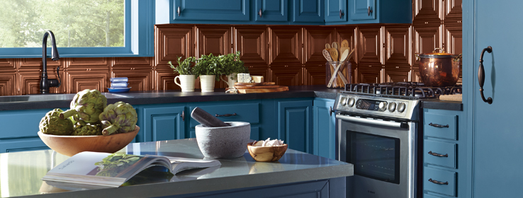
Two-tone cabinets. Two-tone cabinets aren’t new, of course. What is new is how pervasive they are. Walking the show floor at KBIS this year, Masterbrand, Kraftmade, Armstrong were among many manufacturers showcasing two-tone offerings.
Not only can two-tone cabinets combat the monotony of neutrals in the kitchen, they can create the illusion of a higher ceiling (dark cabinets below) or lower ceiling (dark cabinets above). Add a dash of color in your tile selection, and suddenly everyone is agreeing on bolder colors for the walls. If a client isn’t ready to “go there” with two-tone cabinets, start by adding color to an an island: an instant focal point.
Color appliances. Another way to get a client to warm up to using more color in a kitchen design is to start with the appliances. We’re all ready to soften the visual impact of technology in our lives, and nearly every manufacturer is now offering a broad spectrum of color appliances.
This year at KBIS, pastel appliances were everywhere courtesy of KitchenAid, Viking, Big Chill, SMEG and many others. A pastel range is instant fun in an otherwise neutral kitchen design, giving those whites and grays more meaning as supporting players. It’s Euro coziness right out of 1960s Italy. The best part of color appliances? Fewer fingerprints.
Feature walls. A bold pop of color on a feature wall can be an easier sell to clients who aren’t otherwise ready or able to move away from the familiar comforts of neutral cabinets and stainless appliances.
Check out our recent Color of the Month video to see how a color like Cut the Mustard (SW 6384) can add spice to an eat-in kitchen.
Natural materials. Moving beyond butcher block, rugged, natural-wood countertops were also prevalent at trade shows this spring. Maple, walnut, mesquite and even more exotic species were everywhere as accent touches, adding textural contrasts and color transitions to warmer wall colors.
There’s a lot more kitchen color inspiration on our website. Check it out:
- STIR: “It's Getting Haute in Here: A Look at Kitchen Color”
- STIR: “Cooking Up Modern”
- The Sherwin-Williams Kitchen Color Inspiration Gallery
Try these big colors in your next kitchen redesign:


