Close

We asked savvy design pros how they plan to use the Colormix Forecast 2019 palettes. Here are some of their best ideas — plus tips from our own Sue Wadden and her color team.
The 42 colors in the Colormix Forecast 2019 — from the eclectic quality of the Enthusiast palette to the sophisticated, yet calming, vibes of the Naturalist palette — provide endless inspiration. With such a breadth of design possibilities, we asked people in the design community how they envisioned using the trend palettes.
We reached out to designers on the Sherwin-Williams for Design Pros page on Facebook and asked our own Sue Wadden and her color team. Here’s what they had to say.
Shapeshifter schemes
“I used Extra White SW 7006 from Shapeshifter Palette in Emerald® Urethane Trim Enamel in Semi-Gloss finish for my kitchen cabinets. We bought an older home, with beautiful solid wood kitchen cabinets that needed to be refreshed. Emerald urethane added extra durability and provided the smoothest finish and washability to our cabinets. And to top it all, it satisfies the strict environmental requirements for replacing and phasing out oil paints.”
— Sabina Jahic, Sherwin-Williams Designer Marketing Manager, Southeast Division
“I really resonate with the Shapeshifter palette because of the cosmic hues and the wonder of what they represent. I would love to paint my toddler’s bedroom in Elation SW 6827. This color is very versatile and can really mature with her because it can be light and playful, yet sophisticated, depending on what other furnishings are curated.”
— Karrie Hodge, Sherwin-Williams Senior Designer, New Residential
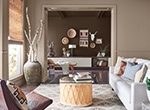
Notes of Naturalist
“Friends needed help for the palette of the exterior of a Craftsman style home they were renovating and I found a great scheme of warm grays from the Naturalist palette. We used Felted Wool SW 9171 on the main body color and complemented it with Porpoise SW 7047 (from Enthusiast) for the shake shingle dormers and Origami White SW 7636 (from Wanderer) for the trim — which really pulled the features and cozy architecture of the home together. The contemporary 'greige' scheme remained honest to the history of the home and struck a good balance as they wanted something fresh but timeless as well. Using Emerald® Interior Acrylic Latex for its self-priming feature and excellent hide was a great choice for this historic home.”
— Michael Plank, Sherwin-Williams Color Marketing and Design Services Director
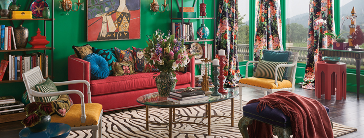
Enthusiastic experiments
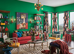
“For daring designers who want to utilize the Enthusiast palette, I suggest using our best-in-class Emerald® Interior Acrylic Latex product. The extra-bold greens, blues, reds and golds in the palette will remain vivid and rich — even in high-traffic areas with kids and pets.”
— Donna D’Alterio, Sherwin-Williams Designer Marketing Manager
“I'm planning several bold accent walls and also experimenting with some abstract DIY mural art in the homes we're working on — great color choices provide inspiration to get creative!”
— Amy Nelson McVeigh, Professional Designer
Wandering into beautiful design
“The Wanderer palette really stood out for me. I’m renovating my cottage and really wanted a fresh approach. For a cool yet warm feeling, we went with Origami White SW 7636 as the main color in the living room in a Matte finish. We used Distance SW 6243 on the fireplace wall and Cavern Clay SW 7701 in a satin on an old hutch we wanted to freshen up. That pop of color on the hutch really stands out. Finally, we went with Moth Wing SW 9174 on our kitchen cabinets. The palette is soft yet has so much life!”
— Jennifer Binns, Sherwin-Williams Designer Account Executive
Accents of Aficionado
“At the Modernos Eternos Decoration Show in Lima, Peru, we use Merlot SW 2704 from the Aficionado palette in the master room to bring an elegant, rich, sophisticated mood to the ambience. Merlot has brought warmth and hospitality, and made a perfect match with the gray and the dark green of the bedding and cushions.”
— Patricia Fecci, Sherwin-Williams Manager, Color Solutions, Latin America
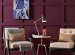
Raconteur translations

"We just bought a new house that needs an update from the ’80s; I was looking to use Black Bean SW 6006 from the Raconteur palette on the existing oak cabinets. It has the bold dark look that is trending in kitchens and has a warmth that will really work well with the rest of the wood trim in the house.”
— Emily Kantz, Sherwin-Williams Healthcare and Hospitality Color Specialist
To see all of the 2019 Sherwin-Williams Colormix palettes, go to swcolorforecast.com.


