Close

The design team behind a luxury continuum-of-care senior living community in Oregon explains how they used natural materials and neutral paint colors to convey a warm, homelike feeling.
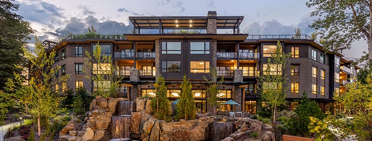
A rooftop wine bar, a dining room with a waterfall view, and patios for activities such as yoga sound like amenities at a luxury resort. But they’re part of The Springs at Lake Oswego, a new retirement community built by The Springs Living just outside Portland, Oregon. Inspired by the nature of the Pacific Northwest, architect Ray Yancey and interior designer Lisa Warnock of LRS Architects created a sanctuary that feels refreshing yet familiar and comfortable for residents — no easy feat for a project of considerable size, with 216 units and a total of 373,000 square feet. “The big idea for The Springs Living is to really build a place that people see as a home, not as a facility,” Yancey says. “So it’s about creating warm and inviting places throughout the community, from common amenity areas to individual apartments.”
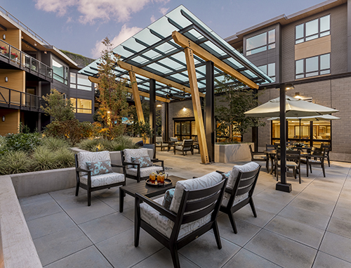
Multiple outdoor spaces, including this courtyard, ensure residents are never far from nature. The dark brown color Black Fox SW 7020 (244-C7) and caramel color Hopsack SW 6109 (204-C5) complement other exterior materials, including wood, brick and stone.
That feeling comes to life even before stepping inside, with glass-topped roof overhangs, recessed apartment decks and lushly landscaped courtyard patios. Natural materials such as wood and stone — and nature-inspired Sherwin-Williams paint colors, including Black Fox SW 7020 (244-C7) and Hopsack SW 6109 (204-C5) — keep the design grounded and feeling residential, Yancey says.
Once inside, though, you’re never far from nature or the neighborhood. “You’re really connected to the landscape no matter where you are in the building, and that was important because many of the residents grew up in or have been a part of this area,” Yancey says.
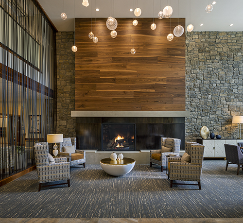
Natural walnut and stone adorn the architecture of the lobby’s fireside lounge. Paint colors throughout the community, including Pure White SW 7005 (255-C1) on the ceiling here, play into an overarching nature-inspired palette.
In many respects, the idea reaches its pinnacle on the rooftop. “We had to keep the building at a certain height, so we took advantage of that and created this rooftop terrace with great vistas all around,” Yancey says. A wine bar, al fresco dining spots, a putting green and raised planters for gardening all take in the surrounding landscape.
The rooftop wine bar opens to a terrace and southern exposure with lots of sunlight. Grecian Ivory SW 7541 (247-C1) on the walls keeps the overall look bright.
Even with top-notch outdoor features, residents spend most of their time inside, which prompted the design team to bring nature there. “The biophilia trend of bringing the outdoors in really works with people,” Yancey says. The idea rings particularly true today, he notes, with people spending an average of 90% of their time indoors — a percentage that climbs even higher for residents of retirement communities. “Anything we can do to provide easy opportunities to go outdoors — and to also bring those elements indoors with daylighting, plants, colors and textures — facilitates that experience,” he says. “And using the right paint colors really helps the natural materials shine.”
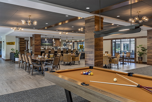
Universal Khaki SW 6150 (207-C3) combines with walnut-wrapped columns and other warm finishes to create a comfy feeling in the community’s casual pub, Fancho’s.
The finishes, particularly paint, also work in tandem with the project’s lighting. “More light helps you safely move within and be within a space — more light to read, to put on makeup, all of those things,” Warnock says. “So a designer has to be extremely careful when selecting their finishes and their paints, and making sure the light reflectance value (LRV) of that paint doesn’t soak up all of the lighting we’ve just provided. One of the great things about using paint is that you always know what the LRV is.”
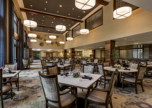
The double-height main dining room features windows that open wide to a waterfall, as well as an open kitchen where diners can watch chefs prepare food, including baking with a pizza oven. As with Fancho’s pub, Universal Khaki covers the walls.
Warnock counts Sherwin-Williams hues among her go-to options for retirement community interiors. “We always use Sherwin-Williams for apartments, and we have some colors we really like,” she says, noting longtime favorites Wool Skein SW 6148 (207-C1) for walls and Pure White 7005 (255-C1) for ceilings and trim. For activity and card rooms, she specified Ethereal Mood SW 7639 (247-C4). And for the art room and rooftop wine bar, it’s Grecian Ivory SW 7541 (247-C1).
The paint colors and overall palette also unify all parts of the community, from independent living to assisted living to memory care. “It was really important to have one design story that feels continuous and cohesive,” Warnock says. “And that, no matter where you are, it feels like home.”
Wool Skein SW 6148 (207-C1) covers the walls and Pure White SW 7005 (255-C1) covers ceilings and trim in all 216 apartments. “Wool Skein is one of my favorite wall colors for units,” Warnock says. “And Pure White is the perfect white paint for the trim.”
Photos by David Papazian


