Close

How designing with colors that resist definition will add a new depth of intrigue to any project.
By Megan Swoyer
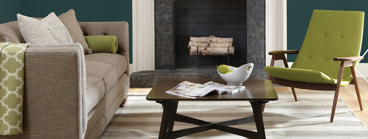
It takes a lot of thought to describe Sherwin-Williams’ Color of the Year, Oceanside SW 6496. It’s a gorgeous blue, but there are captivating greens at work, too. It evokes the deep sea and the tones of a glacier. If an analogy could be made to a precious gem, it would be a stunning mix of stones — lapis lazuli and tourmaline, with a hint of aquamarine and a jolt of emerald. With all these metaphors it’s clear that defining this color is …challenging.
But its almost indescribable nature is what creates the allure of Oceanside — an “in-between” color that is getting shining reviews from designers and color psychologists.
“In-between colors like Oceanside offer a sense of intrigue and sophistication, making me question the nature of the color. I study the spaces a bit more than if I’m in a room that features a more obvious or primary color,” says Catherine Davin of Davin Interiors in Pittsburgh.
Using in-between colors in your own designs can create a distinctive space that helps décor sing. “A smoky, foggy, or misty background color that can’t be described in one word allows you to ‘blur’ the edges of your backdrop so that something pure in front of it will stand out,” says Roger Higgins of R. Higgins Interiors in Nashville.
That mystery and refinement is exactly what Sherwin-Williams’ color experts had in mind when choosing Oceanside as the Color of the Year.
“It’s a blend of three strong colors (blue, green and yellow), but also depth and hue,” says Sue Wadden, Director of Color Marketing for Sherwin-Williams. “That’s why color professionals and designers gravitate toward in-between colors. There is a strong connection to the mystery of these colors. They are not one thing or the other — they’re both vibrant and soulful. An in-between color resists definition, because it can be different things to different people.”
The overwhelming attraction to in-between colors — whether the blue-green Oceanside, a dusty grape or grayed-down green — is likely due not only to their aesthetic qualities, but also the moods they create.
"In-between colors kill the harsh edges of a room and tend to make them more relaxing places to linger,” Higgins says.

Davin concurs: “Depending on the mix, in-between colors create a sense of equilibrium for your eye, which puts it at rest. This signals your brain to relax.”
And when a brain is relaxed, powerful things happen.
“When I introduce myself to a seatmate in an airplane and they find out what I do for a living, they always ask me what color they should paint their home office,” says color psychologist Dr. Sally Augustin. “I always tell them not to use saturated colors, but an in-between green. Different shades of green enhance creative thinking,” Augustin says.
Adding blue to the green, as in the Oceanside shade, is a winning combination. “About 60 percent of people choose blue as a favorite color, which I think has to do with the fact that we enjoy water.” Augustin says that color theorists have studied how our brains evolved and processed color information. In our past we liked blue skies because that meant a clear, good day for hunting and gathering.
As complex as in-between colors may be, they work in just about any space.
These shades are so versatile that they can be used in everything from uber modern to more traditional homes. Oceanside, for instance, would work in a rustic mountain house or a contemporary beach house. “In-between colors add dimension and character without dominating or complicating a space,” Davin says. “I never like it when a color jumps off the wall at me.”
Like the perfect party guest, these colors are not too loud, but definitely not boring. They also can call to mind both conventionalism and casualness.
In Wadden’s own home, you’d be pressed to find a pure color. “Every single color in my home is an in-between color,” she says. “From bronze to oxidized yellow to muddy browns and terra cottas. Picture a rusty old car — those are the colors in my home.”
Her favorite in-between tone? “Anonymous SW 7046 — it’s a warm, rich gray/brown,” Wadden says. “Sometimes it looks gray, sometimes brown, sometimes green. I have it on the exterior and interior of my home. It’s chameleonic — it looks amazing no matter what the landscape delivers.”
An array of whites, too, fall into the popular in-between category. When you see Egret White SW 7570 on a paint deck, it looks subdued and nondescript with a hint of greige, neither gray nor beige. On the walls, it has enough depth to pop off of a white trim or it can play beautifully against any other color.


