Close

Learn how our top bright neutrals picked by Director of Color Marketing Sue Wadden, along with soft greens, help kitchens feel light and breezy.
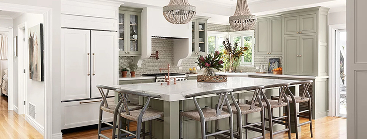
Having two children under the age of 4 doesn’t mean you have to forego a beautiful kitchen. In fact, style holds a special place in this heart-of-the-home space (above) designed by Katelyn Gilmour of KBG Designs for a 1956 ranch in San Jose, California. But so does practicality, with a nearly 10-foot-long dining island and a corner-window sink looking onto a backyard patio and pool. “We call it livable luxury because that’s how these clients like their home to be — beautiful even if it’s covered in baby stuff or kids’ toys,” Gilmour says.
Cornwall Slate SW 9131 (216-C4), which covers most of the kitchen’s cabinets, helps establish the balanced look. “The color has a really beautiful warmth to it,” Gilmour says of the green-gray color. “It’s traditional but very fresh and livable.” A warm custom white paint on the range hood and paneled refrigerator provides the perfect complement. “It’s definitely a warmer white, but it’s still bright,” she says. (For similar neutrals from Sherwin-Williams Director of Color Marketing Sue Wadden, see “Top 5 Colors for Bright and Breezy Kitchens” below.)
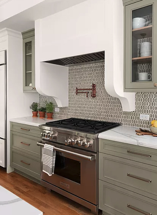
Mosaic tile from Walker Zanger’s Vibe line extends from the backsplashes into the backs of the glass-door upper cabinets. Designer Katelyn Gilmour notes the warm green of the tile relates to the Cornwall Slate SW 9131 (216-C4) paint on the cabinets but without being “too matchy-matchy or on point” — a move that helps create a slightly eclectic look.
Other materials expand upon the palette and include Walker Zanger glass mosaic tile on the backsplashes and Vadara Calacatta Belleza quartz countertops. Aged wood bead chandeliers add a lightly organic finishing touch.
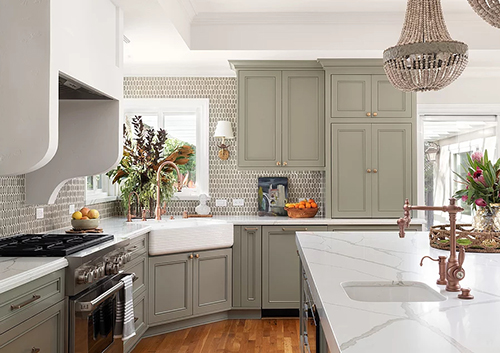
An apron sink presses into a corner window with views to the backyard. The kitchen’s mix of metal finishes, all of which pair effortlessly with the Cornwall Slate cabinets, include Schaub satin brass cabinet hardware, Waterstone copper (rose finish) faucets and a stainless-steel Wolf range.
The resulting eclectic-traditional look suits the owners, who’ve affectionately named their house Sea Horse. “The house has an earthy kind of coastal feel,” Gilmour says. “And it’s beautifully put together in a very practical way.”
Top 5 Colors for Bright and Breezy Kitchens
Sherwin-Williams Director of Color Marketing Sue Wadden knows the right neutral can create a refreshing feeling in the kitchen. Here are her top five picks.
Alpaca SW 7022 (241-C1)
Silver Strand SW 7057 (237-C1)
City Loft SW 7631 (259-C6)
Shell White SW 8917 (264-C1)
Simplify Beige SW 6085 (197-C1)
Want to see more of the California kitchen? Follow Sherwin-Williams Design Pros on Instagram.
Photos by Jean Bai, Konstrukt Photo


