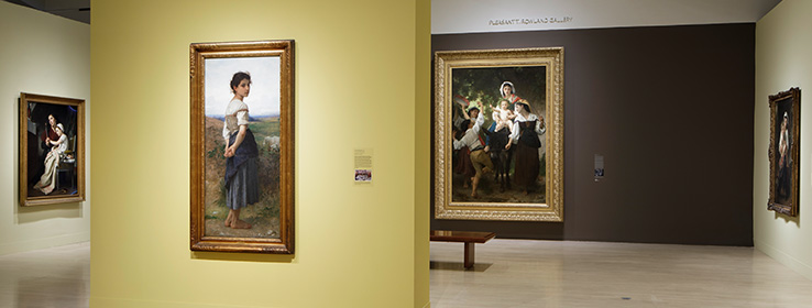
Exhibition designers from four art museums share their secrets for choosing paint colors to make artwork shine.
Approximately 300,000 people visit the Milwaukee Art Museum every year. Enough of them inquire about the paint colors used on the gallery walls that the museum sends them directly to the closest Sherwin-Williams store (at 807 E. Brady St.), which is ready to share the exact specifications for every space. “People really pay attention to those colors and say, ‘I’m going to imitate that,’” says David Russick, the museum’s exhibition designer.
The interest is sincere, but is the approach that simple? STIR tapped Russick and exhibition designers from three other leading art museums — all Sherwin-Williams customers — for the inside scoop on their color and finish preferences, process and more.
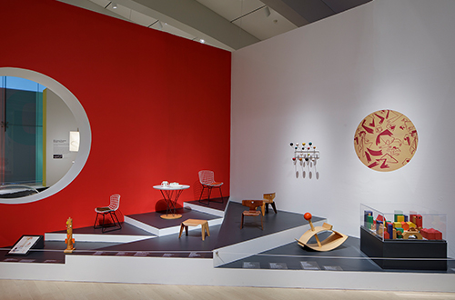
The recent exhibition Serious Play: Design in Midcentury America at the Milwaukee Art Museum explored the projects of more than 40 designers who advocated for playfulness and whimsy — calling for a backdrop of custom Sherwin-Williams colors that did the same.
Color and Saturation
The Milwaukee Art Museum’s Russick likens color to sound volume. “It’s literally infinite,” he says. “You can shout, you can whisper and you can do every decibel level in between.” What he chooses, often asking a Sherwin-Williams store to tint a color slightly lighter or darker to become custom, reinforces what the art is attempting to share. “If it’s done properly, I think color becomes a glue — a binding element — that brings the works together,” he says. Lawrence Waung, the chief exhibition designer at the North Carolina Museum of Art (NCMA) in Raleigh, agrees and acknowledges the importance of paint color in creating a connection. “We’re always trying to use color that will help define the special relationship we want the viewer to have with the artwork,” he says. “It’s more psychological than physical.”
For a Georgia O’Keefe exhibition at the NCMA, that meant Vesper Violet SW 6542 (187-C3), Daydream 6541 (187-C2) and Superwhite SW 6995. (Note: Superwhite SW 6995 is a retired color that is still available via custom tinting.) “We’re constantly looking for colors that recede from view so that they don’t get in front of our objects,” Waung says.
Paler, quieter colors aren’t always the answer. In the past, popular belief might have placed 19th-century impressionist paintings, for example, against cotton candy, baby blue or light green walls, says John Jackson, an exhibition designer at the Nelson-Atkins Museum of Art in Kansas City, Missouri. “But the trend lately has been to go with darker, richer colors to make the paintings themselves have a whiter value so that they pop and come off the walls instead of blending in,” he says.
For Jackson, the same approach applies to creating backdrops for decorative arts and sculptural objects. A special exhibition on view at the museum through May 2020, Teachers of Enlightenment: Traditions in Tibetan Buddhism, includes bronze sculptural pieces that resemble a navy color. They stand out beautifully against the reddish Tanager SW 6601 (107-C6) Jackson chose for the walls.
But exhibition designers walk a fine line between choosing resonant colors — and choosing colors that stand out too much. “We have a fairly well-known collection of Dutch paintings that tend to be really dark with a lot of glazing, and when they’re up against a white wall, it takes a while for your eyes to adjust,” Waung says. “So, we’re mindful of doing something that’s easier on the eyes.”
That said, for more modern and contemporary art, exhibition designers often find white works best. For the Nelson-Atkins Museum of Art, it’s Pure White SW 7005 (255-C1); for the NCMA, it’s Superwhite SW 6995; for the Milwaukee Art Museum, it’s a custom white.
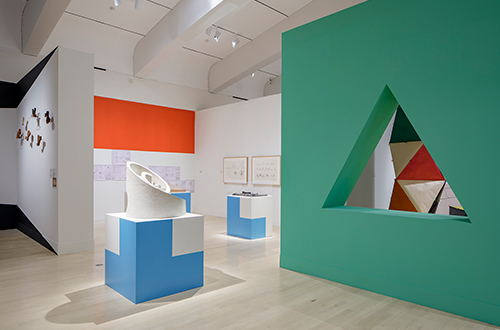
Custom Sherwin-Williams colors complement bold geometric shapes in the Milwaukee Art Museum’s recent Serious Play exhibition.
Finish
Exhibition designers recommend a non-reflective flat finish, which prevents glare from track and natural lighting. Jackson, however, sometimes prefers satin or eg-shel finishes, which are traditionally easier to keep clean. “If we use flat, we can have scuffmarks and handprints on the wall within hours,” he says. (Note: Both Sherwin-Williams Emerald® and Duration Home® paints now come in cleanable flat finishes.)
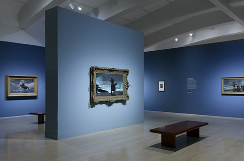
The Milwaukee Art Museum’s 2018 exhibition of works by artist Winslow Homer — all influenced by time he spent in remote coastal England — called for a custom blue backdrop.
An Iterative Process
Choosing the best paint color for a gallery wall tends to be an iterative process, the exhibition designers say.
“We often start by taking a simple color wheel and looking at what’s on the opposite end,” Jackson says. He then applies that principle to a fan deck of swatches, zeroes in on the top three or four paint colors, and has them painted on 2-by-4-foot foam core boards to hold up against the art.
Hans Schmitt-Matzen, the assistant director of internal affairs at the Frist Art Museum in Nashville, Tennessee, does the same. “We often go back and forth a couple of times to make sure it’s just right,” he says. “We never, ever pick a color without doing a color sample to make sure it’s right. I highly recommend investing in a quart of paint before making a commitment to paint the whole room or wall.”
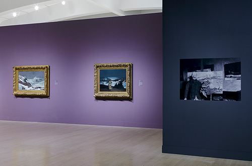
Custom purple and blue come together in the Milwaukee Art Museum’s recent exhibition of painter Winslow Homer’s works.
Photos: John R. Glembin, Milwaukee Art Museum


