Close

Staying on top of trends is a big part of my job as director of color marketing for Sherwin-Williams. That’s why I’m so excited to share the key macro-trends behind this year’s Colormix® Color Forecast — along with a few insights for you to keep in mind with your design work.
By Sue Wadden
As my team and I planned the 2021 Colormix Color Forecast, Rhythm of Color, we talked about nature’s amazing way of staying in step — and how that rhythm and balance apply to the way we as designers live and work, too. It’s exciting to see the idea come to life in each of our Colormix palettes (including one of my favorite photos from the Sanctuary palette, showing Modern Gray SW 7632 (283-C1) and Urbane Bronze SW 7048 (245-C7), above) and in the trends behind them. Here are four macro-trends that rose to the top.
Wellness + Biophilia
Modern Gray SW 7632 (283-C1) pairs well with natural materials and creates a sense of calm.
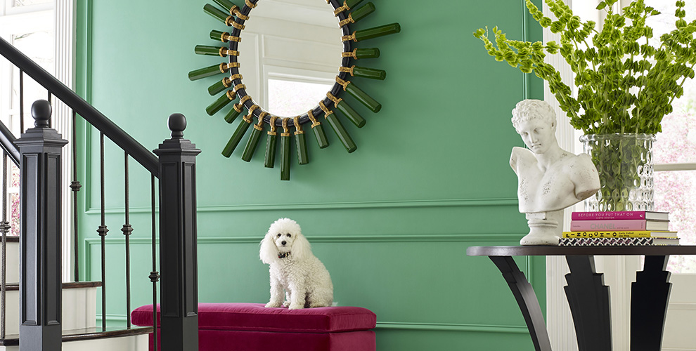
One of the most important macro trends this year is the importance of wellness and biophilia, or bringing nature inside — something we tapped into with last year’s Colormix Color Forecast, Color in Balance. A good example of how this idea takes shape is with sanctuary spaces that are rooted in the positive power of nature. Nature has this amazing way of nurturing wellness and a feeling of calm. The idea is reflected in our Sanctuary palette, and it shows how the whole principle of biophilia will have a big impact on interiors through natural materials, muted hues and warm minimalism.
Storytelling
Reddened Earth SW 6053 (194-C5) provides a rich but muted foundation for a room filled with heirlooms — and their stories.
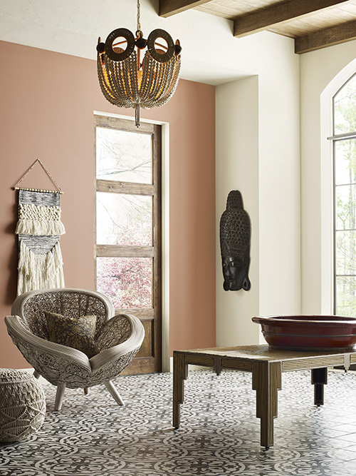
Storytelling is another trend — and by storytelling, I mean the stories behind incredible layers of local character. Consider everything from the crafts and designs of our ancestors to the way our grandparents gardened. Our Encounter palette zeroes in on these influences that came before and will guide us into the future, providing visual cues that tell a story. Finding out and sharing the story about important artifacts you have in your life — from a family heirloom to an African mask you fell in love with at a flea market — is a big part of what makes design meaningful, after all.
Technology + Nature
Wishful Blue SW 6813 (180-C1) embodies a sleek, sophisticated quality that bridges technology and nature.
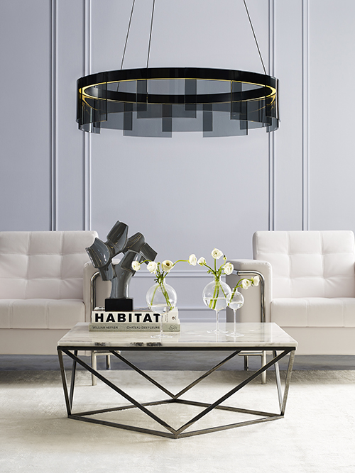
We see how technology is already vital in our daily lives and a part of everything we see, but we don’t want it to look and feel cold or antiseptic. That human side of technology and innovation is going to be a really important trend to watch. It will be everywhere but in many respects hidden away — there to provide intelligence, comfort and convenience when we need it. Tied to that technology is a feeling of innovation and optimism. I liken it to how mid-century modernists innovated as they looked into the deep sea and the night sky — how those possibilities inspired sculptural architecture and working with bright, optimistic colors. The way technology works with the environment around us — working seamlessly into everything and reflected in bright colors — comes to life in a similar way today. Our future-thinking palette, Continuum, builds on that and the way technology ties seamlessly into the environment around us.
Creative Expression
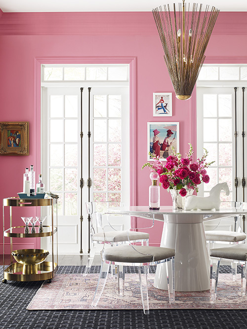
Jaipur Pink SW 6577 (104-C3) instantly conveys an expression of individuality and joy.
One of my favorite macro-trends is creative expression — and it ties to maximalism, which came out of Europe and really started to emerge in the design community over the last few years. The idea of maximalism is a reaction to all of this minimalism, of course, and it’s not going to leave us anytime soon. What’s really fun is how it’s rooted in how we all want to live fully, with what’s important to us. Creative expression is less about perfection and more about personalizing your space with color, texture and pattern. It’s easy for me to get excited about this trend — and it’s especially beautiful now, as we’re living through this pandemic. The idea of taking back joy is important, and it lives in our Tapestry palette.
For more insights and inspiration, explore the 2021 Colormix Color Forecast palettes connected to these trends.
Photos by Diana Parrish Photography


