Close

Anna and Nathan Bond talk color, design, and how they’ve built a booming stationery and lifestyle brand with Rifle Paper Co.
by Amanda Lecky
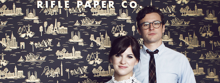
In 2009, Anna Bond was working as a magazine art director and her husband Nathan Bond was a musician touring with his band. Both ready for a change, they launched Rifle Paper Co., a small business based out of their garage inspired by Anna’s love of stationery. Their leap of faith paid off. Six short years later, they are taking their wildly popular stationery designs off the page and putting them on everything from apparel to walls. Over 4,000 retailers around the world sell their products, and their business is moving at lightning speed: Inc500 recently added Rifle Paper Co. to their list of fastest-growing companies. We got Anna and Nathan — new parents, to boot! — to take a breath and talk color.
STIR: How did you get your start in stationery?
Anna Bond: I always loved stamps, letters, and cards as a little girl, but never considered it as any sort of career path until a few friends asked me to design their wedding invitations. I had studied graphic design and loved illustration and realized that stationery was the perfect marriage of the two for me. It just clicked and I haven’t looked back.
STIR: Where do you get your inspiration for the colors and patterns in your products?
AB: I look to a lot of things for inspiration: travel, fashion, architecture, vintage designs, and so on. I try to absorb as much as possible and pull from it later on when I need a new idea. Rifle Paper Co. definitely has a core color palette of warm red, peach, hunter green, and golds that I try to stick to to keep the designs consistent, but I’m also constantly trying to evolve it and add new colors into the mix to keep things interesting.
STIR: Why did you decide to expand into home decor?
AB: Nathan and I have always seen Rifle as a lifestyle brand, so it’s something we dreamed about from the start. We just began with paper because it’s what we knew best and we had limited knowledge about how to develop more complicated products. However, we’re now at a place as a company where it’s become a big focus. Our customers are constantly asking for more and more products that are lifestyle driven.

STIR: Tell us about the wallpaper line. How did you translate stationery designs to such a large scale?
Nathan Bond: Starting with Anna’s original illustrations, our creative team worked on developing the designs. We tried to find a good mix of styles, colors and scale. We then tried numerous color combinations to see what worked best. Our partner, Hygge & West, was also integral in the development process.
STIR: Do you have any tips on using color in home design?
AB: I tend to like the extremes. I love homes that just go all out and have tons of color, and moody rooms and rich black walls. But I also appreciate really clean, neutral homes that are serene and peaceful. I think it's all about what speaks to you and not being afraid to try something.
STIR: Have you ever faced a color challenge in your work?
AB: I think every design has some sort of color challenge with the decisions about what colors to use to solve it. I’ve also started using a lot of periwinkle lately. It’s a tough color to incorporate, but when we get it right I think it’s really unique and refreshing.
STIR: What are some favorite colors you use in your own home?
AB: I honestly have a lot of neutrals! Maybe it’s because I see so much color with my work. I love creams, blacks and gold.
Anna and Nathan’s favorite Sherwin-Williams colors


