Close

How will color preferences shift in the coming year? We tapped Sue Wadden, Sherwin-Williams director of color marketing, and her team for their top insights.
For years, forecasting color trends has been an exciting rite of summer for Sue Wadden. It’s when the Sherwin-Williams director of color marketing announces Colormix — a collection of hand-curated colors, along with the macro-trends and influences behind them — for the year ahead. But as we start moving past the pandemic, this summer is even more special. “People are reimagining their interiors and realizing it’s time to embrace color,” Wadden says. “For a long time, interiors were very neutral and safe. But now, it’s about customization — creating a space you want to live in, one that reflects your personality and passions.”
It’s also a time for an important shift in priorities. “The decade we’ve entered has really changed, and designers are always at the forefront of problem solving,” Wadden says. Sustainability in design, for instance, is increasing in importance. “I can’t tell you how many conversations my team and I have had with designers about how specifying sustainable products isn’t just a win anymore,” she says. “It’s a mandate.”
Sustainability is just one of the influences Wadden is tracking. We tapped her for further insights and her favorite colors from MODE, Sherwin-Williams Colormix Forecast 2022.
Sustainability, well-being and “resimercial” design are some of the macro-trends and influences on the Colormix radar for Sue Wadden, director of color of marketing.
Sustainability isn’t the only influence you’re watching. What are some others?
Well-being and living well are two macro-trends I’ll continue to track. I separated them because living well is about bringing materiality — the exploration of better products — into your home. It’s about things like smart technology, organic materials and the right finishes. And then well-being is about what we’re bringing into our bodies, this reemphasis on clean eating and working out and bringing your best self into this post-pandemic future.
What else are you seeing post-pandemic?
The evolution and rise of the “resimercial” designer. We’re seeing a lot of residential designers get into more commercial spaces — introducing comfortable home-like touches to spaces like office buildings and doctors’ offices. And then, on the flip side, we’re seeing commercial designers get more into residential spaces, especially with so many people working from home and expecting lots more out of their living spaces.
Our team and I’ve talked a lot about multi-family living and what those common areas will look like in the future. These spaces used to be hospitality centers, at best, but we’re starting to see them being modified into coworking spaces. It ties into the larger trend of how workspaces are being reimagined to be totally flexible and really where the whole resimercial idea will serve as a smart example of what’s possible.
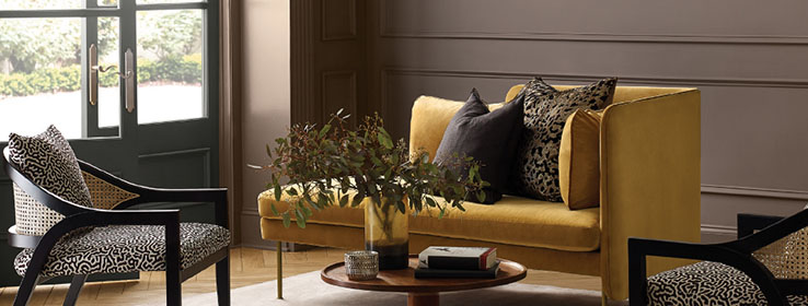
Homes with open floor plans have opportunity for moments of color, Wadden says. Moody Blue SW 6221 (219-C5) (left) and Inky Blue SW 9149 (223-C6) (right), both from the Ephemera palette, are a couple of her favorite blues.
How is the work from home trend in particular changing the way people see color?
It’s influencing the way we’re bringing color into our homes. Open-concept living isn’t at all going away, but I think we’ll see a bit more definition in our spaces, and those are opportunities to introduce joy with color. So, you might have a neutral throughout much of your open plan but then be able to embrace color in a workspace, let’s say, whether it’s a dedicated home office or a smaller nook for working or remote learning.
How do you think the pandemic has shaped the way we see color?
The Roaring ’20s emerged from a similar time. It was about fun and laughter and remembering what it means to be joyful. We’re seeing a lot of that happening again as we come out of the chaos and get back to what’s good. And we’re going to see more people celebrating color.
Nature-inspired neutrals — including Über Umber SW 9107 (203-C7) in the niche and Beige SW 2859 on the walls (both at right), and Accessible Beige SW 7036 (249-C1) (left) — infuse the Method palette with warmth.
Speaking of celebrating color, describe your thinking for the first Colormix palette, Method.
Method is our sustainability and natural materials story that is influenced by the off-whites, beiges and soft colors of Bauhaus design and 1980s modernism, but with organic elements brought into the conversation. It’s anchored by pale neutrals, like the pretty tones of Beige SW 2859 and Accessible Beige SW 7036 (249-C1), and the lovely white color of Shoji White SW 7042 (254-C4). And then we dropped in a beautiful green, Evergreen Fog SW 9130 (215-C4). It’s a balanced, natural palette.
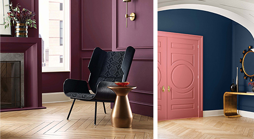
Deep colors such as Blackberry SW 7577 (109-C7) in the living room (left), and Naval SW 6244 (253-C6) and Coral Clay SW 9005 (114-C4) in the entry (right), exemplify the maximalist style of the Opus palette.
Colors get more dramatic in the next palette, Opus, right?
Yes, Opus is an extension of maximalism, which we talked about last year, but shifting to a deeper, darker expression. So, it’s almost like industrial maximalism with industrial glam finishes and a little edginess. I think it’s a reaction to the uncertainty of the pandemic, which fused into this darker “I need sanctuary” type of vibe. We saw this with our 2021 Color of the Year, Urbane Bronze SW 7048 (245-C7). And we see it this year in rich, gorgeous colors like Blackberry SW 7577 (109-C7), a really beautiful, deep purple. Even though we do see some more neutral colors such as the blue-gray of Samovar Silver SW 6233 (222-C2) and pale denim blue of Aleutian SW 6241 (224-C3), we also have the deep hues of Iron Ore SW 7069 (251-C7), Naval SW 6244 (253-C6) and Red Bay SW 6321 (113-C7).
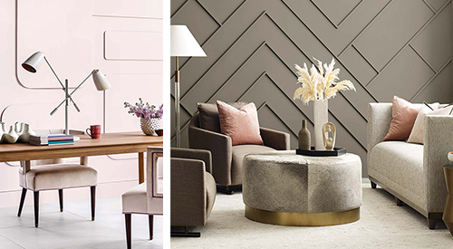
Hues that embody well-being, including Lite Lavender SW 6554 (189-C1) (left) and Felted Wool SW 9171 (245-C4) (right), make up the Dreamland palette.
And then things head in a softer direction with Dreamland. What’s behind this palette?
Dreamland is almost like our well-being palette, with colors inspired by athletic wear and what we’ve been doing to feel good about ourselves, especially during the pandemic. It’s anchored by three very different greens — Rosemary SW 6187 (215-C6), Felted Wool SW 9171 (245-C4) and Cucuzza Verde SW 9038 (155-C4). We also have a beautiful purple in Dynamo SW 6841 (102-C6), as well as Lite Lavender SW 6554 (189-C1), which is stunning — almost like the new pink.
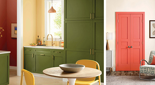
Basque Green SW 6246 (154-C7), Peace Yellow SW 2857 and Sierra Redwood SW 7598 (125-C7) bring cheer to a kitchen (left), while a door painted Rejuvenate SW 6620 (118-C4) adds a pop of color to a room painted Alabaster SW 7008 (255-C2) (right). All colors are from the Ephemera palette.
Colormix rounds out with Ephemera, which you describe as a nostalgia palette. Tell us more.
This is about how were looking to the past to inform our future. I can’t tell you how much entertainment I’ve watched that’s super inspired by the 1960s and ’70s. So, it’s this post-modern look back on where design was, but it looks futuristic now. Designers who remember those colors will find the nostalgia effect, but younger designers see it as fresh and new. We’ll definitely be continuing this conversation into 2022 and ’23. I love every color here, from Sierra Redwood SW 7598 (125-C7) to Cascades SW 7623 (279-C1). Basque Green SW 6426 (154-C7) is a wonderfully rich olive green. And Rejuvenate SW 6620 (118-C4) gives us just the right pop of orange.


