Close

The pale blues and coffee-and-cream accents of the late ’90s, the rusty reds and olive-green gorgeousness of the ’70s, the glamourous color contrasts of the Jazz Age—there are strong and abiding ties between color and different eras, and as the pace of life accelerates, many people are gravitating toward colors, styles, and other nostalgic nods that help them “remember when.”
Let’s take a colorful trip down memory lane together.
The Psychological Tie Between Color and Memory
Nostalgia is idealistic. We don’t find ourselves nostalgic for the unpleasant or unfamiliar. When we see fashions and design styles reemerge, it’s because there’s a timelessness to them and a fondness for those elements that we can’t help but embrace again and again.
It’s human nature to wax nostalgic for a little boost of warmth and good feelings; studies have shown that engaging in nostalgic thinking or activities can activate the centers of the brain associated with well-being and a sense of belonging.
So, it stands to reason that, in times of upheaval or unrest, we find ourselves looking back, taking comfort and finding unexpected inspiration in bygone eras.
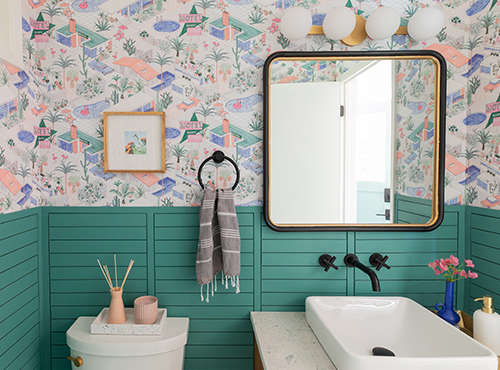
Tons of teal (Surf Green SW 6473 (169-C5)) and a fun printed wallpaper give this bathroom by Rebecca Plumb a happy lift with a ’60s feel. Photo by Nicole Dianne Photography.
The Younger Audiences’ Long Memory for Trends
Millennials and Gen Zers are exhibiting a surprising fondness for throwback styles. These digital natives have an ongoing love affair with all things vintage, resurrecting mid- and turn-of-the-century styles (think 21st century, not 20th) as quickly as these viral aesthetics surface, morph, and fade on social media platforms like Instagram and TikTok.
This isn’t to say that retro revivals aren’t appealing cross-generationally. Gen X, Baby Boomers, and beyond are also shaping and driving these nostalgic trend cycles. People of all ages are reflecting on popular interior designs from the past, and they’re more interested than ever in adopting classic looks in contemporary spaces.
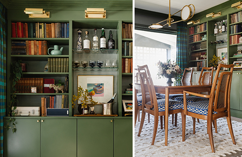
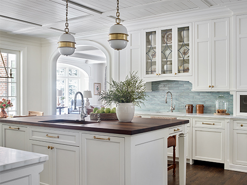
Deep green color with brass gallery lighting turns simple dining room shelving into a midcentury-marvelous focal point. Color: Oakmoss SW 6180 (213-C6). Photo courtesy of Studio Plumb.
In with the Old
No matter their age or inclinations, clients are craving ways to turn their positive memories into authentic expressions of their current sense of style. Therefore, many modern-day trends have the past to thank for their influence and inspiration.
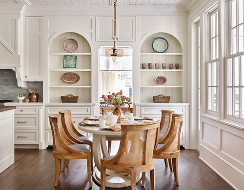
For designer Jessica Bradley, a unique opportunity arose when she set out to revamp a client’s childhood home for the next phase of its history. “I was determined to give new life to the space while maintaining a sense of nostalgia and familiarity,” she says. The classic warm white of Creamy SW 7012 (261-C3) was her choice for filling the historic home with light and loveliness, allowing elements of existing structure and new construction to harmonize.
Jessica Bradley’s unique remodel of this historic home’s gorgeous kitchen showcases the space’s character with the help of Creamy SW 7012 (261-C3). Photo by Emily Followill.
On the other end of the spectrum, there’s room to bring bold, saturated hues to the forefront with certain samplings from bygone eras. Rebecca Plumb of Studio Plumb has the pleasure of playing with the unique silhouettes, clean geometry, and period-perfect materials of past design influences on a regular basis in her work.
“I’m not a preservationist,” she explains, “I don’t want homes to be a time capsule from the era they were built.” She’s discovered that respect for the architecture can still have its place, while letting a more modern take on the interior design give it a feel of being “lived in and evolved over decades of ownership.”
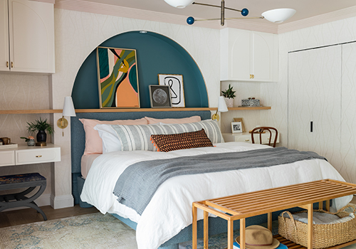
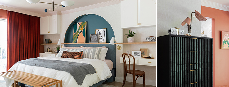
Cozy comfort, influenced by design styles from the past, gets a contemporary update in Plumb’s bedroom design. Ceiling color: Malted Milk SW 6057 (195-C1); bedroom arch color: Mediterranean SW 7617 (281-C6); cabinet color: Alabaster SW 7008 (255-C2). Photo by Nicole Dianne Photography.
Colors and Styles Outside of Time
Our deep appreciation for nostalgic design styles has led us to develop palettes inspired by the iconic looks from past eras. Our color palettes through the decades features a mix of current paint colors and historical collections to welcome a new age of retro-inspired looks.
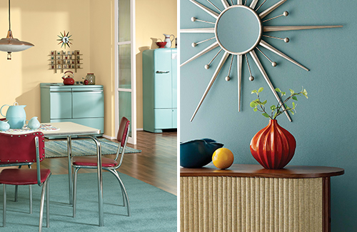
Walls in cheerful Sunbeam Yellow SW 0078 (left), featured in our tribute to the decade of the 1950s, and Moody Blue SW 6221 (219-C5) (right), from the Ephemera palette, make for memorable modern spaces.
We’ve also anticipated that playful reinterpretations of primary colors would experience a resurgence, and some of these trending vintage hues are neatly encapsulated in the Ephemera palette of our Colormix® Forecast for 2022.
The softness of Pink Shadow SW 0070 and Peace Yellow SW 2857—both of them Sherwin-Williams historic colors—joins up with muted blues, rich Basque Green SW 6426 (154-C7), and the peppy pop of Rejuvenate SW 6620 (118-C4) for a palette that inspires us to take another look and a new approach in design.
Photos at top by Nicole Dianne Photography. Ceiling color: Malted Milk SW 6057 (195-C1); bedroom arch color: Mediterranean SW 7617 (281-C6); cabinet color: Alabaster SW 7008 (255-C2); wall color shown on right: Roycroft Adobe SW 0040.


