Close

Designers from California to South Carolina use color to bring character and a sense of sanctuary to screen porches, patios and more.
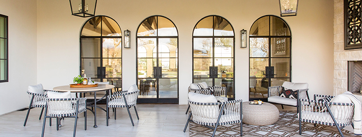
A home’s outdoor spaces provide respite from the busyness of life and a welcome opportunity to retreat into nature’s calm. Whether used for entertaining or as a private escape, these spots offer designers the opportunity to emphasize a home’s architectural features, continue the interior’s style or move in a completely new direction. For the exterior lounge spaces of the home in Chico, California, (above) designer Kerrie Kelly was inspired by traditional architecture found in Spain; California’s Napa Valley; and Santa Fe, New Mexico. “The Spanish farmhouse aesthetic fit well with the inviting, casual livability found in the home’s interior,” Kelly says. A sea of soft white — Snowbound SW 7004 (256-C2) — allows the home’s architectural details to shine. One of those details, patterned tile on the steps, adds a playful accent and complements the custom Palladian doors and steel window frames. Organic materials used in the rough-hewn beams and outdoor fireplace continue the feel of relaxed, transitional living.
Color choices and distinct design details made all the difference for the following outdoor spaces, too.
Cottage Charm
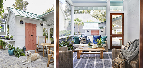
Pops of coral and blue add a summery, coastal quality to the gardening shed, potting area and screened back porch of this Beaufort, South Carolina, home. “I love adding color to spaces to speak to the overall design,” designer Kathryn Lott says. “For this space, I wanted to utilize the traditional shed architecture but add a hint of pizazz.” That pop of color comes in the form of Ravishing Coral SW 6612 (117-C3) on the garden shed doors — just the right shade to complement the shed’s blue metal roof. Extra White SW 7006 (257-C1) on the home’s siding and trim keeps both the exterior space and porch area fresh and bright.
Photos by Laurey Glenn
Breezy Beauty
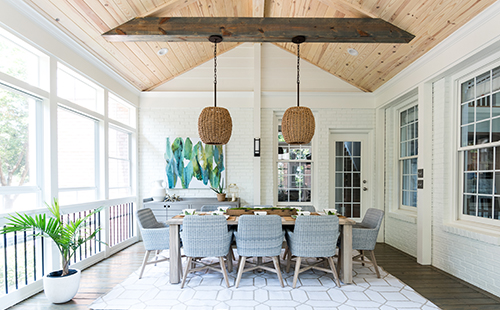
It’s not uncommon for a designer to work on updating the same home over time. In this example from Charlotte, North Carolina, Melissa Lee from New South Home was charged with updating a porch, which sits just off a living room she designed a few years ago with a palette of grays, teals and yellows. “I wanted to continue this color palette into the outdoor space but create some separation by brightening it up with neutrals, taupe and pops of green,” Lee says. “My vision was to make the space feel open and airy but use texture to add visual interest.” Alabaster SW 7008 (255-C2) on the exterior brick and supporting columns keeps the focus on the colors and textures she introduced through furniture, artwork and basket pendant lighting. The ceiling received a coat of Minwax® Wood Finish® Oil-Based Simply White Interior Stain for a natural tone, while Minwax® Wood Finish® Satin Classic Gray Oil-Based Interior Stain on the beams and floor adds contrast.
Photo by Emilie Smith
West Coast Contrast
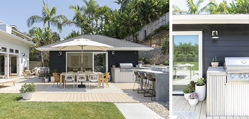
For this coastal home in Carlsbad, California, the backyard provided the opportunity for a style shift. “In coastal style, houses are often white, while Scandinavian design favors moodier little cottages,” says Leigh Jendrusina, principal designer at SALTHOUSE Collective. “I love both design styles, so choosing to mix them was a fun, modern way to add dimension to the space.” A little paint made a big impact in merging the main home’s coastal vibe with the clean lines of the Scandinavian-inspired guest house. Jendrusina chose Caviar SW 6990 (251-C2) for the guest home’s exterior siding, with Pure White SW 7005 (255-C1) trim to echo the main home’s exterior, which is painted the same shade. A mixture of metal and rattan patio furniture, textiles, and pottery in natural tones further ties the multiple lounge spaces together.
Photos by Charlotte Lea Photography
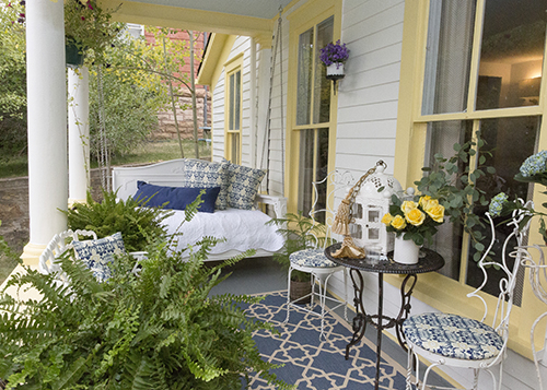
Victorian-Inspired Vintage
The story is in the details for the Johnson House, built in 1867 in Central City, Colorado. Today, it’s a gathering place for the Central City Opera Guild and performers, who partnered with ASID of Colorado and companies including Sherwin-Williams for its restoration. Jennifer Porter of Blue J Interiors worked closely with local historians to honor elements of the home’s background as part of her design process for the front porch. “Since the home was built during the Victorian era, I wanted the design of each space to reflect that time period in an updated way,” Porter says. For instance, she had the pillows and chair seats upholstered in a custom damask fabric depicting the Central City Opera House. A pale blue ceiling, Classical Yellow SW 2865 trim and Extra White SW 7006 (257-C1) exterior paint were color choices also inspired by Southern homes built in the early 19th century.
Photo by Victor Arango
For more outdoor space design inspiration, follow Sherwin-Williams for Design Pros on Instagram.
Photo at top of story by Lindsey King


