Close

We believe that color is for everyone. In fact, we’ve made it our mission to bring beautiful color to passionate professionals and homeowners for more than a century and a half. But while the vast color spectrum offers endless possibilities for personal expression and professional growth, some colors just speak to certain people more than others.
We’re fascinated by the connections that color can create. We asked several designers and color experts to tell us more about what “signature” paint colors define their personal aesthetics, pop up again and again in specific industries, and propel their creative process. Here’s what they had to say.
Tricorn Black SW 6258 (251-C1)
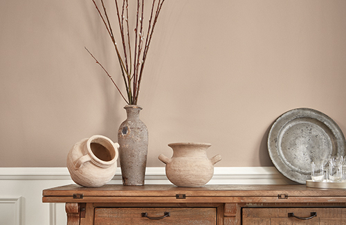
For Bay Area–based designer Ariel Magidson, color is one of the “key ingredients” in the art she creates. “Experimentation is a big part of me as a designer,” she says, and letting old world and new world influences collide is how she stretches her own limits in design. It’s no surprise, then, that her designs favor traditional patterns, colors, and textures alongside ultra-modern touches awash in pretty, grounding neutrals.

“White Sand SW 9582 [Emerald® Designer Edition™], Urbane Bronze SW 7048 (245-C7), and Tricorn Black SW 6258 (251-C1) are three of my favorite bases to start with, and I’ll often add in greens or blues to pull in more of an earthy feeling.” —Ariel Magidson
Images courtesy of Ariel Arts Design Studio.
Solaria SW 6688 (136-C2)
Joann Kandrac, of Kandrac & Kole Interior Design in Atlanta, loves a little brightness and positivity in her distinctive bespoke designs. For her, Solaria SW 6688 (136-C2) is a sunshine-y hue perfect for making a celebratory statement and ramping up curb appeal in exterior designs.

“Solaria SW 6688 (136-C2) screams sunshine, spring and happiness. If you want your neighbors to do a double-take, paint your front door this color!” —Joann Kandrac
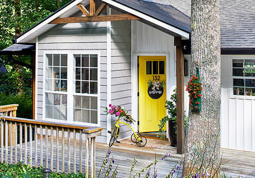
Photo by Lauren Rubinstein Photography.
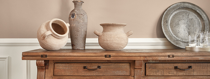
Familiar Beige SW 6093 (200-C2)
Sue Wadden, our Director of Color Marketing, gravitates toward one neutral favorite in particular: Familiar Beige SW 6093 (200-C2). She’s noticed a collective trend toward warmer neutrals lately, and this one “feels at home … modern, fresh and cozy” now more than ever.
“With red and ochre undertones, this relatable neutral gives us a feeling of sustainable luxury and demonstrates versatility in commercial or residential spaces.” —Sue Wadden
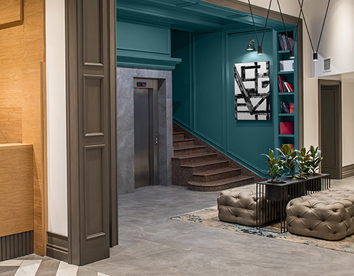
Deep Sea Dive SW 7618 (279-C5)
As our Color Marketing Manager, Emily Kantz curates the Commercial Colormix® Forecast palettes each year. For the hospitality industry in 2022, she’s loving the chameleon quality and subtle mystery of Deep Sea Dive SW 7618 (279-C5), a rich blend of blue and green. Greek Villa SW 7551 (254-C1) gets Kantz’s vote as a top shade for workplace environments, as a clean backdrop for inviting a lightness and brightness into an office.

“This color has the ability to be a backdrop for a historic hotel, adding a bit of mystery of the past; it pairs great with deco furnishings as a sophisticated jewel tone.” —Emily Kantz
Aesthetic White SW 7035 (259-C4)
The design mind behind Patsy Overton Interiors out of Atlanta has found her idea of the “perfect white” with Aesthetic White SW 7035 (259-C4). Overton used it to give a classic exterior a relaxed-but-timeless appeal in pure white perfection.
“It’s not bright, creamy or gray, but in the ‘sweet spot’ for today’s whites. It also plays well on interior walls, adding a little softness against stark white trim.” —Patsy Overton
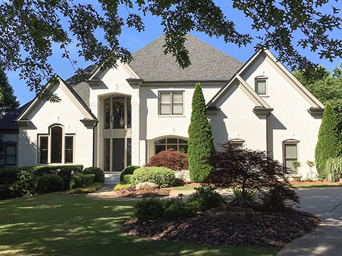
Photo courtesy of Patsy Overton Interiors, LLC.
Sea Serpent SW 7615 (234-C7)
Jenny Warner, a winner of My Home Improvement Atlanta’s top kitchen and bath designers of 2017, favors the “grounded yet bold” Sea Serpent SW 7615 (234-C7) for a little depth and visual interest anywhere it’s used, indoors or out.

“Interested in being a little bolder? Then try painting a cozy family room or study entirely in this color. Whether in a small accent or a whole room, this color is a sophisticated choice.” —Jenny Warner
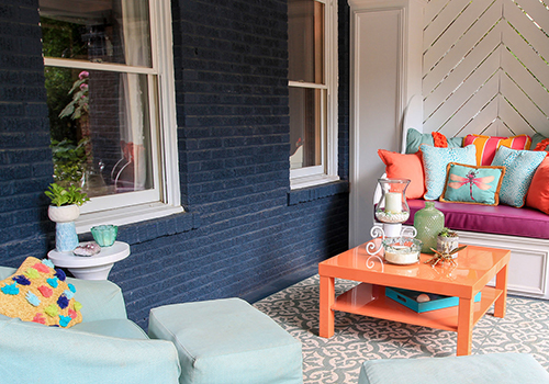
Photo by Krys Alex.
Retreat SW 6207 (217-C5)
For Stephanie Jacobs (SBS Designs), using a go-to hue is all about making the right-size splash. Retreat SW 6207 (217-C5), for example, is “a splash of green that's not too bold,” while Rock Candy SW 6231 (257-C6) creates an airy space made for layering with a dash of wow-worthy color.

"This moody green with a gray undertone is the perfect backdrop for any space when wanting a splash of green that's not too bold." —Stephanie Jacobs
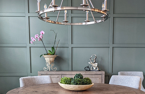
Photo by Kate Koulouris.


