Close


Inside the Sherwin-Williams color forecasting process, including how the forecast was narrowed down to three palettes for 2018.
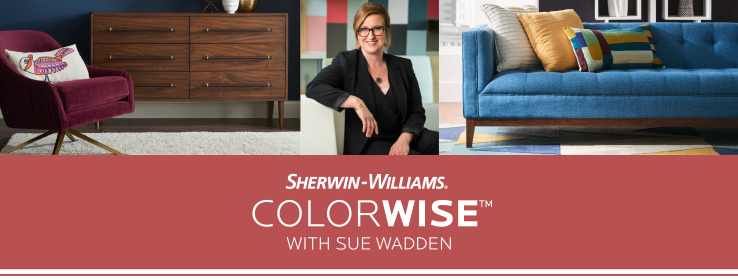
By Sue Wadden, Director of Color Marketing, Sherwin-Williams
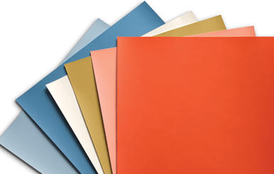
You know that moment in a project when everything falls into place? The furnishings are selected, the lighting has been fine-tuned, and the color and finishes on the walls are bringing everything together. I get the same feeling every year when we release the Sherwin-Williams Colormix® Color Forecast.
My color team spends a full year researching and gathering inspiration, which cumulates in February when we all get in the same room to put our forecast together. It’s three great days of idea swapping and color talk (and, yes, coffee consumption), and we walk out of the room proud to have identified a color direction we can’t wait to share with the world.
It’s amazing how the enormous amount of information we gather finds its way into a final forecast. So amazing, in fact, that I reconnected with my team to get their thoughts on the past year, and what they’re most excited about in the 2018 forecast.
First, meet the color team:
Michael Plank (Color Marketing and Design Services Director)
Carol Derov (Color Marketing Manager, Latin America)
Emily Kantz (Healthcare and Hospitality Color Specialist)
Karrie Hodge (Senior Designer, New Residential)
Patricia Fecci (Manager, Color Solutions, Latin America)
Sabina Jahic (Designer Marketing Manager, South East Division)
What’s the biggest color story in your market segment or area of focus right now?
Carol Derov: In Latin America the color story with the most influence is the continuing arc of cultural migration. New cultures are being woven into daily living in many countries, as immigrants from diverse regions mix with the population.
Emily Kantz: In healthcare, there’s currently a blend of beautiful neutrals in a variety of values that look timeless especially when paired with natural wood and stone elements. In hospitality, moodier jewel tones are making a striking background for hotels.
Sabina Jahic: Biggest color story is definitely the arrival of reinvented Scandinavian style, still calm, but with pops of color.
Where do you first turn to find inspiration for the forecast?
Karrie Hodge: I love to see what is going on in fashion. New Residential is a little bit farther behind than fashion trends, so I can look at what is on the runway now and know that it will eventually translate to residential trends through color, texture or pattern.
Patricia Fecci: I turn to the WGSN platform, Pinterest and bloggers. But I’m also paying attention to my everyday environment. Farmers markets, outside street fairs full of everything from fruits, vegetables and fish to colorful tablecloths and herbal spices — these are great indicators of color direction.
Sabina Jahic: Designers are always right on target. By the time color forecasts start rolling out, designers are already finishing projects that we can use as a confirmation of a forecast, but also as a discovery of what is brewing for a next step.
So, I’m a little embarrassed to admit this, but one of my biggest inspirations for the 2018 palettes was Netflix. I’m obsessed with a series called Chef’s Table! What is the most unexpected place you’ve found inspiration?
Carol Derov: Urban graffiti–turned–legitimate art.
Karrie Hodge: Anytime I travel I always make sure to check out the restrooms of public places. Restaurants usually have interesting themed restrooms.
Michael Plank: Most recently on a vintage 1950s Legnano bike chained up outside a grocery store. It was an amazing metallic version of Nankeen SW 6397 (142-C6); with its paneled paint scheme and distressed finish it still has a quality that seemed fresh despite its 60+ years.
I feel really energized and creative after we emerge from our forecast exploration. What excites you most about our February meeting?
Michael Plank: I love that our brainstorming session runs the gamut — we discuss everything from the headlines to fashion and even favorite foods. It’s the perfect way to delve into the work at hand. So much of what we are forecasting has to do with mood, open discussions really help set that tone and influence the final results.
Patricia Fecci: ... and it is amazing how themes and ideas fit together creating a colorful connection of ideas and concepts.
Sabina Jahic: Yes, together we can see better!

What I love most about our team is our diverse backgrounds and experiences — we’re a unique color crew. What do you think you bring to the table in terms of unique industry viewpoint?
Emily Kantz: I used to work at an architectural firm, so I dove into the commercial side of design looking at what color palettes textile designers use, what’s the inspiration behind a carpet collection, and what wood tones are a manufacturer introducing as fresh and new.
Karrie Hodge: I think I can relate well to the homeowner or homebuyer. While I love bright, vibrant and energetic colors, at the end of the day, most are not going to get painted in a room of someone’s house. If you don’t want it on your walls, then an accent pillow or accessory in the room could make the perfect statement and is much more easily changed out if the trend changes or you don’t like that color anymore.
Talk about the refining process ― what’s it like for you to go from many ideas/inspirations, down to our three final palettes?
Karrie Hodge: I have to ask myself, did we miss any ideas? Was there anything else we need to add? We’re always checking to make sure we are not revisiting recent past colorways.
Carol Derov: I also ask: Is this new? Have I seen this before with another consumer product? Is this applicable to coatings?
How can designers create projects and apply this year’s forecast?
Michael Plank: Many design firms’ market focus revolves around neutrals, so we use that as our starting point. Then we look at how these base colors influence the rest of the palette and determine schemes. So I would advise to start with a base and introduce the more chroma-infused selections from the forecast into accents, trims and feature walls.
Sabina Jahic: Use it when sourcing new material resources. The forecast can help you choose new neutrals and sheens as well.
Patricia Fecci: Use digital color tools! Sherwin-Williams ColorSnap® Visualizer app make the daily routine of creating a color scheme much easier.
Visit swcolormix.com to explore the palettes, and to see the color team in action, watch this behind the scenes video.


