Close

The iconic San Francisco Ferry Building gets a facelift with help from a custom Sherwin-Williams paint color named in its honor — Ferry Building Gray.
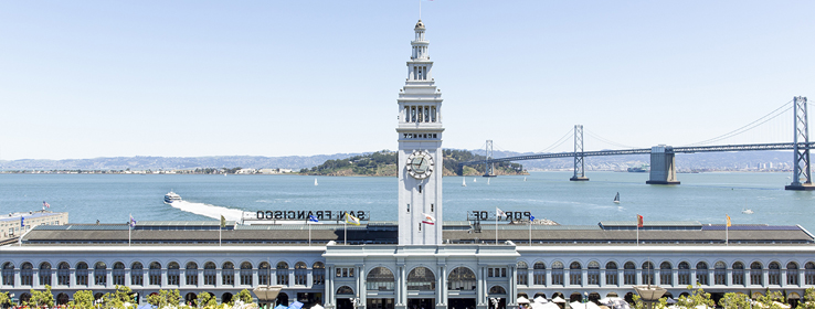
Decades before the Golden Gate and Bay bridges opened to traffic crossing San Francisco Bay, the San Francisco Ferry Building was key to keeping the city connected. Built in 1898, it linked ferries from across the bay with a fleet of streetcars in Downtown San Francisco. In its heyday, it was considered the world’s second-busiest transit hub after London’s Charing Cross Station.
Although the 1950s saw a decline in ferry traffic and a conversion of the Ferry Building’s interior spaces to offices, adaptive-reuse efforts in the early 2000s returned the structure to its former glory. Reopening the building’s Grand Hall — now filled with eateries and shops — represented a key, overwhelmingly well-received piece of that project. But the main exterior color that closely matched the building’s original gray hue didn’t hold up. “It faded rather quickly to a very blue color, which is not the color of the original Colusa sandstone or a color appropriate to the building at all,” says architect Andrew Wolfram, AIA, a principal with TEF Design.
As part of a significant restoration project, Hudson Pacific Properties collaborated with Wolfram and the Port of San Francisco to choose a new color. “We wanted a color that related to the building’s history and that provided a civic quality that was welcoming,” he says. Part of that goal was matching the original warm gray color of the building’s Colusa sandstone, which, following repairs made after the Great San Francisco Earthquake of 1906, had been coated with paint.
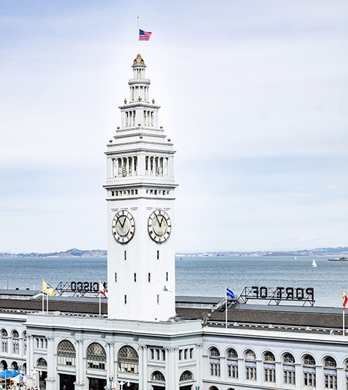
By the end of 2020, the exterior of the San Francisco Ferry Building’s Grand Concourse, which had faded to a bluish color (top) will be painted in a custom Sherwin-Williams gray that more closely matches the structure’s historic color, as shown on a completed section (bottom).
Although previous paint colors attempted to match, doing so then — and even now — proved tricky. “Because Colusa sandstone is a natural material, it has a lot of variation in it, so you could pick a color that might be close to one part of the sandstone but different from another,” Wolfram says.
The team began with digital mockups to narrow the color choices down to three. From there, they worked with Sherwin-Williams to come up with custom colors to match and then painted physical mockups on the south, east and west sides of the building. “We captured different light conditions because the quality of light and the time of day really affects your perception of color,” Wolfram says.
The winning hue was a custom color Sherwin-Williams has named Ferry Building Gray. “The color was chosen in response to the gray-green tones of Colusa sandstone, so it’s kind of a grayish, khaki-ish, greenish color — a very warm, welcoming gray,” Wolfram says. A darker gray for window trim and a warm white for the tower, also custom Sherwin-Williams colors, complete the exterior palette.
Wolfram and his collaborators, including players from the Port of San Francisco and Hudson Pacific Properties, couldn’t be happier. “We are very pleased with the custom-blended Ferry Building Gray that preserves the Ferry Building’s historic roots while restoring and repairing this civic landmark,” says Jane Connors, the Ferry Building’s general manager. “As we unveil the completed sections of the building, we are getting excellent feedback from our merchants and visitors alike.”
Work, including related repairs, is scheduled to largely wrap up by the end of 2020. “As we continue this significant restoration project, we are committed to ensuring the Ferry Building remains a vibrant, historic and beloved icon in the city’s fabric,” Connors says.
3 Other California Landmarks With Sherwin-Williams Coatings
The San Francisco Ferry Building is the latest in a lineup of Golden State landmarks that stay looking sharp with Sherwin-Williams paint. Here are three favorites.
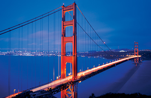
The Golden Gate Bridge
The rich vermillion hue of San Francisco’s most recognizable landmark was chosen by architect Irving Morrow to contrast with the Marin Headlands’ ochre vegetation and the Golden Gate Strait’s waters. A team including 28 painters and five painter-laborers uses up to 10,000 gallons of Sherwin-Williams coatings a year to keep the bridge looking bright. In response to numerous requests, the Golden Gate Bridge, Highway and Transportation District has shared the formula: 0% cyan, 69% magenta, 100% yellow and 6% black. Fireweed SW 6328 (114-C7) is the closest off-the-shelf color.
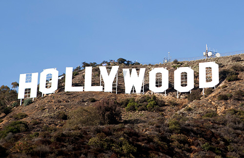
The Hollywood Sign
Now nearly 100 years old, this treasured landmark underwent its last major refurbishment in 2013. The sign was primed with 105 gallons of Pro Industrial™ Pro-Cryl® Universal Acrylic Primer and then painted with 255 gallons of Emerald® Exterior Acrylic Latex Paint in Satin. The color, High Reflective White SW 7757 (256-C1), provides just the right pop.
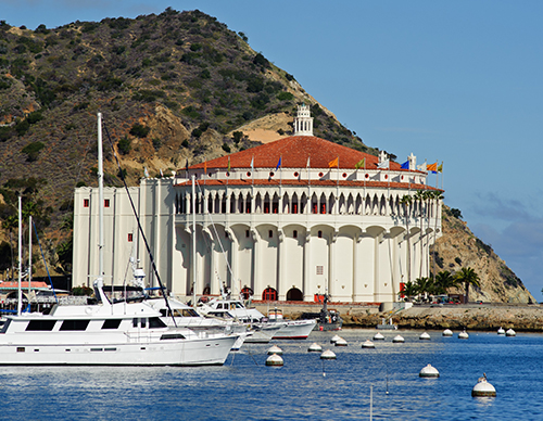
Catalina Casino
Built in 1929 by chewing gum tycoon William Wrigley Jr., this Catalina Island landmark underwent a major refurbishment in 2012 that included painting the façade with A-100® Exterior Acrylic Latex Paint in a custom color blended to match the original warm white.
Photos of San Francisco Ferry Building by Nat and Cody


