Close

This Sherwin-Williams palette — including our 2020 Color of the Year, Naval SW 6244 (253-C6) — fosters a sense of well-being and complements the latest furnishings and holiday décor from West Elm.
A fresh, modern take on decorating and entertaining extends to every corner of the first-ever West Elm Holiday House, a 3,300-square-foot condo near Union Square in New York City. That includes the color palette, where Sue Wadden, Sherwin-Williams’ director of color marketing, chose hues that demonstrate color’s connection to mental, physical and emotional well-being. Here are our favorite spaces.
Living Room and Kitchen
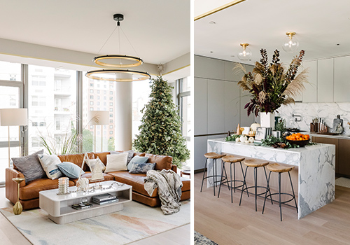
Alpaca SW 7022 (241-C1) brings comfortable sophistication to the living room and kitchen. The hue balances cool and warm tones, complementing the rooms’ other surfaces, including pale wood floors and a marble-wrapped kitchen island, backsplash and countertops.
Bedrooms
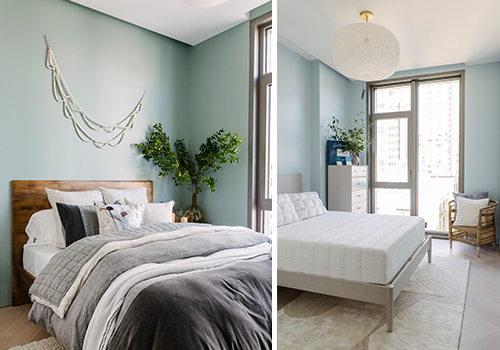
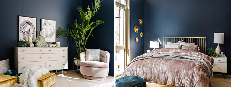
Restful hues create a feeling of refuge in the condo’s three bedrooms. In the master suite (shown at the top of the story), our 2020 Color of the Year, Naval SW 6244 (253-C6), evokes a sense of calm, inspiring well-being. Halcyon Green SW 6213 (218-C3), which covers the bedroom on the left, is a color with a special story: In Greek mythology, the fabled halcyon bird held the power to calm the wind and waves so it could nest on the sea during winter. Sleepy Blue SW 6225 (220-C1), used in the bedroom on the right, has a soft, healing quality that fills the space with a sense of tranquility.
Want to Learn More?
Watch our broadcast from the West Elm Holiday House as Sue Wadden; Genevieve Gorder, celebrity interior designer; and Jonathan Orr, vice president of product development at West Elm discuss the connection between color and wellness.


