
COLOR COLLECTION
Living Well™
A collection of colors and paints carefully chosen to invite a sense of comfort, style and well-being into your home.


A PURPOSE BEYOND PAINT
Pairing exquisite color palettes with innovative paint formulas, Living Well™ is a smart choice for the well being of your home.

Sue Wadden
Sherwin-Williams Director of Color Marketing
Explore the Coordinated Color Palettes
Discover a curated set of complementary shades to help bring your vision to life.
A Sanctuary for Stillness
Paint Colors that Promote Reflection
When the mind is cluttered, you need to create a space that encourages introspection and strips away the excess. Soft, atmospheric grays like Silverpointe and cool whites like Zurich White act as visual hushes, fostering tranquility and reducing stress. These shades are perfect for bedrooms where you want light airiness throughout the day and a calming retreat at night, where thoughts can settle in preparation for deep sleep.
Creating Space for Thought
The art of creating a space for productive contemplation means creating a space that feels clear of distractions without being stark. Striking this balance requires choosing the right colors with the right undertones. Foster focus and tranquility in your home office with Quicksilver’s blue-green undertones or Fleur De Sel’s faint green undertones. If you want to encourage balance in a reading nook, the subtle warmth of City Loft’s beige undertones keeps the space from feeling stark while still promoting reflection.
Creating Balance at Home
Rooted in Nature’s Calming Hues
Design a space that invites a deep exhale. Colors that are reminiscent of fresh greenery are perfect for bedrooms and bathrooms where you want to feel rejuvenated. Deep, organic tones like Cascade Green and Contented act as a visual anchor, grounding the room in the lush tranquility of a forest floor. For a lighter touch, atmospheric grays like Chatroom and Unusual Gray capture the stillness of morning mist, offering a soft, serene backdrop that encourages mindfulness while still incorporating soft green undertones.
Ground Yourself in Comfort
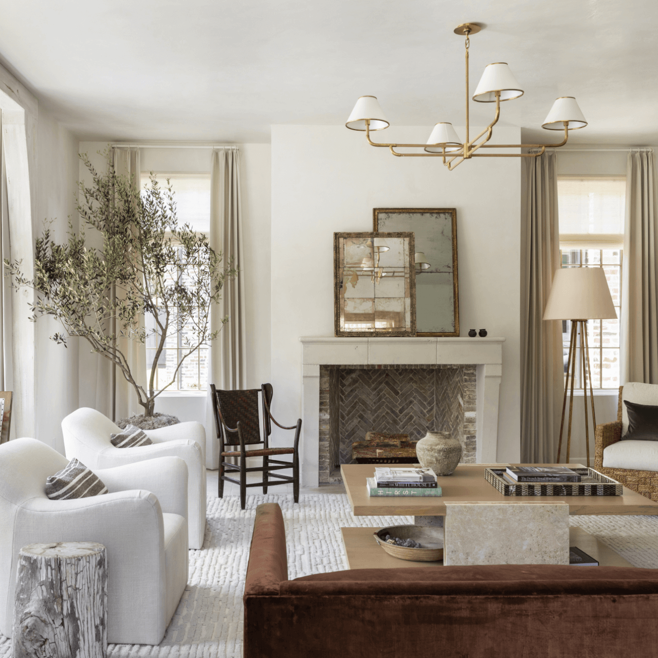
Balance requires a steady foundation. Whether you’re redecorating a living room or trying to invite calm into a bustling kitchen, warm neutrals offer timeless versatility. Bridge the gap between cool gray and warm beige with earthy greige tones like Accessible Beige and Sandbar. For crisp energy that doesn’t feel stark, creamy, reflective whites, such as Dover White, will help brighten a space’s darkest corners. For a touch of cheer that isn’t too energetic, try soft yellows such as Ionic Ivory or the green-tinged Lemongrass.
Creating Spaces to Breathe
What is the Calmest Color to Paint a Room?
Calm comes from clarity, and removing visual clutter will get you closer to the calm you seek. Opt for warm neutrals such as Simplify Beige that make small bedrooms or offices feel clean and expansive without being too stark. If you prefer white space, creamy whites like Panda White and White Heron act as palate cleansers for the mind while still making the space feel spacious and clean. Even darker tones like Truly Taupe can promote mental clarity thanks to their earthy, violet undertones.
Wrap Your Room in Warmth
Crisp spaces don’t have to be cold. The Breathe color palette is all about pairing purity with warmth. Layer in muted earth tones such as Classic Sand and Sand Trap that mimic the restorative properties of the coast, creating a space that feels like a gentle embrace. For a softer, more emotional connection, Chelsea Mauve and Pinky Beige introduce a hushed influence that offers a physically soothing presence, adding peace without overstimulating the senses.

Paints to Invite Well-Being Home
SuperPaint Products

What's Inside the Living Well Collection?
What's Inside the Living Well Collection?
The Sherwin-Williams Living Well collection combines curated color palettes and advanced Living Well paint products that promote your general well-being. As you explore these refreshing palettes, perhaps you’ll discover the perfect green neutral like Lemongrass and turn your space into a welcoming haven of nature-inspired hues. Or you might be drawn to the cool slate gray of Let it Rain for a more relaxed vibe. Finally, bring the theme of living well full circle with a Living Well product like SuperPaint® with Air Purifying Technology or SuperPaint® With Sanitizing Technology.
The Sherwin-Williams Living Well collection combines curated color palettes and advanced Living Well paint products that promote your general well-being. As you explore these refreshing palettes, perhaps you’ll discover the perfect green neutral like Lemongrass and turn your space into a welcoming haven of nature-inspired hues. Or you might be drawn to the cool slate gray of Let it Rain for a more relaxed vibe. Finally, bring the theme of living well full circle with a Living Well product like SuperPaint® with Air Purifying Technology or SuperPaint® With Sanitizing Technology.
Choosing a Color? Try Our New AI Experience
Ask questions, get inspired and find the best shade, tint or tone for your next project.


Color Selection Made Simple
Color Selection Made Simple
Our color experts offer guidance so your home and color feel truly you.
Our color experts offer guidance so your home and color feel truly you.


