Close

You can successfully incorporate orange walls in your design by choosing the right rooms, complementary colors and accessories.
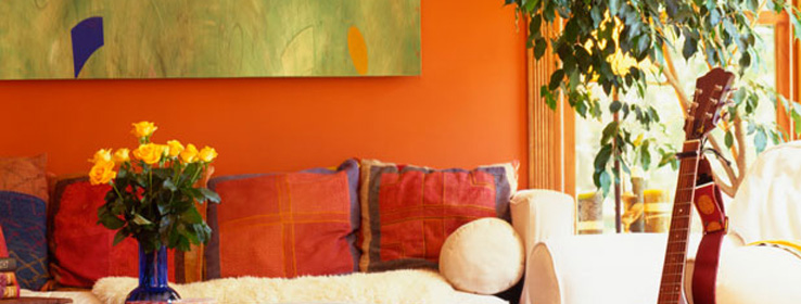
Orange is a vibrant, happy, social color. An orange wall can bring a dynamic energy to any room. It can simultaneously brighten a space while warming it up. Paired with the right colors and accessories, a large swath of orange can make a room really shine. But orange walls haven't always been an easy sell to homeowners.
"People are just now getting comfortable stepping outside the beige box," says Los Angeles-based interior designer Kenneth Brown. "Orange has finally become something that I can mention to clients. They used to think, 'What are you talking about?' and now they are saying, 'Let's give it a try.' They're realizing that orange has a really dramatic, beautiful effect."
An orange wall need not look like a giant homage to the citrus fruit; many different hues of this inviting, invigorating color exist in the paint world. Patricia Gray of Patricia Gray Interior Design in Vancouver, British Columbia, has selected three Sherwin-Williams paint colors that she feels illustrate the diversity of orange:
Husky Orange (SW 6636): "Husky Orange features rusty tones with more brown in it, and I find that this color is a lot more acceptable to a broader range of people. It is one of my favorite colors for using in living rooms, libraries and family rooms."
Tango (SW 6649): "Tango is what I would call more of a mid-range orange, a current and hip color. I would use it for a focal wall in the living room or dining room; it would also be fun for an entryway."
Kumquat (SW 6648): "Kumquat is beautiful because it tends to go into the peach tones, but it's an upbeat and livelier tone than what we were inundated with in the '80s. I find that Kumquat is very relaxing and soothing, which makes it ideal for a bedroom, sitting room or anyplace where you want a quieter mood."
Brown also believes that orange has its place in certain rooms of the house. For homeowners looking to dip their toe in the water, Brown suggests painting a wall orange in the dining room. "This is one room where you really want to have a big impact," he says. "You can take it to a bit more of a dramatic level than, say, a room you're going to live in all the time. The color works on two levels. You add to the dining experience, and it also adds to the drama of the house. And to me, there is something so appetizing about an orange dining room."
Orange walls are also well-suited for sunrooms and kids' playrooms. "I am never afraid to use orange in spaces where you want to create social interaction, energy or a lot of spirit," Brown says.
Like any dramatic color used abundantly, orange needs its counterparts. "White or cream help balance the heat of the color," Gray says. "Chocolate browns and charcoal grays are also accents that balance and coordinate nicely."
"Don't be afraid of your complementary blues and greens," adds Brown. "That doesn't mean you want to paint a blue wall across from an orange wall, as it will vibrate too much. Rather, consider placing two blue vases against an orange wall, and then throw in a couple of green pillows on a neutral surface, such as a sofa or chair."
Teal in particular is becoming a favorite color among homeowners for decorative accents against orange palettes, Brown notes. The designer completed a project where he created an orange accent wall and complemented it with very soft baby blue furniture. "The two together worked beautifully – offering serenity and spice," he recalls. Additionally, Brown believes that orange "is a great backdrop for black-and-white prints or to showcase your fabrics."
When it comes to selecting art for your orange walls, Brown urges caution. "Remember that an orange wall can sometimes act as the artwork in the room," he says. "So you don't want to overpower the wall with another piece of popping artwork. It will be a little too distracting for the eye."
The key to accessorizing and complementing orange walls, of course, is balance. "Teal and orange do work well together, but that doesn't mean you can't have something small that's yellow, green or purple," Brown says. "It's OK to bring in other little spots of color, but it's about creating balance, and that's what designers do very well."


