Close


Helping your client recreate a color palette and design scheme that may not jibe with the region in which they live.
Interior designer Sarah Barnard of Los Angeles received an interesting request from a young professional client who'd recently been on a cruise to Antarctica. "In the initial client survey, I asked her what she wanted her home to look like, and she answered, 'Like living on a glacier,'" Barnard recalls. "Our task was to capture the concept or memory of being near this glacier, then recreating that feeling in her home."
Many homeowners like Barnard's client want to convey a style in their homes that may not jibe with the region in which they live. It makes sense, Barnard says. "You get out there and face the real world, do your job, drive in traffic, hustle to the market. When you walk in your front door, you want to be swept away to someplace that gives you warm, happy, relaxed feelings. Our unconscious mind wants to model our environment after that good place, whatever it might be."
Implementing a color palette and design scheme not native to an area (for example, a Southwestern style in a Midwestern bungalow) takes careful consideration. "Homeowners can introduce influences from other regions by purchasing art, bringing home artifacts, collectibles, textiles and native crafts," says Seattle-based interior designer Robin Chell. "You can create repetition through shapes and colors, display like items together and highlight certain objects."
A great way to pull together a "non-native" look is through paint. "A complementary background palette can seamlessly integrate all the items," Chell notes. "Paint is crucial in mixing styles and making them feel cohesive. Color can create contrast, excitement, serenity. It can create mood and tell a story. Especially when creating a theme, color can add both boldness and subtlety to a space."
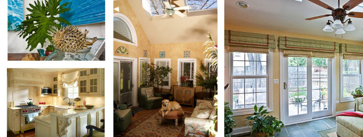
Paint played a big role for a Chicago-area husband and wife who wanted to make their primary home more reflective of their condo in Florida. The Florida space was filled with white, ivory and other light hues, not to mention loads of natural light. By contrast, their Midwest residence conveyed a more rigid, traditional feel. To recreate the Florida vibe, designer Joan Kaufman of Interior Planning & Design, Inc. in Naperville, Ill., introduced a palette of aquas and celadon greens in a new sunroom encased by windows. A ceramic tiled floor with radiant heating warms the room and makes it usable year-round. Kaufman brought a similar color palette into the adjacent kitchen, where light green and red accents in the backsplash, window treatments and accessories provide unity.
What's more, the project serves as a good example of scale. "The key to pulling off [non-native design] is having a space that can handle it," Kaufman says. "If you have a specialty room like a sunroom or music room, it's easier to do it. But if you want to carry that look throughout the entire home, the spaces need to coordinate and connect with one another."

When crafting a regionally inspired space, Barnard, for one, tries to avoid literal interpretations of place. For example, one of her clients wanted his Southern California home to reflect the Caribbean – a place where he could retreat after long hours at work and traveling for business. He got a head start by incorporating statuettes, towels, potholders and toothbrush holders adorned with palm trees. "Everything was kind of kitschy," Barnard recalls. "His challenge was to get a few feet away from the literal interpretation of the islands [so we could] capture the essence of what it might be like to live there. The key is committing to your theme without falling off the deep end."
The result: A neutral wall color with pops of brown, green and blue, along with subtle hints of island life. "It's a masculine space that ended up being a minimalist interpretation of the island," Barnard notes. And for her glacier-inspired client, Barnard forwent obvious things like ice-like Lucite seating in favor of a serene atmosphere enhanced by cool whites and grays, slate blues, taupes and browns, along with contemporary furnishings and upscale textiles.
For another client – a woman whose family moved from the East Coast to California – Barnard created a cottage-style aesthetic. "She came to me armed with a binder full of magazine tear-outs and photos of their previous homes to show me what she loved," says Barnard. To enhance the already sun-drenched home, Barnard incorporated a creamy yellow on the kitchen cabinetry and bathroom tiles.
Above all, a designer should consider the home's architecture before committing to a non-native color scheme. "If you have a Cape Cod house, to me that represents blues, whites, yellows and other fresh colors," says Los Angeles-based interior designer Donna Livingston. "I would probably not use that palette for a house in Aspen that has a stone or cabin look."
Still, that doesn't mean you can't incorporate items from other regions or countries. In an ultra-modern penthouse in Seattle, Chell integrated her client's primitive artwork collection – from Native American and Indian artists as well as work from the Maori people of New Zealand – using floating glass shelves, wall niches and fireplace mantels set against a soft, neutral color palette. "Color was very important in tying together a collection like this," Chell says. "Everyone who enters the space says it takes their breath away."


