Close


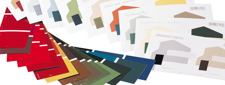
Looking for design inspiration? Just spin the color wheel and see what happens.
"All colors are the friends of their neighbors and the lovers of their opposites." — Marc Chagall
If you're looking for a striking color scheme that will wow your client, or are concerned that a dominant color in your design is going to be overwhelming, the solution's as easy as looking at the opposite side of the color wheel. Complementary colors, when used correctly, liven up a room in a way that's also soothing and pleasing to the eye.
The most striking, colorful and sophisticated designs often incorporate complementary colors, such as blues and oranges, yellows and purples, and greens and reds. Why? Because when the eyes are overwhelmed with one color, both the eye and the brain seek the respite associated with the color's complement. Says Michael Scott, design director for Robb & Stucky Interiors in Scottsdale, Ariz.: "Complementary colors make you feel good! Using them gives you a clean, fresh feeling based on the contrast of color." But the technique must be applied carefully.
"When the complementaries are used at a high level of intensity in nearly equal quantities, [they] can become strident and harsh," writes designer John F. Pile in his book Color in Interior Design. Designer Ashley Phipps agrees in a recent Design Dazzle blog article, "When placed beside each other in equally intense forms, they can almost appear to vibrate."
However, when used with restraint, the effect can be lovely and even soothing. "Each of the hues balances and gives relief from its complementary in some way that seems to offer visual and psychological satisfaction," Pile writes. He recommends using one of the colors in large quantity but at a low intensity, while using its complement in a more intense hue but only as an accent, such as a pale green room with pops of red in the accessories.
Dallas-based Designer Glen Boudreaux agrees with the need for a light hand. "When you look at complementary colors, they're a little more exciting and add a bit more vibrancy to a room, but the intensity of complementary colors can be a bit overdone. So if you go to a medium value, there's still contrast but it's not as intense. When you go to pastels, you can even get a Zen spa-type effect." He warns that complementary colors in their purest, brightest form can remind you of a sports-team logo or a children's space.
If a client is in love with one color and wants it to permeate a design, the best way to make sure the eye isn't overwhelmed is by adding hints of its complementary color. According to Scott, "We all want to refrain from the matchy-matchy pitfall. To avoid this, the use of complementary colors is a sure way to make an exciting, accurate choice." As a cautionary tale, Phipps relates a legend of a Hollywood star who demanded so much purple in her interior that the tan carpet appeared yellow to the beholder, whose eye was so overtaxed by the purple that it sought relief by perceiving the tan as yellow.
A successful complementary color scheme requires a careful balance of daring and moderation, but when done right, the effect can be both tasteful and exciting. Says Scott: "If you're going for drama, using complementary colors is the easiest way to achieve that dramatic effect."


