Close

DeafSpace design leverages the power of color to make interiors easier to navigate, safer and more welcoming to their inhabitants.
by Amanda Lecky
Using color to create a mood or to make a space look brighter, larger, or cozier — as a functional element of design — is something designers do all the time. DeafSpace design, a discipline developed at Gallaudet University in Washington, D.C., the only liberal arts institution in the world geared specifically to the needs of the deaf, pushes color into more-functional roles: wayfinding tool, safety guard, and conversation backdrop, to name a few.
Architect Hansel Bauman, Executive Director of Campus Design and Construction at Gallaudet, is one of the leaders in this emerging design field, which has applications far beyond campus. “Many of the principles we’ve developed, including the use of color, make spaces more comfortable and easier to navigate for everyone, not just the deaf, hearing impaired, or visually impaired,” he says. Architect Hope Mitnick of Odessa Architecture in San Francisco, who consulted on the color palette for many new and renovated spaces at Gallaudet, agrees: “DeafSpace design is really just humane design.” Here are three smart DeafSpace color strategies that can improve any project:
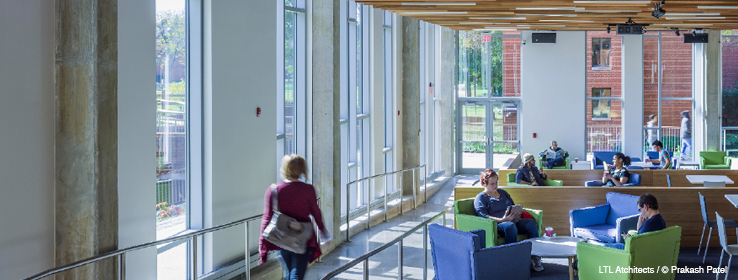
Define space with color and contrast. “Think about walking down a hallway with someone or a few people and talking as you walk. When the deaf do that, they’re looking at the people they’re signing with and navigating the space at the same time, so they’re not always looking straight forward and they’re constantly scanning for obstacles, the edges of the room, stairs. We use color and contrast to provide quick visual clues to make that process safer and easier,” Bauman explains.
A tall baseboard or chair rail in a contrasting color, for example, can indicate the presence of a wall and direction of a hallway; a doorway framed in a different color stands out from afar; a ramp or hallway in a new color can indicate a change of location and help people visually locate themselves in a large building.
Keep the palette cool and calm. “Because the deaf communicate visually through sign language, we wanted to use colors that provided contrast with the warm shades of skin tones — so the people signing were easier to see — and that didn’t create a lot of visual distraction,” Bauman says.
The team tested many colors by filming people signing in front of different shades, then asking for feedback, and settled on a palette of soft blues, greens, and gray-based white (Sherwin-Williams’ Eider White (SW 7014) is the go-to white for the entire campus) with the occasional umber or red thrown in for accent.
Stay away from reflections. “For the deaf, who rely so heavily on their eyes to communicate and to scan their environment, eye fatigue is a real problem,” Bauman says. “Colors with a lot of reflectivity, like bright whites, require the pupil to work very hard,” Mitnick says. Accordingly, the design team chose white with more gray content, and easy-to-see colors like green.
For the same reason, flat finishes work better than shiny, glossy finishes. “Most facilities departments prefer semi-gloss or at the very least eggshell for cleanability, but wherever you can it’s better to stick with flat, which absorbs the light and is a bit easier to see,” Bauman says. “And the best flat paints today are actually very washable, so there’s no reason not to use them.”
To re-create the DeafSpace environment, start with Emerald® Interior Acrylic Latex Paint or Duration Home® Interior Acrylic Latex Paint both available in the industry’s first cleanable true flat finish. And watch how advanced technology means you won’t have to sacrifice performance for appearance when using a flat finish.
Image Credit: LTL Atchitects / © Prakash Patel.


