Close

A Midwestern cathedral returns to its gilded Roman roots.
Hidden behind the stone walls of a church in Springfield, Ill., is a little slice of Italy.
From the outside, the Cathedral of the Immaculate Conception is a true model of American architecture, designed in keeping with the "American Church Plan” popularized by architect Asher Benjamin. The interior, however, draws inspiration from the Basilica di Santa Maria Maggiore in Rome, which dates from the 5th century and is considered one of the greatest ancient basilicas.
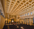
Built in 1927, the Springfield Cathedral once boasted a sanctuary worthy of its European ancestors. But the decades had dimmed its luster. It took a team of restoration experts to bring it back to its original splendor.
For help, the church called upon Wisconsin-based Conrad Schmitt Studios, a family firm that's been in the craftsmanship business since 1889. Together with Springfield's Graham and Hyde Architects, the team did a "color investigation" removing layers of dirt and paint to expose the original colors and finishes.
Armed with that information, the team developed a sketch of what the interior once looked like, then created an on-site model to dramatically demonstrate the impact and vibrancy that a restoration would bring. Once the scaffolding was removed, the floor-to-ceiling mock-up literally glowed with gold.
"Our goal was to go back to the original inspiration of the Basilica di Santa Maria Maggiore," says Heidi Emery, vice president of Conrad Schmitt Studios, who oversaw the 10,000-hour project.
The plan included a palette of 18 colors even more reflective of the Roman interior than the original Springfield one. When the cathedral was repainted in the 1950s, the gold disappeared, blue overtook the ceiling, and the entire color scheme was muted. Emery vowed that the new palette would still be subdued, but that the ceiling would be opulent and "pay homage" to the one in Rome.
Regal palette
For the task, Conrad Schmitt used all custom-mixed colors, including warm gray, taupe and ivory tones, lavishly accented with 23-karat gold leaf — a palette very similar to the Santa Maria Maggiore. The colors complemented the existing finishes of the cathedral's scagliola (plaster columns that resemble marble) and the marble features in the space.
Before anything could be primed or painted, the cathedral needed an extensive cleaning to remove dirt and candle soot. The team repaired deteriorated areas of plaster. The fluted scagliola columns also needed repair; large seams had split open and were carefully filled with matched pigment. Attention and repair were also given to low relief panels and griffins around the room” the latter a wink to Bishop James Griffin, under whose leadership the church was built.
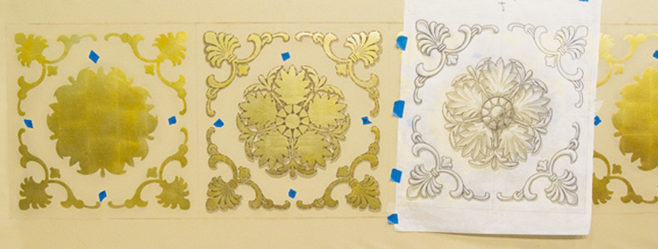
The biggest undertaking was the ceiling, where 190 five-foot coffers each needed a nine-layer application, including stenciling, painting and carefully tinted aluminum leaf. New rosettes — based on the Roman interior, but not original to this cathedral — were made, using a technique known as trompe l'oeil (or "fool the eye"), to look three-dimensional.
To achieve an opulent Old World look, the team used multiple Sherwin-Williams coatings, including ProMar® 200, ProGreen® 200, Duration Home® and a Faux Finish Glazing Liquid, which added depth and dimension to bas-relief panels and moldings.
Painting was intricate and complicated, made more so because the ceiling coffers also served a structural purpose: Many of them needed to hold lights or canvas acoustic panels.
"Our challenge was to contemporize the acoustic environment in the space," says architect Jim Graham. The canvas panels (a combination of flat and concave surfaces all carefully disguised in the coffers) dramatically improved the quality of the organ music. "We needed to reflect and distribute sound, not absorb it."
Delighting in color
Creating and painting the ceiling coffers was such a multifaceted project that many of them were produced in studio and later installed on-site. Both Graham and Emery were gratified when they weren't able to tell visually which ones had the acoustic panels. Even up close you can't tell, Graham says, recalling the team huddling on scaffolding to inspect and instead marveling at the paint technique. "That's what it's all about — delighting in what color can do," he says.
Fortunately, others marveled too. The finished project has won a handful of awards, including the Religious Architecture-Restoration Honor Award and the Painters and Decorators Contractors of America Commercial Restoration Award.
"We really wanted to emulate the gold feeling, just as the "We really wanted to emulate the gold feeling, just as the Roman church did," Emery says. "It's an elegant, holy place; the gold is opulent, but not overdone."
The cathedral's Father Peter Harman enjoys watching people's reaction in his church. Some initially felt the restoration wasn't necessary and pushed back. Now he says they all come in and just stand there, looking up.
"Without exception, everyone who came back and saw it said, 'Oh, my heavens, this is what we remember and more so,'" Harman says. Since returning to the cathedral after 14 months of keeping his parish together at various local churches while the restoration took place, he appreciates how the large space has become both bright and warm. While it was always a beautiful space, he says, "This is the way it was supposed to be."
What's old is new again
The ceiling treatment in the Cathedral of the Immaculate Conception was a careful nine-step process, designed to recreate the look of the Basilica di Santa Maria Maggiore in Rome. Each of the 190 coffers required sizing, stenciling and leaf, as well as an intricate trompe l'oeil technique to create the rosettes. Three different pigment tones added highlight and shadow. Final glazes were applied to add just the right amount of sheen.
Here's how Conrad Schmitt Studios achieved the look:Base coat of Sherwin-Williams Duration Home® in matte finish.
Sizing (adhesive) for metallic leaf. (The sizing is stenciled on and allowed to dry to the appropriate tackiness).
Aluminum leaf (used to create dimension with gold-tinted varnishes).
Six applications of tinted varnishes and stencils, layered to create highlights and shadows.
Jennifer Blaise Kramer is a Minneapolis-based writer and editor.


