Close

By Lynn Bronson
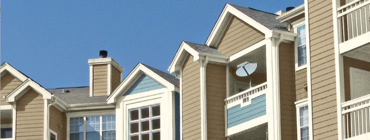
Architects and designers consider many factors when choosing colors for a multi-family facility.
It's a delicate balancing act to choose just the right colors for a multi-family residence. There's much more at stake than pleasing one client. The designer or architect must consider four major factors: the architecture of the building, the character of surrounding buildings, the culture and history of the region, and potential buyers and residents. Finally, it's always good to stay on top of the latest trends in color.
The building
Size, style, and existing or specified materials can all influence paint colors. Multi-family residences can be overwhelming in size. The right colors can give balance, scale and visual relief to an otherwise intimidating building.
"We find that using color to differentiate architectural elements or individual buildings within a complex works to create variety," says Seth Anderson of Ascent Architecture in Bend, Oregon. Careful color choices can give large buildings a more human scale, as well as help guide the eye to important elements. David Eisen of Abacis Architects in Boston also uses color to differentiate parts of the building and help break down the mass. "You don't want one big beige building."
Anne Diedrich, interior designer at Sherwin-Williams, specializes in helping with strategic color palette development. Her clients are looking for color concepts they can choose with confidence — painting or repainting a multi-family residence is a big investment and missteps can be expensive.
Diedrich begins with a careful analysis of the existing building, or plans or specifications for a new building. "What building materials and decorative elements are used on the exterior? I take inventory of existing finishes, like brick and stone. Because they're fixed elements, color selection needs to coordinate around those." Then she finds out which areas of the exterior the client wants to highlight. Is it a featured entry? A terrace? A solar roof? The trim around windows? Contrasting colors can help those pop.
The neighborhood
The surrounding community and local architectural style will have a big impact on color choices. Multi-family residences should fit in with the neighboring buildings and streetscape, but not necessarily disappear. Color can go a long way toward helping a building stand out― in a good way.
Eisen puts it this way: "We want to have the best-looking building on the block. Not the brightest, or the darkest, but the one the eye is drawn to." Anderson wants to make sure his buildings say something, too. "It's about creating an identity. It doesn't have to be in your face, but something that makes it unique. Architecture ensures the building fits with the surroundings, while color creates a difference that helps it stand out."
The region
Regional color preferences influence exteriors more than interiors for multi-family residences. "Thinking about geographical location is key," Deidrich says.
While earth tones are popular nationwide to coordinate with natural building materials such as stone and timber, there are some distinct regional preferences, especially when looking at accent colors. Deidrich breaks it down this way:
Northeast: Patriotic and nautical-based hues and deeper reds.
Southeast: Vibrant, saturated colors with a sense of warmth and charm, such as oceanic blues.
Midwest: Traditional earth tones that reflect the colors of the landscape.
West: Darker colors, rich reds and gold-based yellows.
Southwest: Lively hues with a rustic twist.
Anderson's firm has done projects in Texas and finds a little more leeway for true brights in communities closer to the border with Mexico. In Boston, Eisner stays away from all-white schemes because they read as colonial and too traditional — he looks for historic colors that have a contemporary flair.
The residents
Will the building be home to young families? Retirees? Professional couples on the move? Every designer and architect thinks about the type of prospective residents, because ultimately it's about sales and attracting buyers and tenants.
"Our clients who own or are building facilities for seniors want to make sure the residents are comfortable. The residents are often coming from a single-family home and it may be their first time living in an apartment. We try to use colors similar to what they're used to," Anderson says. Whether it's the familiar colors of Craftsman homes in Atlanta or red brick houses in central Texas, context matters for these clients.
Mark Peterson of Paraline in Atlanta has found that when he designs for first-time homebuyers and younger families, he can play with color a little more and make the buildings more distinctive. "They want to identify with their home and be proud to say, 'that's my building, that's my unit.'"
In Atlanta, developers are sometimes required to get input from the community. Peterson and his firm consider it a highly valuable exercise — a way to survey prospective buyers or tenants. "We try not to design in a vacuum. Community input has helped guide the color and material choices for many of our projects."
Diedrich believes a well-thought-out color scheme can provide distinction in a crowded market. "You have one chance to make a great first impression. With all the technology people use to look for homes ― from tablets to smartphones to computers ― exteriors really do need to make an impact, and not just in person."
Guide to choosing colors
Our new Multi-Family Color Collections provide building designers, managers and owners with inspiration and guidance on exterior color choices, including several palettes that work well separately or in combination. Whether you're designing a brand-new building in an up-and-coming neighborhood or refreshing an existing building in an established area, this brochure can help with the color selection process.
The latest trends
Every year, Sherwin-Williams creates a new color story and companion color guide for the multi-family market segment, featuring color trends and recommendations for that year. The 2014 color story focuses on the millennial generation.
Get started
The Multi-Family Color Collections provide a range of hues — cool and warm, bold and calm — that can work for both traditional and modern buildings. Consider these a starting point for your own color exploration for multi-family residences.
Have you ever been involved in designing multi-family exteriors? Share your thoughts and stories with us (@SWDesignPros) on Twitter using #SWStir.


