Close

By Kitty Shea
STIR talks with Old House Authority's color consultant, John Crosby Freeman, who specs period paint jobs.
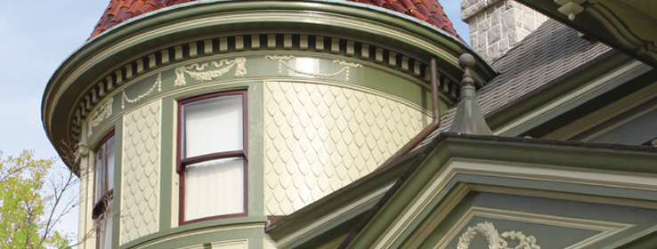
In history-rich Richmond, Va., homeowners making improvements to their period properties are keenly aware of their responsibility to honor architectural history, both on the inside and outside of their houses. So when it comes to color, many residents pick safe palettes or don't know what to do.
Richmond natives and preservationists Walter and Jennie Dotts, founders of Old House Authority, help alleviate this paralysis. Working with John Crosby Freeman (also known as "The Color Doctor"), they offer interior and exterior color consultation with a heavy focus on 19th century residences.
Freeman was part of the original team that helped Sherwin-Williams create the Heritage Colors card in 1981, which evolved into today's Preservation Palettes. Freeman formed and named the categories for these palettes as well, and regularly specifies Sherwin-Williams paints in his work. "I specify Sherwin-Williams colors because they are available everywhere and are supported by the best Internet-accessible paint color visualizing system."
Below, he and Walter Dotts talk historical color shoulds and coulds.
STIR: So clients are nervous about getting historic color "right"?
John Crosby Freeman (JCF): It's because they have no background, no frame of reference. After World War II, traditional art education was replaced by creative self-expression. The great majority of Americans are deficient in their knowledge of the rudiments of exterior and interior architecture and design because those subjects haven't been taught in public schools for more than 50 years.
Walter Dotts (WD): That's why having professionals like John is paramount. While we instill in clients a sensitivity for their older home's historic quality, we also assure them they still have the flexibility to do what pleases them. It's a balancing act.
JCF: My proviso is this: Whatever you do, honor what the house is. You own the property; you have the right to treat it as you wish. But when somebody asks for my help, it's my job to advocate for the house and defend its architecture.
STIR: How does a typical job unfold?
JCF: Clients send me digital images of the structure and tell me what colors they like or don't like. Once I determine the potential for multiple colors and contrasts, I'll put together 10 or 12 different schemes for them. There's no mystery involved. It's looking at and understanding a structure.
STIR: He's being humble, isn't he, Walter?
WD: Due to his vast experience, John has an obvious feel for the architectural logic these houses possess. It's impressive how he speaks to the types of colors that will reveal and enhance the design and decoration originally incorporated into the building.
JCF: Color has always been the servant of architecture. It helps you see the architecture.
STIR: Any rules of thumb?
JCF: Actually, much of what I do is replace rules with alternatives. For example, shutter and door accent colors don't have to be the same color because they belong to different architectural features and have different functions. I never allow an existing color, such as that of a roof or masonry material, to tyrannize paint color selections and placements. And I never tell anyone what to do. I guide them. I very much like Sherwin-Williams Concepts In Color [fan deck] because it gives homeowners what I suggest: options.
STIR: What about the colors of your own home?
WD: Jennie and I live in an 1840s Greek Revival with an 1870 Italianate addition. John chose Faint Coral (SW 6329) for our painted brick and Smoky Salmon (SW 6331) for the cornice. However, when we submitted the colors to the Richmond Commission of Architectural Review — which reviews any proposed alteration, repainting, construction or demolition to properties within neighborhoods designated as historic — the colors weren't part of the approved palette. So, we had to paint our house "white," but we were a little subversive about it — we used Popular Gray (SW 6071) for the brick and painted the cornice and foundation in Spalding Gray (SW 6074).
JCF: We thought our original proposal was appropriate, and I could have argued that they were traditional colors of the period, but the community-appointed people didn't see it that way. Even so, Walter and Jennie found suitable alternatives. When it comes to color, there's always another option, and that's a good thing.


