Close


Redend Point and the Rise of Nourishing Hues
?qlt=82&ts=1704781340103)
?qlt=82&ts=1704781307276)
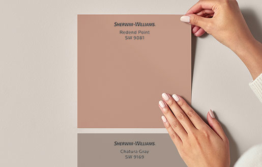
The unveiling of the Sherwin-Williams 2023 Color of the Year, Redend Point SW 9081 (195-C4), is finally here. This color will find its place within home interiors, adorning accent pieces, and providing a foundation for beautiful, inspired design.
Here we’ll take a closer look at the 2023 Color of the Year’s significance and examine how warm, nourishing hues like this trending neutral are defining so much more than design.
?qlt=82&ts=1704781588200)
?qlt=82&ts=1704781332973)
The Shift from Cool to Warm Tones
For years, cool grays and other chilly neutrals have dominated mainstream design. And while cooler colors and bright whites do speak of tranquility and simplicity, over time we’ve been starved of a different kind of beauty.
In response, we’ve begun to see some much-needed warmth enter the picture. For residential spaces, this shift has been especially meaningful, as our homes became not only about convenience but also about connection—a chance to devote more of our energy to feel-good pursuits and passing the time more purposefully.
?qlt=82&ts=1704781322739)
?qlt=82&ts=1704781308788)
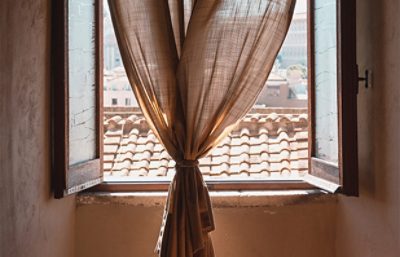
This desire for comforting, cocooning experiences at home has given favor to more soothing hues, warmer neutrals, and designs that inspire relaxation and renewal. As Sue Wadden, Director of Color Marketing at Sherwin-Williams, puts it: “The enduring qualities of warm neutrals imbue architecture and spaces with a tangible sense of permanence that embraces the need to slow down.”
?qlt=82&ts=1704781303337)
?qlt=82&ts=1704781311867)
Grounding Colors & New Perspectives
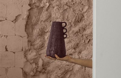
As the positive impacts of empathetic design begin to permeate our lifestyles and priorities, several trends have emerged to support a new focus on compassionate, intentional living. In the world of color trends, this influence can be felt in the rising popularity of warmer, earthier hues.
?qlt=82&ts=1704781336066)
?qlt=82&ts=1704781313640)
?qlt=82&ts=1704781339306)
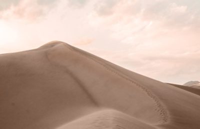
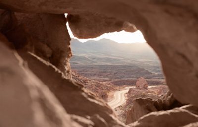
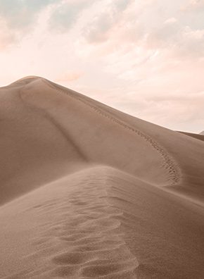
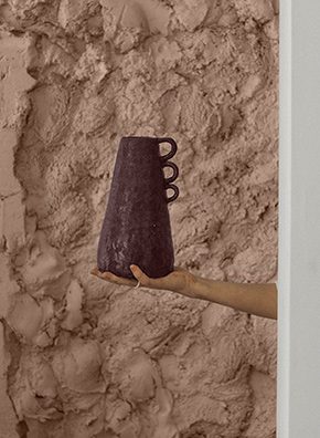
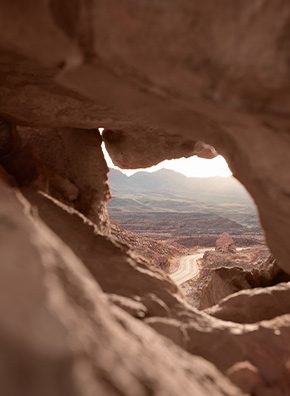
Warming desert tones like Redend Point SW 9081 (195-C4) promote a sense of restoration and calm, inviting quiet moments of blissful ease.
“In an age of acceleration and rapid change, physical acts of slowness and active mindfulness can nurture,” says Wadden. Often, this translates into slowing our consumption and being mindful of our environmental impact, and brown, terracotta, and beige are gaining popularity as designers look to natural materials, fibers, mineral paints, and plant dyes.
Care for the planet, care for one another, care for ourselves—it is all connected, and surrounding ourselves with restorative colors is one way to bring that care into our daily experience.
Creating Space for Slowness
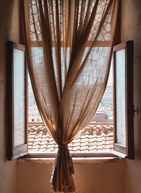
Stylistically, Redend Point can be great for merging pared-back aesthetics with comfort and coziness, and this color feels right at home within evolving-trend aesthetics like meaningful minimalism, soulful bohemian, healing nostalgia, and even “grandma glam.”
“Work terracotta into seasonal prints, plaids, and stripes to create intriguing narratives,” Wadden suggests. “Offset it with greens, purples, and blues for vibrant contrast, or layer it tonally to create spaces that feel refreshing and reassuring all year round."

- 1
- 2
- 3
- 4
- 5
- 6

- 1
- 2
- 3
- 4
- 5
- 6
Click through to explore more inspiration for Redend Point.
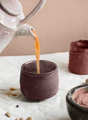
Warm, intriguing neutrals like Redend Point are becoming an important decorative element for new design concepts where calm, stillness, and reconnection are vital. Nude and blush hues denote simple luxury with a warm, human touch, and a mix of layered tones from this color family can build a delicately textured, tactile calm and lovely lived-in feel.
“The nourishing aspect of natural clays and baked pigments inform a narrative that feels natural, heartening, and familiar,” Wadden adds. “The overall vibe evokes naturalness; warm woods, grainy and tactile fabrics, muted velvets, and textural glazes all work together to achieve an environment that has a calming and restorative effect.”
Click here to learn more about Redend Point and the colors that pair best with our Color of the Year, and connect with your local Designer Account Executive or Architectural Account Executive for more information and professional resources.