Close


Jubilant Colors for Joyful Designs
Designers often act as translators, interpreting our clients’ needs and wants through collaborative designs that will summon all the best feelings—especially joy. Morgan Britt Howard of Morgan Britt Interiors put it perfectly when she told us she defines joy as “the look on the client’s face when they see the fully completed project for the first time.”
In design, we’re often creating spaces and experiences that reflect unique interpretations of joyful living. Here, we’re exploring some of the many ways that designs can boost dopamine with even the smallest details, as shared by designers in our community.
Defining Joy in Design
When we ask designers in our community to tell us how their profession and passion makes them feel, we discover why it can be so difficult to define joy: the definition is different for everyone.
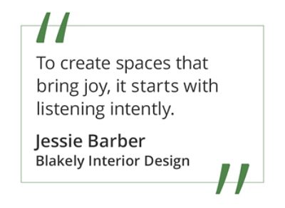
“To create spaces that bring joy, it starts with listening intently,” says Jessie Barber of Blakely Interior Design. “What brings one client joy (a vibrant green racing stripe on the ceiling) could be vastly different from another (light, bright and neutral). We also try to add personal elements to our designs that bring our clients joy.”
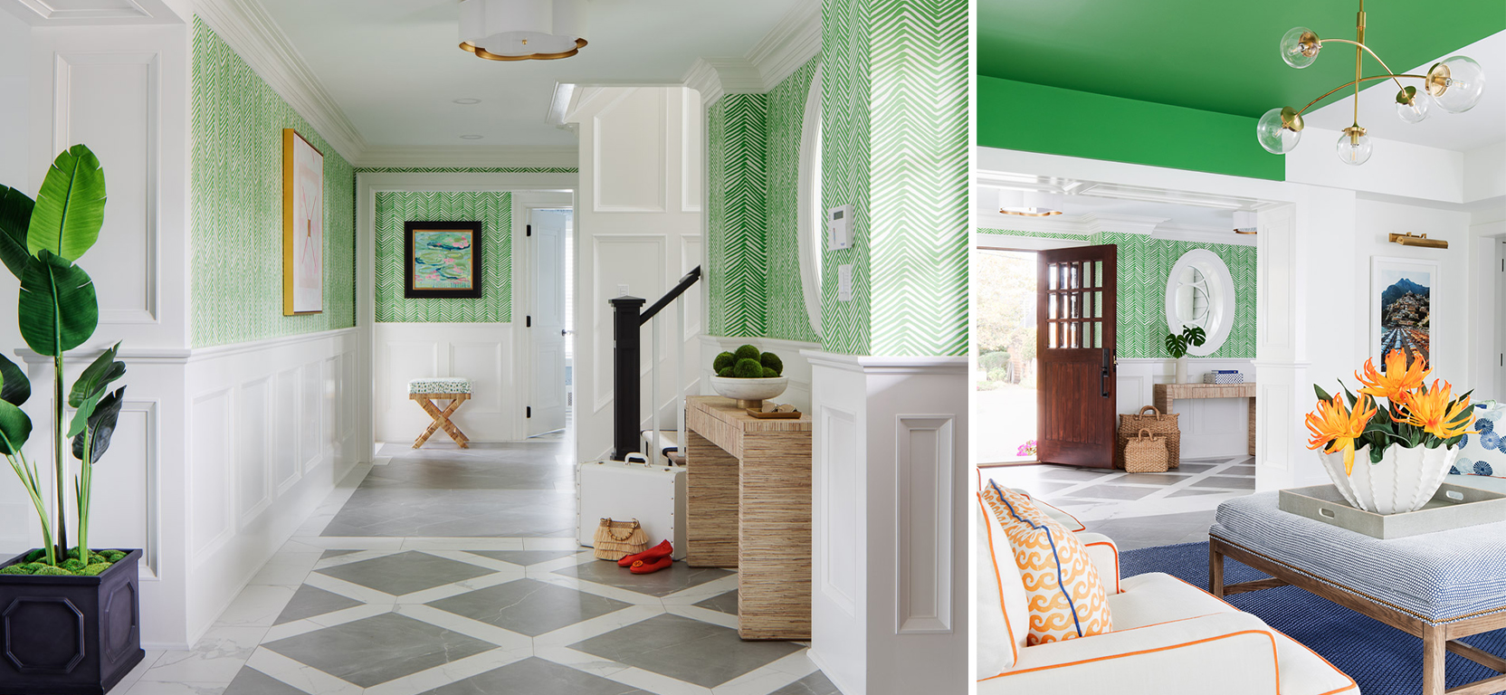
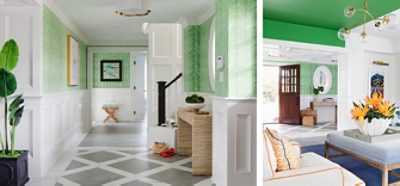
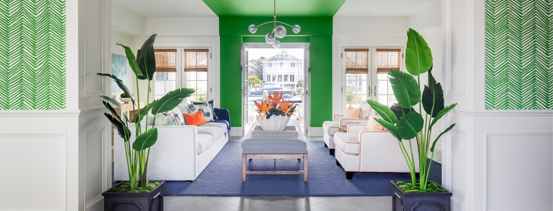
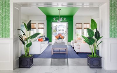
Blakely Interior Design used a generous dose of bright green to suit this homeowner’s unique personal tastes. Pure White SW 7005 (255-C1) and Grasshopper SW 6733 (150-C6). Photos by Greg Premru Photography.
For Liliya Gulych at Okomoko Interiors, finding joy is synonymous with fostering strong relationships—with clients, with her work, and with the people with whom she lives, works, and spends quality time. She likes to immerse herself in diverse design shows, events, exhibitions, art galleries, and any other activity that sparks the creative spirit.
The Ebullience of Bold Colors
From project to project and person to person, a variety of color preferences and beautifully harmonious color palettes can spark joyfulness. In some cases, bolder is better.
Oreoluwa Oderanti of Inspired Ore Home Decor based in New Jersey was able to showcase her color selection skills in a special young person’s bedroom recently. “The goal was to bring it from a gloomy and uninspiring space to a room that sparks joy, feels fun, and is light and beautiful,” Oderanti says.
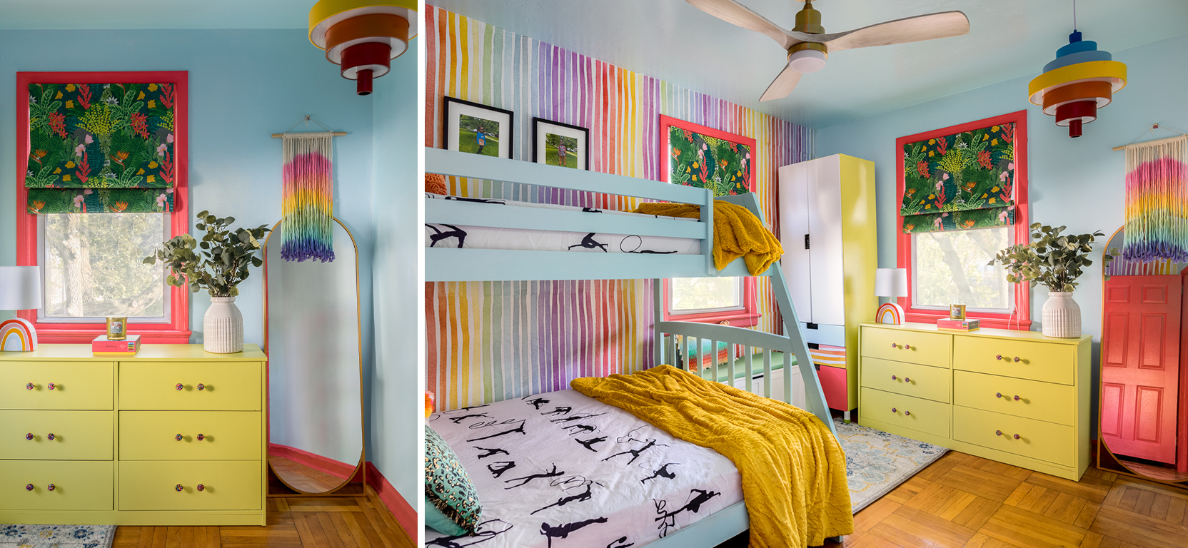
A designer’s eye and childlike sense of imagination come together in Oreoluwa Oderanti’s playful color palette for her child’s room. Chartreuse SW 0073 (dresser), Grenadine SW 6592 (106-C4) (trim & door), Swimming SW 6764 (164-C1) (walls & bed). Photos by Meghan Balcom Photography.
She collaborated closely with her “clients”—her own children—to pick out an array of beautiful colors and fabrics that brought the sleeping, sitting, and storage areas of the room together. This project was a joy for the whole family, the designer says, a place where the kids can “know they are loved, embrace who they are, have fun and be themselves.”
Canadian firm Okomoko Interiors also got to liven up a youthful space, striking a beautifully bold balance with an energetic accent wall. The client, “a teenager with a colorful imagination,” was granted a masterpiece of a room that used the vibrant hue of Inventive Orange SW 6633 (120-C3) complemented with the soothing tones of Popular Gray SW 6071 (242-C1). “The result? An absolutely stunning accent wall that’s bold and balanced.”

The Gentle Joys of Calming Colors
As a counterpoint to the bold colors that bring some projects a jolt of happy vibes, some feel most joyful when they find themselves in surroundings that are soothing and decorated in an understated way. Color can have an enormous impact on our sense of well-being and happiness, and certain color palettes (like those in our Living Well Collection) and design elements place peaceful comfort at the forefront.
Jessie Barber has a personal preference for this approach. “I’ve recently shifted from my usual love of jewel tones to soft and serene palettes,” the designer says. “Perhaps in my hectic life as a mom and business owner I’m craving some respite and tranquility with soft neutrals, like Fleur de Sel SW 7666 (258-C3) and City Loft SW 7631 (259-C6).”
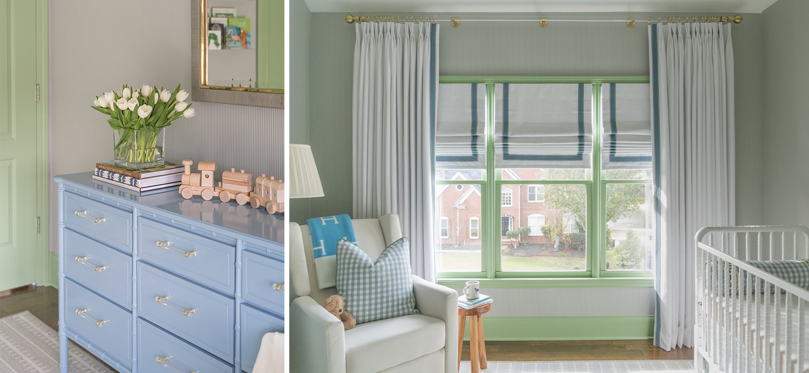
In a room that will be at the heart of so much memory-making, Morgan Britt used a soothing color palette and subtle pop of color on the trim for a happy and harmonious space. Haven SW 6437 (156-C3) (door & trim). Photos by Holly Knight Photography.
For those who feel most at ease in sophisticated spaces, Okomoko Interiors shared a recent project that demonstrates how a space doesn’t need to be bursting with boisterous colors to uplift and invigorate. For this project, the Canadian firm brought regal style to a whole new level of refinement with Quietude SW 6212 (218-C2) and Popular Gray SW 6071 (242-C1).
Okomoko Interiors grounded two different spaces and two distinct accent colors with a balancing choice of Popular Gray SW 6071 (242-C1). Also shown, Inventive Orange SW 6633 (120-C3) (left) and Quietude SW 6212 (218-C2) (right). Photos by Julia Merk Photography.
“We’ve added just the right touch of texture and hints of pink and yellow to create a space fit for royalty,” the designer said of this princess’s bedroom, “transforming dreams into reality with the stunning Rove Concept queen bed, complete with a headboard that flawlessly echoes the originality of the half-round moldings. The tapestry wall art and unique nightstands bring it all together in a perfect symphony of style and comfort.”
For some, the joy of home resides in the escape from high-pressure careers and other demanding responsibilities. Designers Kandrac & Kole were inspired by the soothing tones of rainfall to create a restful retreat for a busy client with a corporate job. They took advantage of the natural and ambient light–filled atmosphere and repeated a peaceful pale blue—not unlike our 2024 Color of the Year, Upward SW 6239 (224-C1) —across artwork, fabrics, and window treatments to create an environment that would ease the eye and mind.
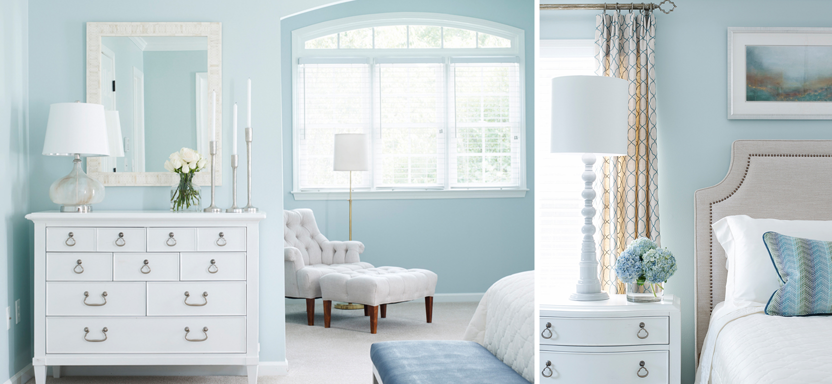
Joyful spaces don’t need to be bursting with color to provide feelings of happiness, as shown in this serene realm of relaxation designed by Joann Kandrac and Kelly Kole. Rain SW 6219 (219-C2). Photos by Emily Followill.
The Pleasure of Pushing Boundaries
Maximalism allows designers an opportunity to indulge in adventurous design choices, often inspired by their clients’ motivations and interests. “A home should be a reflection of its owners and the items that matter to them,” says interior designer Lindsey Putzier.
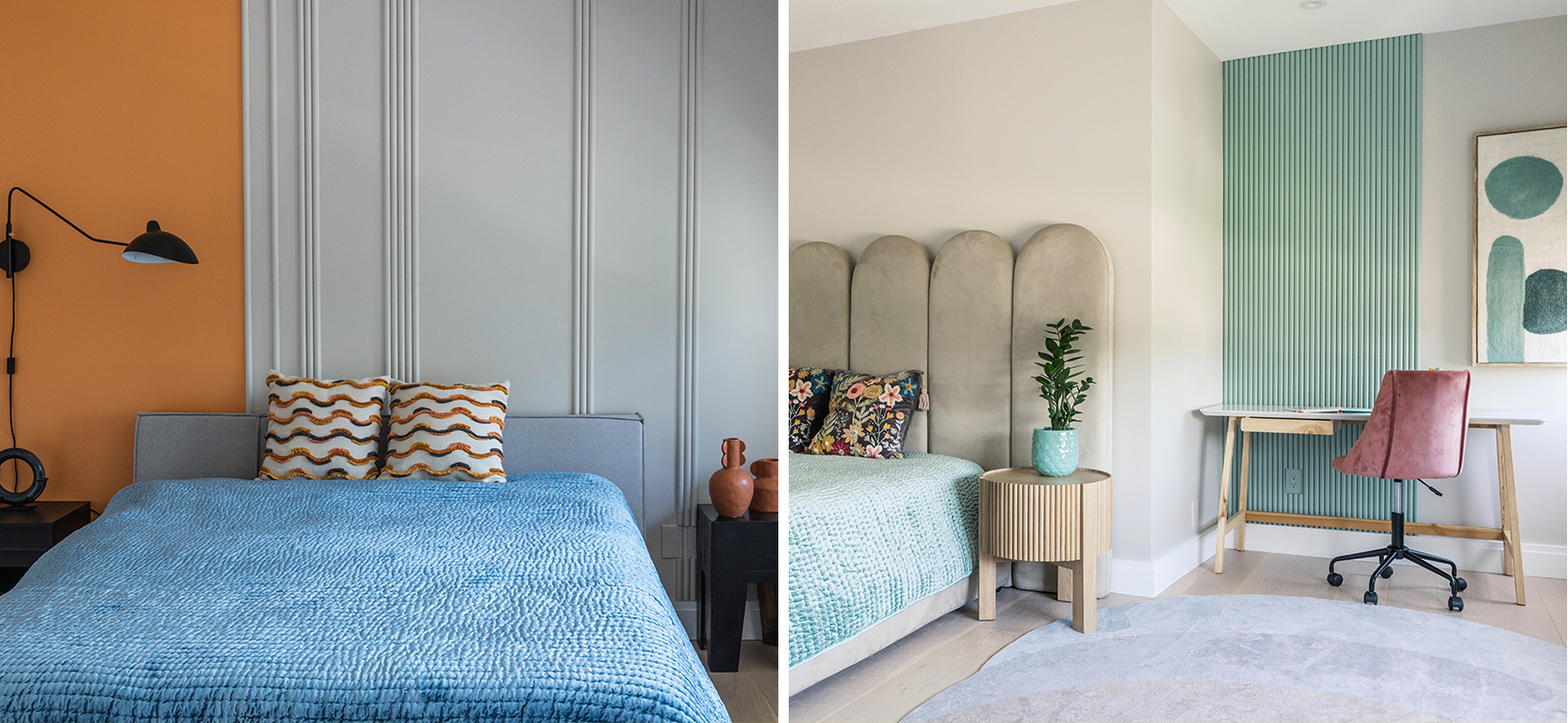
Lindsey Putzier’s unexpected colors, prints and patterns create a beautiful room-to-room harmony for immeasurable mood-boosting benefits. Alexandrite SW 0060 (left) and Atmospheric SW 6505 (175-C1) (right). Photos by Stephanie Penick Photography.
Commercial designs, on the other hand, are so functionally driven that opportunities for fun can look a bit different, and the thrill of the challenge can come from finding ways to infuse joy into places that people may come to work, learn, shop, heal, or just pass through.
Take Z Dimensional’s artful use of color and clean lines in the office of Plover Pediatric Dentistry. While it’s common for healthcare facilities to incorporate more muted colors in their interiors, the demographic served by this medical center allowed designer Zehra Arif to bring richly saturated hues into play for an uplifting effect. The boldness of Quilt Gold SW 6696 (137-C3), Inventive Orange SW 6633 (120-C3), Watery SW 6478 (170-C2), Waterloo SW 9141 (221-C6), and Pickle SW 6725 (151-C5) are set against a classic blank canvas of Ceiling Bright White SW 7007 (257-C2) in a riot of fun and cheery colors.
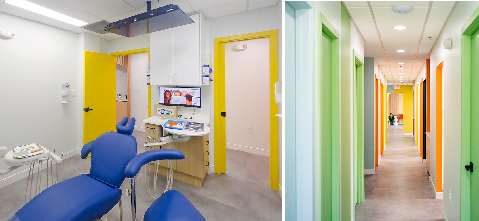
Kids and teens are greeted by a cheerful array of bright colors throughout Plover Pediatric Dentistry, designed by Zehra Arif.
Whether a project is for yourself or a client, in residential or commercial spaces, following trends or favoring timeless styles, there are many different routes for finding joy in the process or the finished product in design. Explore our latest Colormix® Forecast and reach out to your Account Executive to let us help you bring your most joyful design visions to life.
Top image: Pure White SW 7005 (255-C1) and Grasshopper SW 6733 (150-C6).
Photo by Greg Premru Photography.