Close

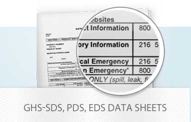
GHS-SDS, PDS, EDS Data Sheet Search
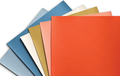
Order Oversized Color Samples, Fan Decks and More
Order Now
Photography Credit: Rayon Richards

Photography Credit: Rayon Richards

Get the latest inspiration on color and cutting-edge design.