Close


We hear so much about trend colors and hot hues, but how are these decisions really made?
You've seen the headlines: "Color of The Year," "The Next It Color." These announcements by trend forecasters let us know which colors will be fashionable, favored and just plain hot in a given year. But have you ever wondered how these forecasts are made? I know I have.
As designers, should we present – and if so, how? – these "trend" colors to our clients? Yes. But first and foremost, it's important to remember that color is a tool and just one element of an entire design. Color specifications need to meet our client's goals and tastes. However, understanding color trends gives us great insight into what's coming down the pipe, helping us create designs that are stylish and vibrant.
So what do color forecasters look for when determining trends? You may be surprised to learn that the main focus no longer points solely to the fashion runways in Paris and Milan. "We study information from many resources, such as current and predicted economic conditions, travel destinations, cinema, theater, trade shows, and various trend-watching organizations, websites and blogs," says Jackie Jordan, director of color marketing for Sherwin-Williams.
As far as how designers should use these hues, Jordan advises against reinventing the color wheel. "Forecast colors show the design community where colors are trending. Meaning we expect them to grow in popularity, but they may or may not be here today and gone tomorrow," she explains. "We encourage designers to consider these colors as additions to current trends and to incorporate them into existing palettes, rather than using them to create something entirely new."
This is a very useful insight because, as many designers know, it can be difficult to convince a client to go with something new or previously unseen. It can also be a challenge to get a sense for how clients are feeling and what they actually want, but this is another area where understanding color forecasts can assist us.
Like Jordan, Kate Smith, color trend forecaster and owner of Sensational Color (http://www.sensationalcolor.com/), also studies a variety of sources. Smith says the whole idea behind forecasting lies in the observations rather than just the predictions, and ultimately it all comes down to two things:
"First, I look at what's on our minds. What issues are people thinking about – an election, the economy, concern for the natural environment? Secondly, I look at what events or items have grabbed our attention," explains Smith. She says that the latter has everything to do with the real-time images we're seeing in the media. She points to the 2008 Summer Olympics in Beijing as an example: "Because we were seeing a lot of the culture and the city, we started to pick up on design elements we wanted to bring into our homes."
Smith says that the best way to help clients choose colors is to understand what influences them. "Your clients are interested in what's happening right now." Coincidentally, Smith muses at how trend research has become more of a challenge in recent years. "Color trend forecasting used to be easier. The cycle began when you saw colors on the runway in Europe, then one to two seasons later you'd see them in U.S. designer houses, and then in the marketplace." These days, Smith says, trends can start in the home and then jump over to fashion, or they may even begin in the automobile industry with new finishes and stand-out colors that end up on kitchen cabinets. "You have to be tuned in to a lot more," Smith explains. But she also encourages designers to use their own observations and intuition to make predictions about color trends for the home.
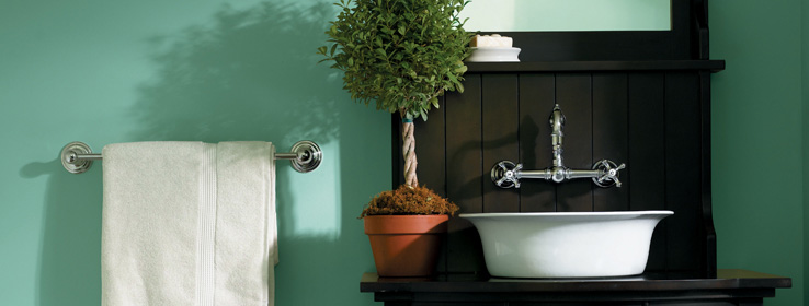
I've done that quite successfully, but what I understand now is that my conclusions were partially based on forecasts identified in advance of my own. Now I'm challenged to look deeper. All designers have the ability to be tastemakers, and we can certainly learn from the in-depth level of study, travel and gathering of information that forecasters put into identifying trends. In the case of Sherwin-Williams' colormix™ 2011 color forecast, says Jordan, the compilation was a result of identifying and distilling key factors that drive color and design trends, which emerged as four distinct themes: Purely Refined, Restless Nomad, Bold Invention and Gentle Medley.
When asked how the colors are selected for each palette, Jordan's response revealed considerable research: "For the colors that make it to the final palettes, we must have the backup research and validation from all of our resources to prove these colors make sense and are derivative of that comprehensive research."


