Close

By Kelley Stratton
It's been proven time and again that our emotions affect our health. So it makes sense that how we feel while in healthcare environments can make a difference in how we recover.
A few years ago, I visited one of my best friends in a drab white hospital room. She was hooked up to numerous devices and receiving one of several rounds of chemotherapy. We sat in the room and talked and laughed, and at one point she said, “What would you do differently with this room?”
The question shouldn't have been what I would do with the room, given I was going to return to the comfort of my own home later. Rather, it should have been what she, the patient, thought.
So I said: "You're the one who has to spend the most time here. What would you want to do differently?" She looked around at the stark white walls, the nondescript upholstered chairs and the beige laminated furniture, and said, "Well, some color would be nice."
We've all been in some sort of healthcare environment at various points in our lives, whether for a basic checkup, a surgical procedure or an emergency. We've been the patient, the concerned family member, the supportive friend. How do healthcare facility designers account for all of these experiences? And what parts do color and design play in the mental, emotional and even physical reactions of patients and their support system?
Emily Kantz, interior designer for the Color Marketing and Design Department for Sherwin-Williams, has spent hundreds of hours researching and trying to answer these very questions. In fact, Sherwin-Williams will soon be unveiling new color collections for the healthcare environment. "Healthcare is a growing segment for Sherwin-Williams. We want to provide everyone associated with healthcare design - facility directors and managers, designers and architects - with the information they need to have color confidence and product power when planning any healthcare setting," Kantz says.
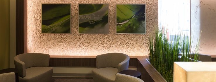
She notes that each color collection draws inspiration from nature. "Evidence-based design has shown how important nature is in the healing process. For example, studies have shown that viewing nature reduces stress and pain through positive distraction. It's a very direct influence because people easily understand and relate to nature - green grass, blue sky, red flowers, etc. Whether it's the pediatric patient whose mom is pointing out a bird on the windowsill, the aging patient who's enjoying a stroll through the hospital's gardens, or the cancer patient about to undergo treatment who's staring at an island painting and daydreaming about vacation, nature is taking them out of their present situations, thereby reducing stress and possibly improving their outcomes."
A growing priority of interior design for healthcare facilities is to create comfortable environments that feel less institutional and more like "home." Rooms should feel less hospital-like and more residential and include the comforting details of a living space. "That's why it's vital for designers in this industry to keep an eye on what's being featured on HGTV and in shelter pubs and fashion magazines, what's being talked about on popular color and design blogs, and even what's being displayed on the shelves of stores like Target - all of these things play a role in influencing and connecting with people's familiarity with colors and trends," Kantz says.
It’s also important to consider the facility’s staff when designing a healthcare environment. “Above all, staff - and patients for that matter - prefer clean, updated, well-maintained environments,” says Matthew W. Martin, M.D., of Traverse City, Mich. “That said, ‘clean’ doesn’t have to mean ‘white.’”
Both Martin and Kantz agree color is a great tool to assist with way-finding. “I think the stereotype of the sterile, clinical hospital is gone,” Kantz says. “Healthcare facilities are demonstrating they’re not afraid to use color. Some healthcare facilities are so large that it’s easy to get lost. So color recognition - Grandma is on the floor with the green walls or the nurse’s station is directly below the bold blue soffit - can help alleviate unnecessary stress and confusion in an already stressful situation.” Martin agrees: “It’s especially beneficial for patients and families when colors change in hallways and various wings of a hospital to indicate transition. When everything’s the same color, it makes finding your way around what’s already an unfamiliar environment that much tougher.”
The bottom line for all parties involved - the patients, the medical staff, the supportive friends and families, the designers - is to promote wellness. And that means broadening the focus of the healthcare environment - looking beyond just addressing the patient's physical ailment to finding new ways to promote the patient's overall health and well-being.
Related content:
To read about the healing hues and innovative design of Chicago's new Ann & Robert H. Lurie Children's Hospital of Chicago, click here.


