Close

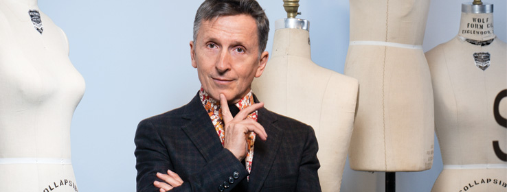
Barneys New York's window dresser Simon Doonan is renowned for his unique blend of art, commerce and British whimsy.
For more than two decades, Simon Doonan has been putting a fresh, distinctive spin on displays for Barneys New York. Who else would dare to put rats or lumpy caricatures of celebrities into a luxury retail store? Now Barneys' creative ambassador at large — "ambassador of fun,” in his words — Doonan is also a style columnist and best-selling author.
STIR: What's your recipe for a successful window display?
SD: To be cheeky, have a sense of fun, be a little irreverent. I've always thought, make a list of what people typically do and do the opposite. You're bound to get some attention.
STIR: What's your process for working with color?
SD: The starting point is the merchandise. With designers like Jil Sander and Yohji Yamamoto, there tends to be a lot of black, which gives you a lot more flexibility with color. You can go bananas.
STIR: You've said you built an entire career out of being inappropriate. What's the most inappropriate thing you've done?
SD: The typical window display is a pristine, meticulously clean environment. I've done messy windows, full of debris, almost like an episode of "Hoarders.” That is not expected.
STIR: Has Barneys ever vetoed one of your windows?
SD: I'm pretty good at self-editing. It's retail, and my goal is to sell things. I'm more interested in that than career-making provocation. My goal is to intrigue people, not appall them.
STIR: How has technology changed the art of window dressing? Are there things possible now that weren't when you got started?
SD: For me, window display remains a fairly craft-y thing. Technology is ubiquitous. That was never my way of approaching it. My way is a bit more "loving hands at home,” like old-fashioned dioramas.
STIR: How does being British affect your design sensibility?
SD: British people of my generation tend to be irreverent and fun, with a camp sensibility. American culture is very playful, but Americans tend to be very serious about themselves. There's a lot of Monty Python in my blood.
STIR: What were your earliest color influences?
SD: My mum was a big color fiend, with a natural flair. She would paint walls different colors. Our dining-room ceiling was peacock blue. When I see that color, I always think of her.
STIR: You married designer Jonathan Adler in 2008. What did you wear?
SD: He and I are such a couple of guys. I never thought twice about what I'd wear. I wore a brown velvet Thom Browne jacket.
STIR: Who does the designing at home?
SD: I don't believe in negotiation. It has to be somebody's vision. He holds the remote when it comes to décor.
STIR: How would you describe your color palette at home?
SD: Every color of the rainbow. It's a gallery kind of setting. The apartment is white but we have orange tables, a yellow lamp and a big black foot. It's rubber, an Italian found object, in the living room, next to the Ping-Pong table.
STIR: What's your favorite spot in your home?
SD: Diana Vreeland said she loved her bathroom. I've become that person. There's an armchair, books and magazines, a place for drinking cups of tea. It's all white with orange detailing €¦ an orange shower €¦ and lots of gold and gold ceramics.
STIR: What color would you not be caught dead wearing?
SD: Remember that book, Color Me Beautiful? Johnny and I joke about it. I'm an autumn; he's a winter. Autumns look much better in warmer colors. I never wear black. He says, "I can't believe I live with two low-contrast autumns.” Me and the dog.
Kim Palmer has been a contributing writer and the managing editor of Sherwin-Williams® STIR® magazine since 2004.


