Close

A rich palette brings enduring warmth to a home by the sea.
The house was built on a sandy point – Mount Hope Bay in front, Sakonneto River behind. It made sense, then, that the owner wanted rooms with views. And the owner, New England architect Gary Graham, got them. From every room in his new Portsmouth, R.I., home, you can spy the many moods of the sea and sky.
This ocean-hued outdoor palette, dominated by shades of blue, called for vibrant interior color that could lighten moods on gray days. But Graham, principal with the architectural firm Graham/Meus Architects of Boston, needed more: durable color that could withstand the best his grandkids could throw at it.
Graham turned to his painting contractor, Sherwin-Williams representative Tony Amantea and Architectural Account Executive Mark Weiner for suggestions. Durability for entertaining and for youngsters was as key as color-rendering for Graham, Weiner says.
Two coats of Sherwin-Williams Duration HomeTM line of washable coatings applied over a primer promised easy cleanup of stains.
House With a View
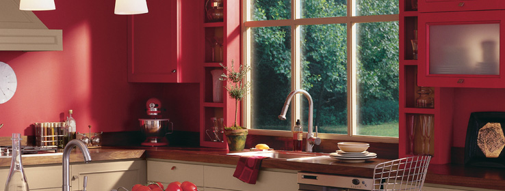
While Duration Home provides the protection, the color palette provides the drama. "I was selecting colors during the midst of a very cold winter, which influenced the palette toward warm yellows and golds," Graham says. "Since this is a year-round house, I wanted to be living in an environment that was comfortable during the cold nights of winter and during the summer months as well. My wife and I are very satisfied with the colors. It's like living in a French vanilla ice cream cone."
The custard-like hues are boldly paired with rich, saturated accent colors in russet and gray tones to soften the wall palette. Graham's use of color offers dramatic proof that the era of "making everything white is over," Amantea says.
"And, every room has different colors and a different view of the water," Weiner says. "It really is dramatic."
In addition to desiring warmth and durability, Graham had another design goal in mind: "I wanted a comfortable, livable home that incorporated my personal philosophy of rational, sustainable design," he says. The home's many windows provide passive solar energy. The three-story structure was built on piers to comply with coastal zone requirements. Breakaway glass blocks at the lower level glow softly at night and reinforce the concept of a house that floats above the ground.
Other features include bamboo, slate and travertine tile floors and a dramatic central staircase with stainless steel cable guard rails and natural cherry handrails. And the long-lasting Duration Home coating carries the Sherwin-Williams GreenGuard Gold certification.
Graham's house, at 1,800 square feet, is not large, but its design elements and colors give it big impact, he says. "Together they combine to create an unexpected and very remarkable space in our little home."
Palette Pointers
Architect Gary Graham used the following guidelines in choosing colors for his new beachfront home:
Start with a "permanent" feature. Graham keyed off the gold-toned travertine tile floor. The bamboo flooring and wall hues were chosen to complement that color.
Think of the environment around you, and the corresponding moods. "We chose exterior colors to blend with the naturally gray cedar shingles that cover the body of the house," he says. "Interior colors were selected to contrast with the abundance of dark blue water, light blue sky and the green of a large tree."
Consider an accent wall to highlight a design element. In Graham's home, the central staircase is a key feature. In that area, he painted one wall in Bold Brick (SW 6327) to contrast with the other walls and draw attention to the stairway's stainless-steel and cherry rails.


