Close


Inspired by his favorite places, designer Larry Laslo stirs up intriguing paint and fabric combinations.

Why tip-toe around the color wheel, creating safe, less-is-more palettes, when you could be having fun? That's Larry Laslo's philosophy. "I'm a great believer that you have to be fearless," says Laslo, the creative force behind New York–based Larry Laslo Designs. "You really have to saturate a room with color. Two purple pillows is not my idea of using color."
And in his view, predictable color combinations are just as timid as shying away from color overall. Sometimes unusual pairings can help us see color and spaces in fresh, new ways. "When you look at a combination of colors that seems startling, think again," he urges.
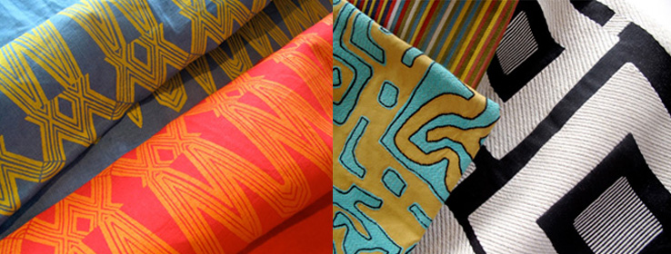
That sense of adventure is woven into the fiber of Laslo's new Destinations fabric collection for Robert Allen. To create the collection, Laslo channeled two of his favorite places, South Florida and Aspen, then put his own spin on their signature hues.
His Miami Beat group features bold ethnic and graphic patterns in bright, vibrant colors and high-energy accent hues. Like Miami, "it's chic, hip and bright," he says. Rustic Chic, his Aspen-inspired group, is more laid-back, yet still adventurous, with textural constructions and nature-inspired hues. "It's more of a neutral palette," he says, "a new variation on the tried and true."
Laslo handpicked a palette of Sherwin-Williams paint colors to complement the Destinations fabrics. When designing a space, he often likes to splash the strongest color on the walls. "Paint is the least expensive thing to change," he notes. "Most of my clients are terrified of a turquoise or yellow sofa. It's much easier to repaint than reupholster."
For Laslo, pairing paint colors with fabrics is an intuitive process. "It really is gut," he says. "I don't believe in trying to painfully match."
One of his favorite paint colors is Heartthrob (SW 6866), a bright, true red that helps print fabrics make a big impact. Laslo recently splashed the color on the walls of the "Poker Room" he designed for the Esquire SOHO ultimate bachelor pad. "I love Hearthrob. It's one of the best clear, lipstick reds in the business," he says. "That's hard to find. Most reds are either too orange or too burgundy."
Even black walls can be a dramatic backdrop that sets off other elements. Laslo likes Tricorn Black (SW 6258) with Deco Flair in Domino, a graphic black-and-white print fabric with more white than black. "With black [walls] you would probably use a fabric with lots of relief. When you do an intense color, you don't want the whole room that color. You want a background for other colors to pop."
Red or black walls won't fly with all clients, obviously, but more subtle hues don't have to be boring and predictable. "We're so tied to beige, but there are a lot of gorgeous grays that can play that role," Laslo says. "Garret Gray (SW 6075) is a great color with anything you put it with."
Laslo likes to explore color with his clients before committing to a palette. "I'm a great believer in finding a client's inner self," he says. "Usually I don't let them buy anything the first month unless I know them well." Instead of scheduling shopping expeditions, he prefers to start out by taking new clients on museum visits, to experience and react to color in other applications.
Whether your client is bold and adventurous, or wants to play it safer, there is a wide range of combinations within the Destinations collection designed to help you strike the delicate balance between creating a high-impact palette and respecting a client's comfort zone. Here are some ideas from Laslo.
Miami Beach
Less bold: Take the classic blue-and-white palette, but put a fresh spin on it with turquoise. "Everyone loves blue and white, but turquoise is a little more hip," Laslo says. A soft tone-on-tone textured turquoise fabric, such as Artisanal in Aquatic, with Extra White walls (SW 7006) will evoke the Miami spirit in a sophisticated way. "It gives it a beachy feeling without being corny," Laslo says.
More bold: Lemony yellow, paired with turquoise, is a juicy, just-squeezed way to add Florida sunshine to a color palette. "Orange and lime have been with us, and they're still good, but we haven't embraced yellow in a long time," Laslo says. He likes Decisive Yellow (SW 6902) walls to set off Art Basel, a fabric with a bold pattern that suggests wide paintbrush strokes, available in Cerulean, Lime Peel or Aquatic.
Rustic Chic
Less bold: For a sophisticated, nuanced look, Laslo pairs Aspen Lodge fabric – a subtle patterned stripe in Stucco – with Threshold Taupe (SW 7501) walls. "These are great comfort colors and a new take on traditional neutrals," he says.
More bold: Saturate the walls with rich, earthy Sconce Gold (SW 6398) or Rookwood Terra Cotta (SW 2803). Either color will create a dramatic backdrop for the graphic Las Olas screen-print fabric in Cobblestone.
To learn more about Larry Laslo's Destination collection with Jackie Jordan, watch the video.