Close

When your potential customers – let's call them Mr. and Mrs. Smith – ask for your opinion about the deep maroon semi-gloss they're considering for the living room, how should you respond? First, examine the conditions.
Examine and Explain Consequences
Once in the room, take note of its size and of fixed architectural details like windows and doors. Then, ask the Smiths to consider the room, its use and its furnishings. Help them by asking questions like:
Will you keep the same furniture, flooring and window treatments that you have now?
Will you use the room for reading or other activities that require good lighting?
What kind of lighting do you expect to use in this room?
Their answers will help you provide guidance for the Smiths' unique situation.
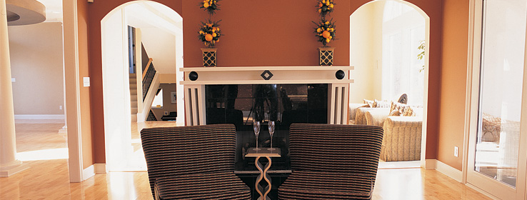
Say the Smiths' living room measures a modest 14x18 feet, has two 36x48-inch windows that face north, and relies on a combination of lamplight and natural lighting for illumination. The floors are covered in cream-colored carpet, and furnishings are predominately deep-toned plaids; neither carpet nor furniture is expected to change. The current wall color is ivory.
With this knowledge, you're able to explain consequences of the Smith's maroon color choice. Since maroon is a deep-tone color, it will reflect less light than do the current ivory walls. Thus, if the Smiths want to use the room for activities that require lots of light, they'll probably want to raise the lighting level by either, a) moderating the wall color choice, or b) adding extra light fixtures.
In addition, since some darker colors tend to make a space seem smaller, the maroon walls will make the room seem less spacious than it currently appears. While you're not obligated to suggest another color option or to discourage the Smiths from their original color choice, simply presenting them with a few consequences of their selection provides them with useful knowledge that helps them make better color choices.
Color Basics in a Nutshell
Light or pale colors can make rooms feel larger. They create a sense of openness – an impression that the space is larger than it actually is. This is one reason why whites are so often used on ceilings: They make the ceiling seem higher.
However, bright whites can also create the illusion that adjacent colors are darker, so they may not always be the best choice for ceilings. Off-whites with a hint of cream, or whites tinted with just a touch of the wall color, may bring more harmony to the room.
Many dark colors – or colors that are deep in tone – can make a room appear smaller, providing an illusion of intimacy or coziness. These kinds of powerful, more intense shades – sometimes called accent colors – create a visual perception that walls and ceilings are closer than they really are. They are ideal for accenting architectural features, such as framing a window. If your client has an impressive exterior view, framing the window with a dramatic color will "pull the eye" and help make the view a focal point in the room.
As always, though, there are exceptions to every rule. When dramatic colors are used, contrasting colors can help give definition to a room, especially when the contrasting shades outline molding, window trim or other architectural elements. White always works in this case, but off-white or a contrasting neutral can fit the bill nicely, too.
Cool or Warm?
Besides light and dark, colors are also classified as being warm or cool. Cool colors – like the blues, greens and grays found in nature – are restful and calming.
That makes them popular choices for a customer who seeks shades that set the stage for relaxation. Cool shades, even the deepest ones, tend to make the wall recede, giving the sensation of more space. In addition, these colors can make the room "feel" cooler from a temperature standpoint.
Warm colors – yellows, reds and browns – do just the opposite. They are considered cheerful, sunny colors, making them good picks for rooms when a pleasant upbeat atmosphere is your client's goal. This is one reason many kitchens have been traditionally painted yellow.
An aside on yellow: Though many yellows are indeed bright and cheerful, yellow has a high light reflectance value - the reflection from painted surfaces that causes colors to act as a secondary light source. Consequently, bright yellows can sometimes be visually irritating. Coverage may be an issue, too, though many of those concerns are easily addressed by using the right primer coat before applying the yellow topcoat.
How Low Light Affects Wall Color
The type of artificial lighting in a room will affect the perception of the wall color, and should be considered when making paint choices. Here is a quick guide to the effects of the most popular lighting sources:
Incandescent lights cast warm yellow or amber tones that can intensify wall colors.
Standard fluorescent fixtures bring out cool tones and green casts. Warm fluorescents, while not as rich as incandescent sources, add warm casts.
Halogen lighting is bright and white and distorts color less than any other artificial light source. It does, however, tend to cool colors a bit.


