Close


A deeper look at the many shades of pale.
On the face of it, white walls are as simple and safe as it gets, the last refuge of the color-phobic. Maybe that's because white carries such reassuring associations: freshness, purity, even holiness. White promises a dirt-free, germ-resistant, till-death-do-us-part world (although white weddings are not traditional in Asia, where the color connotes death and mourning). But despite the color's profound symbolism in Western culture, it's the singular visual impact of white that may make it the strongest design statement of all.
"Think of a yellow school bus, then imagine it white," says Andrew Oyen, an associate at the New York City architecture and design firm Ferguson & Shamamian. "Or take a hearse and make it white. By reducing one factor – color – you suddenly draw attention to its other elements."
White's ability to heighten awareness of space, shape and light has made it a perennial favorite of celebrated architects and designers as diverse as Mario Botta, Gwathmey-Siegel, Rose Tarlow and Richard Meier, who has praised the hue's unique ability to intensify our "perception of all of the shades of the rainbow" while still retaining "its absoluteness."
White's self-possession, its almost aristocratic indifference to the threat of common dirt, endows it with effortless glamour. Manhattan's trendsetting design store, Troy, recently reissued a line of classic black-and-silver Danish modernist furniture – this time in white leather. The color keeps reinventing itself as a way to simplify and savor simultaneously, an appealing combination for those seeking respite from a hectic world without sacrificing a sense of luxury.
Palette Refresher
Andrew Flesher, named one of House Beautiful magazine's "Next Wave of Designers," recently chose a serene, white-on-white palette for his own Minneapolis loft. After assembling colors for clients all day, he says, his gallery-like space offers soothing visual relief: a "blank canvas" that clears his mind.
The usual complaints about white – that it's sterile, boring, too hard to maintain – may have more to do with limited imaginations than the possibilities of the color itself.
"The sky's the limit with whites," enthuses Flesher, principal with Gunkelman Flesher Interior Design. "There are an infinite number of whites, and which one you choose can make all the difference in the world."
Zeroing in on the perfect white means following the same rules you'd apply to any color match. If you're dealing with existing features or furnishings, stay within color families. "Make sure the base of your white is congruent with the other things in the room," Flesher says. Even if you're just painting a ceiling white in a room with color on the walls, consider cutting that white with one-fourth of the wall color. "Don't just use 'ceiling white,'" he cautions.
Sherwin-Williams offers a wide range of whites with different bases. Dover White (SW 6385) achieves its creamy warmth with a touch of yellow, while Navajo White's
(SW 6126) brown tones give it an earthy but clean feeling. Becky Ralich Spak, senior designer with Sherwin-Williams' Color Marketing and Design Group, loves Alabaster White (SW 7008). "It's a beautiful white, so fresh but with a little softness. It works wonderfully with neutrals, especially khaki and tan." Antique White (SW 6119) pairs well with stained or weathered wood trims, she adds.
Light Makes White
What really makes a great white soar or sink is its interaction with both natural and artificial light sources. Daylight conditions vary locally (from wall to wall in a single room) and geographically (compare the intense sunlight of Los Angeles with the softer light of the Northeast), so "it's critical to look at the white you're considering under the actual lighting," Flesher says. Even a color expert like Ralich Spak sometimes has to learn the hard way.
"When I was looking at different whites for my bedroom, I wanted something serene but not clinical," she recalls. "I selected a crisp, blue white. When I tried it out, the bedroom looked like the inside of a refrigerator!"
Keep in mind that "the brighter the light, the more the pigment used in the white will show," Oyen says. "In Greece, those chalk-white walls become glaring under intense sunlight. In a brightly lit room, warm rosy white can turn into strawberry ice cream very quickly. But that same rosy white in a darker space might look cozy."
Finishing Touches
Adding a subtle sheen to a flat white is another way to achieve an intimate glow. "You can do a lot of things with white just by changing the finish," says Sheri Thompson, director of the Color Marketing and Design Group. For example, Sherwin-Williams offers a pearlized finish that can be used as a final coat or as highlights or striping (applied with a dry roller). She especially likes the effect when used in a powder room or bedroom, but recommends experimenting. "It's a very versatile product."
And if you're having trouble finding the right white for the effect you're after, Sherwin-Williams' paint experts can custom-blend a color based on a sample (a piece of fabric, for example). Debbie Insana of the company's Color Marketing Lab notes that its updated spectrophotometry system, Sher-Color™, can create a "thumbprint" of a desired hue more accurately than ever before. The service is available in most Sherwin-Williams stores.
There are endless ways to incorporate white's unique qualities into any design configuration. Both Flesher and Oyen love the visual impact of white floors. The gleaming flooring in Flesher's loft was achieved with the help of an industrial epoxy used in airport hangars.
Another choice is to whitewash a wood floor – especially in an older building, such as a converted farmhouse – so that the roughness of the grain shows through the paint. "By covering a rustic surface with white, you're mixing two ideas," Oyen says. "You get a sense of texture and freshness simultaneously."
Don't these designers ever get sick of white? "I really don't!" Flesher laughs. Oyen agrees. "The qualities of freshness, cleanness and timelessness will always make white easy to rely on. All that, and it still has as much subtlety as any other color."
When To Go White
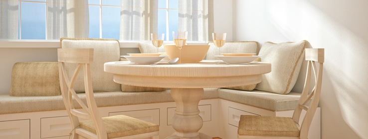
To complement, rather than compete with, nature's palette. Make the most of a room with a striking outdoor view. "A white room picks up all of the color coming in from outside," Flesher notes.
To create a feeling of intimacy. While wood paneling can generate artificial warmth, it absorbs natural light. White walls reflect daylight directly, imbuing an interior with a cozy glow.
To reclaim the visual possibilities of a period space. Oyen remembers clients who were moving into an old apartment painted in lavish, almost overwhelming colors. "They whitewashed the whole apartment, which created a sense of neutrality. Then they gradually brought back color over time. Going white first enabled them to see the space in a new way."
To show off beautiful moldings. White showcases the details. "It becomes about the play of shadows," Flesher says.


