Close

GHS-SDS, PDS, EDS Data Sheet Search
Lookup a Product
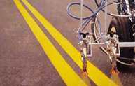
Pro-Park® Traffic Marking Paint
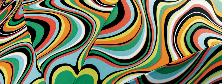
A quick guide to five common color terms your clients may not fully understand.
Color terminology helps designers and decorators accurately share their vision with clients before it comes into existence. But even the most basic terms are often misunderstood by clients and even by some designers. Words that have a very specific meaning in color theory can have much broader, more nebulous meaning in the average person's mind. So being sure your client understands what you mean when you're describing a color scheme can be a tricky proposition.
Here's a handy glossary defining five of the most common – and most commonly misused – color terms: tint, shade, tone, value and saturation.
Tint.
Put simply, a tint is a lighter variation of a color. Tints are created by adding white to colors. For example, pink is a tint of red. A commonly held meaning of this word is to add color to something (blue-tinted hair), so it's important to be clear with clients that the color-theory meaning is quite different.
Shade.
A color made darker by adding black to it. Navy is a shade of blue. This word is routinely used to describe any variation of color, even much lighter ones — take for example the 1960s song "A Whiter Shade of Pale" — so some clients may not understand that shades are darker than the base color.
Tone.
If gray is added to a color, a tone of that color is created. Tones are generally more muted versions of colors. Clients sometimes refer to grayer versions of colors as "tints" or "shades," a distinction not widely known outside the art and design communities.
Value.
This term describes the lightness or darkness of a color. Colors with more white (tints) have higher value, and darker colors (shades) have lower value. It's a very helpful term when describing the possibilities of color, but you'll want to explain it clearly to clients.
Saturation.
The purity or intensity of a color is called saturation. The most-saturated colors are vivid and strong, where less-saturated colors can appear washed out or muted. Gray has zero saturation. The quality of light can affect saturation; for example, a painted wall's color can appear more saturated during the day and less so as the light fades, and different types of artificial light can enhance or diminish saturation.
For more information:
For more information:


