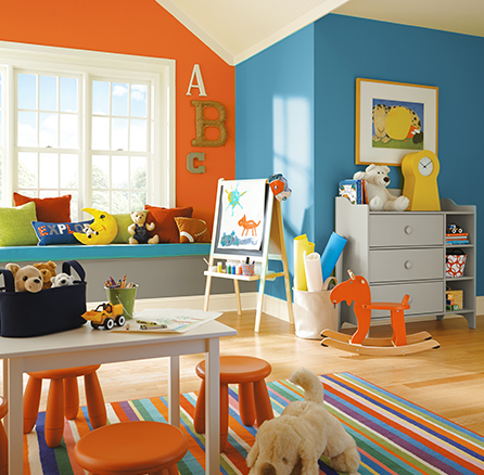
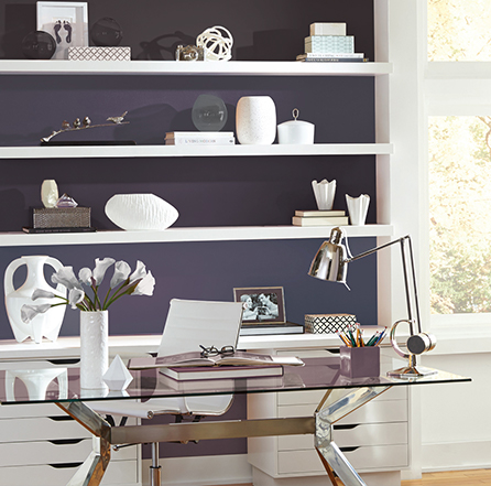
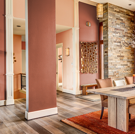
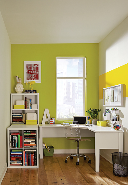
So often, we fall in love with a particular color and know we want to use it in our home. But then what? How do you build off of one color to develop a complete palette? When you break down the possibilities into four color combinations, the process becomes much clearer and a lot more fun. Here are the four ways to create a successful color palette.

COMPLEMENTARY
When the desired look involves activity and movement, the high-contrast complementary color palette is the ideal option. Complementary colors sit on opposite ends of the color spectrum. Red and green and blue and orange are good examples of high-contrast combos. Many of today’s interiors employ this type of palette, especially in hubs of activity like playrooms and family rooms. If you want to make a bold, boisterous statement, this is the palette for you.

SPLIT-COMPLEMENTARY
If you crave color contrast but in a less noisy fashion than above, consider split-complementary. To achieve this palette, take a look at the color wheel. Find the color you want to work with, then look at its complementary color on the opposite end of the wheel. Now, choose the two colors on either side of the complementary color. For example, if your main color is orange, the split-complementary colors would be blue-green and blue-purple. Orange can be your main color for walls, while the others can be used for trims, fabrics and accent pieces.

SIDE-BY-SIDE/ANALOGOUS
You don’t have to go far to find the right colors for this palette; they sit side-by-side on the color wheel. They can also be found on the same row on the color wall at your Sherwin-Williams store. As the name suggests, a side-by-side/analogous palette bespeaks harmony and compatibility.

MONOCHROMATIC
Building off of a single color lends dimension, thus making a room seem larger than it is. Monochromatic is ideal for small living rooms, powder rooms and anywhere you want to enhance the feeling of space. Choose one color and use tones, shades and tints of the same color. Notice how each new tone increases the depth of the color palette.

KEEP IN BALANCE
Once you’ve chosen the appropriate color palette, practice keeping the look balanced. For this, remember the 60-30-10 rule for color. In any room, feature 60% of your main color; use the next color half as much as the main color; and finish the look with 10% of a color for small accents.


