


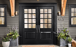
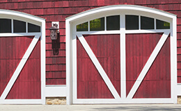
Explore Paint Colors
Bring your interior or exterior project to life with stunning paint colors from Sherwin-Williams.


- coty26
- emerald
Browse By


Offbeat Green
The Loneliest Color™
Radiant Lilac
The Loneliest Color™
Looking for a paint color that’s unexpected? Express yourself with our least chosen, yet still striking shade.
Looking for a paint color that’s unexpected? Express yourself with our least chosen, yet still striking shade.


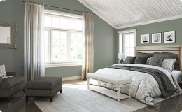
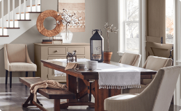
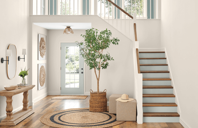
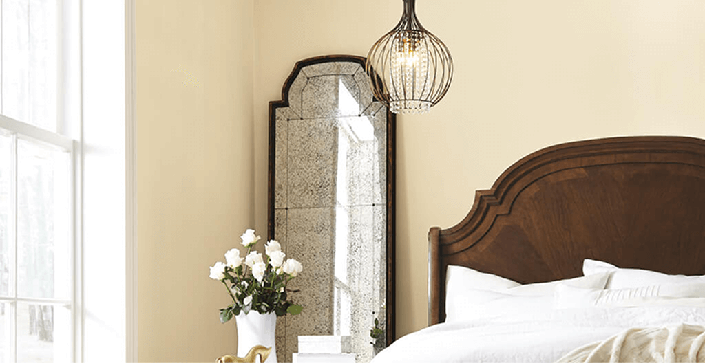
Get Inspired by Popular Colors & Color Collections


Ask Our Color Experts
Ask Our Color Experts
Get personalized color help based on your time, project and budget.
Get personalized color help based on your time, project and budget.

Color Tools
Color Visualizer
Color Tools
Color Visualizer
Upload a photo, then virtually paint your scene and compare colors side-by-side.
Upload a photo, then virtually paint your scene and compare colors side-by-side.


SHERWIN-WILLIAMS COLOR EXPERT™
Visualize Our Colors in Your World
SHERWIN-WILLIAMS COLOR EXPERT™
Visualize Our Colors in Your World
Find the perfect hue for the inside or outside of your space with our next-gen app.
Find the perfect hue for the inside or outside of your space
with our next-gen app.


Start Your Project with These Helpful Guides


Color Choice: Simplified
Color Choice: Simplified
Go from guesswork to confident color selection with tinted Color to Go® samples you can apply directly to the surface.
Go from guesswork to confident color selection with tinted Color to Go® samples you can apply directly to the surface.

Resources for Designers & Pros


Visit Us in Store
Stop by your neighborhood Sherwin-Williams for project advice, color help and the best paint, tools and supplies.
Visit Us in Store
Stop by your neighborhood Sherwin-Williams for project advice, color help and the best paint, tools and supplies.
Explore Color | Find the Perfect Hue
Ready to find the perfect hue? Explore our interior and exterior paint colors by color family or curated color palettes to get inspired. We also offer easy-to-use tools and color samples to help you see which hues look best in your space. Whether you're painting your front door or adding an accent wall to your home office, we have all the color solutions to bring your vision to life.
Sherwin-Williams en español
Sherwin-Williams en español
Descubre todo lo que tenemos para ti y en tu idioma.
Descubre todo lo que tenemos para ti y en tu idioma.


