Close


BY HOLLY O'DELL
Pastels are back and popping up everywhere — from bathrooms to retail.
Say the word "pastel" and for some it might conjure up a series of stereotypes: Easter eggs, little girls' bedrooms, 1980s interiors a la Dynasty. However, pastels have re-emerged as a bright, airy, calming option in retail, health-care and residential settings. "Pastels don't have to be baby blue or pale pink," says Jackie Jordan, director of color marketing for Sherwin-Williams. "They can have depth and substance to them, which makes them more vibrant and usable."
Another misconception about pastels: They're solely "feminine" colors. "Men are often afraid of pastels because they think they have a girly connotation. However, pale grays and blue-grays, which can be considered pastels, are very masculine hues," says designer Guillaume Gentet of New York.
Designers are turning these misconceptions on their heads and crafting unique interiors rich in pastels.
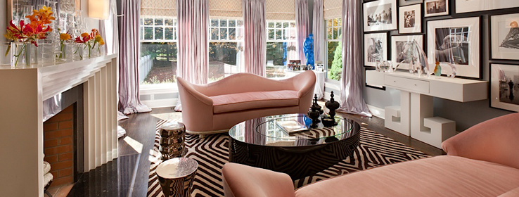
Pairing up pastels
As part of its 2013 Color Forecast, Sherwin-Williams focused on pastels in a few of the trend palettes. The pastels that make up Vintage Moxie not only exude a carefree attitude that reflects current fashion trends, but also echo retro color preferences of the 1950s and '60s. "With the economy being the way it's been over the past few years, people want to get back to having fun and feeling uplifted," says Jordan. The pastels are a bit bolder, including semiprecious gem tones like citrine, peridot and amethyst, set off by crisp neutrals. Hues like Radiant Lilac (SW 0074), Rosedust (SW 0025) and Bathe Blue (SW 6771) are coupled with black and white for a modern edge. And according to Jordan, Aloe (SW 6464) — a minty green deemed the Sherwin-Williams color of 2013 — pairs wonderfully with chartreuse, bright coral, periwinkle and violet.
According to New York-based Sergio Mannino, who specializes in retail design, pastels often need a strong accompanying color to provide contrast. Mannino employed a combination of soft and bold hues when designing Hirshleifer's Shoe Salon in Manhasset, N.Y. Bright red seating and a red lacquer wall serve as assertive accents against the lavender walls and ceiling. "While it's a very calm environment, the reds give it attitude and zing," says Mannino.
For retail boutique Shoebox New York, Mannino took advantage of pastels' flexibility. The store's target customers are women in their late 20s, so he needed colors that were young and fresh, fun yet sophisticated. Mannino used the pink that's part of the Shoebox logo as a starting point. From there, he created a variety of wall panels — dressed in fabric, linoleum and shiny lacquer finishes — that could be rearranged to create new looks. The panels come in a range of pastels — pink, green, purple and gray — with white providing the contrast.
In some instances, however, a strong contrasting color would defeat the purpose of a pastel-infused design. "Pastels are great for spas, health-care facilities and the hospitality industry — places where you don't want to feel crowded or hectic," says Mannino. "Soothing, gender-neutral pastel hues can help calm you down."
Brightening up the home front
Pastels' soothing effects also make them popular in bedrooms and bathrooms. When using pastels for painted walls, Gentet finds the ideal hue on his color charts, then always picks a shade lighter. "Once the color is spread on the surface, it becomes a little more intense," says Gentet. He then adds a clear glaze on top of the paint to give the color depth, an especially effective technique in small spaces like powder rooms.
For a residential bathroom he designed, Gentet selected a bold golden-yellow-and-white patterned floor tile to complement the pale blue damask wallpaper. He painted the rest of the walls in a tone of the wallpaper color to make the room "feel bigger and more open." Similar blue hues show up in the shower tile and mosaic surrounding the mirror.
In other projects, Gentet has chosen colors that, by themselves, might not be considered pastels, but appear to be so when paired with a darker color. For example, Gentet selected a red fabric for a sofa and a dark purple velvet for the piping. Once the trim was added, the red sofa suddenly looked pale pink.
Gentet believes there's a place for almost all pastels in interior design, but he urges caution regarding one particular hue: "Sometimes, yellow can be tricky. It doesn't always provide the best coverage and tends to reflect the colors around it. And be careful pairing it with blue; too much and your yellow may take on a green cast."