Close


By Lynn Bronson
Thoughtful use of color in design can help bring comfort and care to the elderly in healthcare settings.
Creating healthcare spaces for older patients requires designers to see color in a different way. The latest trends are less important than a healing environment with colors that will stand the test of time.
"Most facilities don't renovate very often. They're looking for solutions that will last ten or fifteen years," says Jennifer Paist, an interior designer at Horty Elving in Minneapolis, Minn. The firm specializes in designing for both senior living and healthcare facilities. Paist says the latest trends are a moving target that most healthcare facilities can't afford to aim for.
Instead, the physical, psychological and emotional responses of the elderly become paramount when designing for acute care, short-term care and long-term care facilities. Patients at any age can feel vulnerable in a healthcare setting; aging patients or those with dementia are particularly fragile. Décor and color choices can help create a comforting, nonthreatening environment that contributes to the healing process and helps compensate for physical and cognitive losses.
Within every facility, each space has its own demands, depending on who will be using the room most often and for what purpose. Sleeping, living, treatment and dining areas require different approaches.
Paist draws color inspiration from nature for her healthcare designs, keeping in mind the psychological impact of different colors. "Green is a calming color and gives a sense of life and new beginnings. Brown is grounding. And blues soothe and instill confidence," she says. Green and blue are natural choices for bedrooms because they create a sense of tranquility. Brighter colors can be used to engage the senses when appropriate. For example, patients with Alzheimer's or dementia sometimes forget to eat. Judicious use of red and yellow in the dining room of a memory care facility can help stimulate residents' appetites.
Part of the challenge in designing for long-term care facilities is making residents feel at home and connected with the community around them. Recent research has suggested that having access to nature and the outdoors is therapeutic for elderly residents in long-term care settings. Looking outside the building for ideas is one way to create a color scheme that resonates. "Working colors of the surrounding landscape into the design creates a sense of familiarity and safety for residents in long-term care facilities, especially for those with dementia," Paist says.
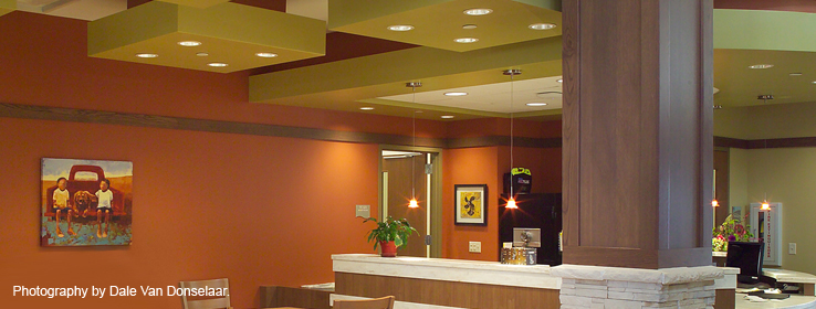
She did just that in the recently completed Klein Center, a long-term care facility for the elderly that's part of the Great River Health Systems campus in West Burlington, Iowa. Drawing inspiration from images of the Burlington area, Paist created distinct color schemes for each part of the facility that work together to create an overall sense of community. For example, blue hues reflect nearby waterways, including the mighty Mississippi; greens, browns and earthy neutrals bring in the surrounding fields and trees; and generous use of timber and stone mimics the nearby rugged river bluffs.
"Color choices for healthcare settings should also be based on color perception due to the physical aspects of aging," Paist says. As we age, the lens of our eye hardens, thickens and becomes more yellow. Colors appear more gray and subtle shade variations are hard to see, so muted colors don't work as well as brighter ones. "It's as if you're looking at everything through amber-colored sunglasses," Paist says.
In addition, cells in the retina responsible for normal color vision decline in sensitivity, causing the contrast between different colors to be less noticeable. This change affects depth perception and makes judging distances more difficult. That's where high contrast can play a role to help delineate objects and levels. However, it needs to be used carefully to provide cues, not to cause more confusion. "To someone with compromised vision, a dark carpet with a light border can be perceived as a hole that needs to be avoided," Paist says. "It's important to ensure that countertops and floors, for example, or walls and stairs are done in contrasting colors so it's easy to see differentiation — where the edges are, where one thing ends and the other thing begins."
Sherwin-Williams will soon unveil new color collections for the healthcare environment — both for acute care and senior living. "We want to provide everyone associated with healthcare design — facility directors and managers, designers and architects — with the information they need to have color confidence and product power when planning any healthcare setting," says Emily Kantz, interior designer for the Color Marketing and Design Department for Sherwin-Williams.