Close


BY HEIDI PEARSON
A look at how one company took office supplies from strictly utilitarian to a fresh way to infuse the workday (and school day) with color.
It all started with lame school supplies. When Minneapolis mom Chris Plantan brought her young daughter back-to-school shopping in 2003, she was disappointed with the aisles of notebooks, folders and binders regimented to wearisome primary colors. Undeterred, the graphic designer used patterned papers in vibrant colors to transform a stack of store-bought notebooks into one-of-a-kind works of art. Their cool factor soon had her daughter's classmates clamoring for more.
Those teens proved what Plantan had already intuited — that school and office supplies can be accessories, not merely utilitarian tools for jotting notes and keeping organized.
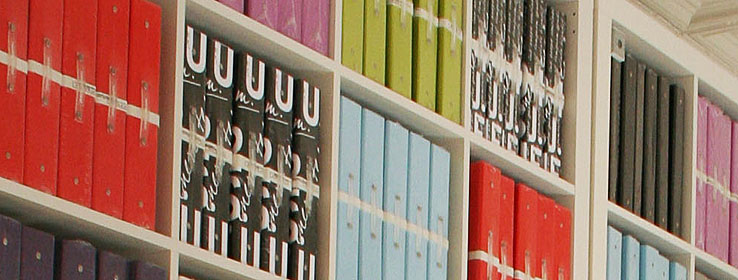
Knowing a business opportunity when she saw one, Plantan launched russell+hazel, with a line of file folders, binders and notebooks. Ten years later, russell+hazel has carved out a coveted niche in the office supply universe with an enthusiastic fan base. Their 300 design- and color-conscious products range from multicolored Chicklets Adhesive Notes to aubergine leather business card holders. The company even launched a wedding line.
Creative Director Jocelin Johnson guides the brand's evolution with equal parts fashion sense and business sense. "Our design team looks at our products as an extension of a person's wardrobe or interior," she says. "If you love fashion, if you appreciate a well-designed home, you're going to love our products. What we offer is another way for people to accessorize."
russell+hazel's designers are constantly searching for the next "it" hues that will be both trend-right and brand-reflective. The line's core colors are black, white, charcoal, red-orange, light blue and lime. "We've had these colors since the company was founded, then we rotate in seasonal colors every year," Johnson explains.
The color selection process is more art than science. "Seasonally we look a lot at fashion. There's no specific formula, it's just what inspires us," says Johnson. "However, a color that might be trending in fashion isn't going to make the cut if we don't genuinely love it and think it fits with our existing family."
Nearly all of their color choices have been hits, including the most recent debut of Vibrant Pink and Shimmery Silver. But there has also been a miss or two. "The colors that are really daring will either do really well or tank," says Johnson. "We did a bright yellow that was one of our worst sellers, but we also did a hot pink that was one of our best sellers."
The company, which was recently purchased by Minneapolis-based Gartner Studios, uses trade shows such as the New York International Gift Fair and National Stationery Show to introduce new colors and patterns — and to listen closely to customer feedback.
"It's so amazing as a design professional to have the creative freedom to play with different colors, designs and products ideas all day long," Johnson says. "We just cross our fingers that everyone else will love it as much as we do!"